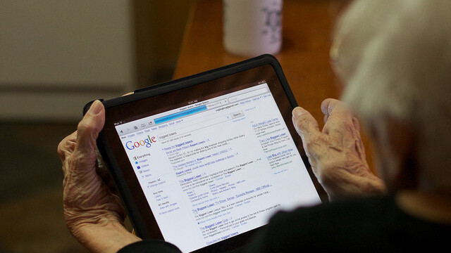
There’s a good chance that if you own an iPad, Google is your search engine of choice. The company has made some huge updates to its search interface this year, and has pushed a few more helpful tweaks today.
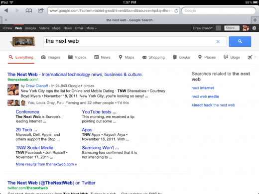
When you perform a Google search on your iPad, you’re now shown slicker and bigger buttons to change your search preference. Images, Videos, and News are placed prominently, but a tap of the “More” button uncovers similar buttons for Maps, Shopping, Books, Places, Blogs, Flights, Discussions, Recipes, and Patents.
Swiping over the options slide through all of the selections. It’s a way better search experience than the previous display of options only being in the top black bar. On the desktop version of Google search, these options are available on the left hand side. Clearly, Google has made the design fit the iPad’s screen perfectly.

Once you drill into your choice of search, a tool button on the right hand side will let you dig even deeper. When searching for images for example, you can choose to search by size or color. These are all features that Google have offered in its search product for some time, but making them readily available on the iPad is definitely welcomed.
The design is so gorgeous and compact, I’d like to see it adopted on the desktop version. I’m not a fan of toolbars at the top or left-hand side, and would much rather have all options readily available in the context of what I’m actually searching for.
The changes are only viewable on the iPad right now, but I assume that they will be made available for other tablet devices, including those running Google’s own Android operating system.
However, with the iPad accounting for 87.6% of global tablet traffic, maybe Google isn’t in a rush.
Get the TNW newsletter
Get the most important tech news in your inbox each week.


