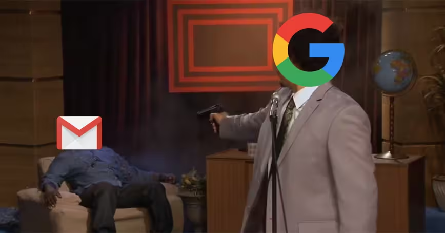
I’ve never held any particularly strong feelings for email clients. I didn’t care when Mailbox shuttered, and I barely batted an eye when Google killed Inbox. I had Gmail. It wasn’t much — but it was more than enough for me. It was simple and easily available, and that’s all it needed to be.
It’s still easily available. But it won’t be simple for much longer. Google is making notable changes to Gmail — and not for the better.
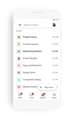
A month ago, the company outlined plans for its biggest redesign ever, a move that would see the email app turn into an “integrated workspace” with separate tabs for emails, chats, shared files, and meetings. Well, the Big G has now begun rolling out this new experience — and I absolutely hate it.
Google’s new vision practically frankensteins Gmail into a horrid fusion between Meet, Tasks, Drive, Docs, Sheets, and Slides. What used to be a clean email client will soon transform into an all-in-one solution that also lets you manage email.
Here’s what it looks like:
The release is exclusively limited to G Suite users for the time being, but the writing’s on the wall.
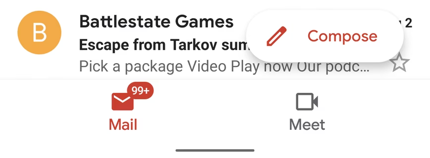
In fact, the company already gave regular users a taste of what’s about to come with the addition of a dedicated Meet tab at the bottom of Gmail a few days ago. Fortunately, you can disable that. But my fear is that won’t always be the case — especially once the Big G thinks it has softened us into liking (read: accepting) the new user interface.
(Update 16:30PM UTC: As pointed out by a Google rep, this piece incorrectly suggested the changes will roll out to the regular app within weeks. For now, only the Meet tab has been integrated within Gmail. “We are actively thinking through how and when to bring this experience to the consumers who might want it,” Google told TNW, when asked about the possibility of adding Rooms and Chat.)
We’ve seen other technology giants do it too. When Twitter rolled out its redesign, a number of user agent spoofers that let you revert back to the old look cropped up. Twitter tolerated those extensions for a while, but it eventually began blocking them, ultimately forcing its new aesthetic on all of us.
I’m eerily suspicious Google might pull a Twitter with the new Gmail, too.
The Mountain View behemoth says the new integrated experience was designed to improve focus, productivity, and ease of collaboration, but my concern is it will obliterate the mystery of emails.
There’s a certain sense of wonder that comes with Gmail notifications. They immediately build up anticipation and expectations — is it a job offer, yet another canned rejection notice, a spammy newsletter, or perhaps a message that was never even meant for you? It’s a trigger that makes you want to lift up your phone and check your email.
But that dynamic is now at stake with the new design. Soon enough, the Gmail logo might flash on your screen each time someone shares a document or schedules a conference call. It’s not like we didn’t get emails for those before, but at least we were granted the mystery and bliss to hope for more than that.
I also have doubts the real motive behind this unholy integration is to leverage the popularity of Gmail to create more engagement for Google’s less popular products, especially Tasks and Meet.
Don’t get me wrong, with more than 105 million installs between the two of them on Android alone, Meet and Tasks are by no means unpopular apps, but their user base pales in comparison to Gmail’s 5 billion installs.
There’s also no better time to push remote collaboration tools like Meet and Tasks than during a pandemic — and Google knows this very well.
Earlier in April, the Mountain View behemoth saw an opportunity to take advantage of Zoom’s security woes and lure in disappointed users by making Meet free for everyone. At the time, Meet boasted over 10 million installs on Android. It now has over 100 million.
Tasks hasn’t enjoyed the same rapid growth, but bundling it with Gmail might be a bit of marketing as brilliant as making Meet free — as far as user growth and engagement goes at least.
Unlike Gmail, Tasks and Meet aren’t system apps and don’t come pre-installed on Android. But by integrating them within Gmail, Google has virtually made them system apps. Sure, chances are most people won’t ever touch those extra functionalities, but the sheer volume of Gmail users can boost engagement for those features significantly.
Gmail’s ubiquity also makes it unlikely for users unhappy with the new redesign to ditch the app, which is why Google can afford to aggressively bloat the app with unnecessary features.
The real tragedy of software monopolies is that even those most averse to unwanted change have been primed to put up with it, one iteration at a time.
Which is why most of us will keep using Gmail — no matter how hard Google is trying to ruin it for us.
Get the TNW newsletter
Get the most important tech news in your inbox each week.

