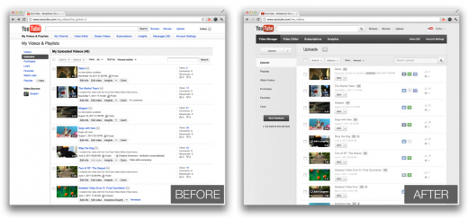
Google continues its company-wide renovation with Youtube’s new video manager. The experience is certainly fresher, with a clean UI that’s easy to navigate without feeling overwhelmed with options. It honestly makes the older version look rather embarrassing.
The changes are being rolled out now, and should make it much easier for users to manage their videos. To try it out, go to the Video Manager and click “try it now.”

Highlights of the new Video Manager are:
- Simplified top and left navigation bars to help you get to the tools you need more quickly
- Icons to indicate privacy status, if monetization is enabled and scheduled publish status
- Badges to indicate whether videos are HD, Creative Commons and/or captioned
- A new look that’s consistent with our fresh coat of digital paint
Youtube has also cleaned up their suite of editing tools and improved the navigation used to get between these tools. Check out the Official Youtube Blog to learn more.
http://www.youtube.com/watch?v=CI9zey7SfQI
How do you think the redesigns are going? Let us know in the comments!
Get the TNW newsletter
Get the most important tech news in your inbox each week.


