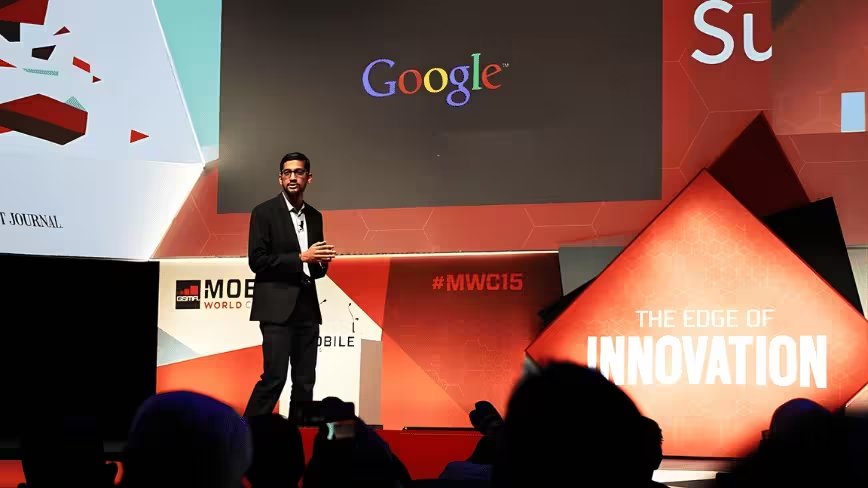
Vic Gundotra, VP at Google, announced an overhaul of the G+ experience on tablet devices during his keynote speech at Google’s I/O event. The Android version is available immediately and the iPad counterpart has been submitted and is on its way.
Speaking with Gundotra and Bradley Horowitz in Mountain View earlier this week, the pair shared something that most people don’t know: Google+ is starting to see most of its usage coming from mobiles devices.
Horowitz thinks that it’s a good thing. “We are delighted at our mobile usage and see it as a positive trend,” he shared with me. Gundotra added that the trend was “accelerating.”
It’s no surprise that “Where’s the tablet app?” is the number one question from Google+ users.
The tablet versions of Google+ completely turns the stream experience on its head. When you’re in landscape mode, you can swipe your way through your stream, as items are bunched together based on how popular they are. For example, if a photo in your stream has a lot of +1’s, it will show up slightly larger in your stream.
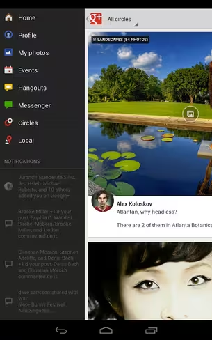
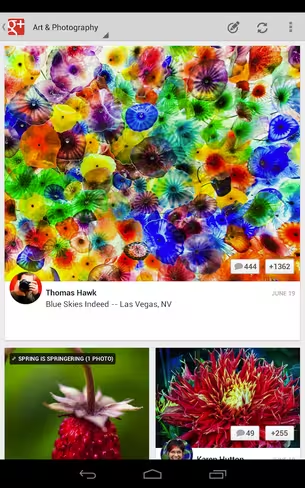
The app is absolutely gorgeous, and it definitely takes some cues from Flipboard’s approach to content display and digesting. I found that after using the app for a few minutes, navigating your way through all of the features on Google+ was simple, and more importantly, natural. It’s a hybrid of Flipboard and Apple’s coverflow.
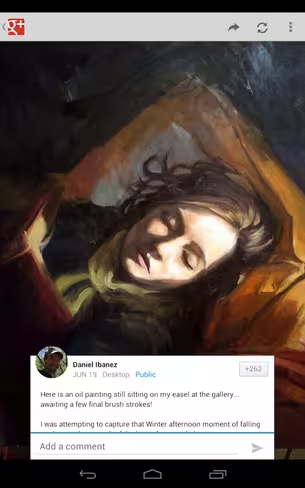
You can slide up the comments in a post that you’ve tapped on, and there are all new animations for when you +1 something. It’s the little things that count when it comes to user experience, and the Google+ team is on its game with this iteration.
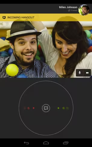
Even answering an incoming Hangout request is kind of awesome, simply slide to accept.
Notifications get broken out into a stream on the left-hand side as well, a change that will also be making its way to the web version. Instead of simply seeing the number of notifications, you’ll see something very similar to Facebook’s News Ticker.
As far as I’m concerned, the next innovation in social products is the “stream.” The idea of seeing a column of content updated in real-time is something Twitter, Google+ and Facebook are doing. I’m looking forward to Google switching on the “smarts” to bring you a better experience.
“The stream experience should be about connecting people”, Gundotra told me.
Community has been a huge part of the adoption that Google+ is seeing, and Horowitz said: “It’s key because we learn when we do something wrong. And it’s not just the community managers, Google+ is a product that builds communities.”
Most assuredly, this mobile push is due to the much-rumored 7 inch Nexus tablet that the company is set to unveil.
Get the TNW newsletter
Get the most important tech news in your inbox each week.

