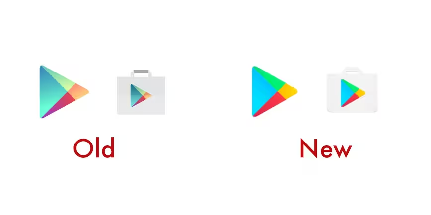
No need to blink twice — it’s not just you. Google Play is updating its icons today for a rounder look with brighter colors that’s more fitting with the redesigned logo from last year.
The Google Play logo no longer has a gradient look and instead opted for flat, solid colors. The update will be rolling out over the next weeks so you have plenty of time to adjust your eyes.
![]()
Personally, I’ll miss the gradient as it’s less harsh on the eyes, especially with these super vivid hues. What do you think?
Get the TNW newsletter
Get the most important tech news in your inbox each week.