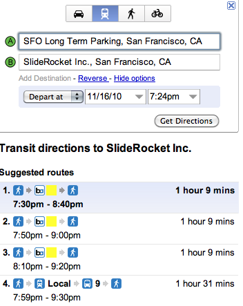
 While I’m a huge fan of Google Maps, I’m not always a fan of using it to be able to compare the different routes and directions. Apparently I’m not alone, as according to the Google Lat Long Blog, the Maps team has been hard at work tweaking the UI.
Now, instead of having to select modes of transportation early and then re-search for each one, you can switch on the fly and get an extensive view of your entire trip in one pane. There are changes, as well, to the descriptions for routes that will make it easier to decipher exactly what you’ll need to do in getting from point A to point B.
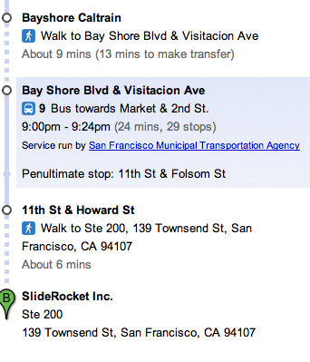
But even at that, Google didn’t stop. Now, instead of simply having a step, you can go as deep as turn-by-turn directions for each part of your journey and you’ll see more context by Google Maps showing train stops previous to your final destination.
All said, the changes look really slick. I’m also a huge fan of the detailed steps. It’s really nice to click on something and see the in-depth information about it:

That single bit of information, telling me things like transfer times, turns at specific streets or other things of which I’ll want to be careful has really increased the usability of Google Maps all around. For now, it looks like the changes are all big winners for you and for Google.
Get the TNW newsletter
Get the most important tech news in your inbox each week.


