It’s a bold and risky move any time that Google decides to change how things look on Google.com. While the vast majority of us do our searching from within a browser-native search box, Google.com still gets an inordinate amount of traffic.
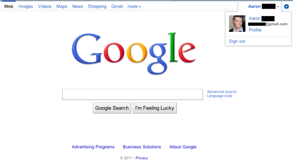
As first reported by Google OS a couple days ago, we’ve now been able to confirm with a bit more detail what Google is testing. Loyal TNW reader Moshen has spotted the change and sent us some screenshots. Though it appears on his wife’s Google account and not his, the changes do appear to be the real thing. They all center around the navigation that appears at the top of Google.com. To refresh your memory, here’s a look at the present setup:

And the screenshot acquired by Google OS:

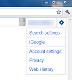
What Moshen has spotted, however, appears to be a refresh that incorporates the image stored in your Google account:

You’ll notice that not only is the text now highlighted with a bar above to show what section you’re viewing, there’s also been a cleaning up on the right hand side. Rather than the standard email address/settings/sign out links, the test shows a pair of dropdown menus.


For now, it doesn’t appear that any of us here at TNW have the test UI. We’re using an identical version of Chrome as the chosen tester, so it doesn’t appear to be native to any version of the browser, either. We’ll just have to wait and see what features end up making the cut.
Get the TNW newsletter
Get the most important tech news in your inbox each week.


