Android and Chrome OS apparently aren’t enough for Google, because the company has been working on a third operating system codenamed Fuchsia for over a year. Now that we’re getting our first good look at the OS’ UI, it’s clear Google has big goals for Fuchsia – perhaps even replacing Android some day.
Ars Technica recently went hands-on with Fuchsia’s UI, which it was able to compile for use on Android. Though the OS was sometimes speculated to be for IoT devices, the UI shows Google has much grander plans. Keep in mind it’s not particularly functional, but it still gives us a good look at what Google has been working on.
Before we get started, it helps to watch this video of the UI by Hotfix.net:
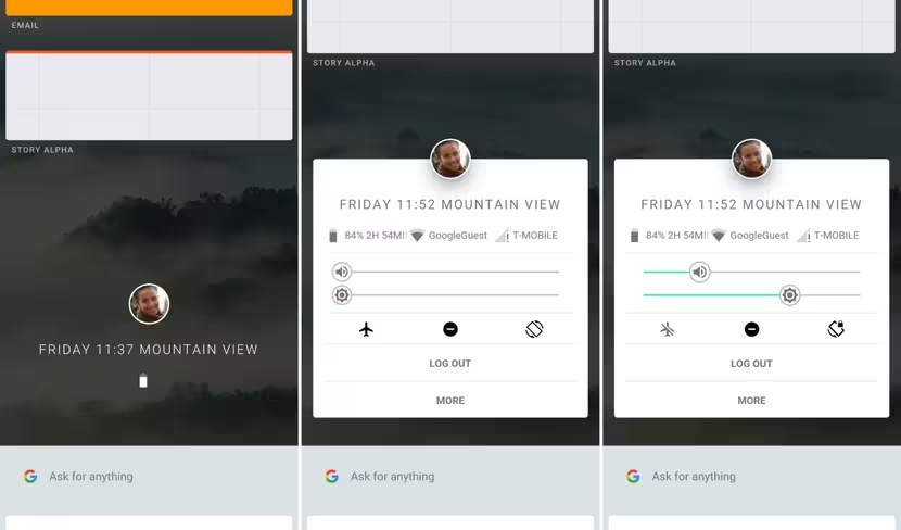
The UI centers around a vertically scrolling homescreen list. At the center is a profile picture, the date and time, your location, and a battery icon. Above this central space are “Stories,” which thankfully aren’t of the Snapchat kind. Instead, this seems to be a place for your recent apps and app groups (more on this later). Below is a search box and a selection of suggestions, kind of like Google Now, except it might double as a launcher too. Tap on the profile image, and you’ll be able to access some quick settings.
Once you tap on one of your stories, you’ll be taken to a full-screen app interface (again, just placeholders from now). If you drag one window onto another in your Stories list, you’ll be taken into a split screen mode. But you can combine more than two apps, in a move that seems to combine the simplicity of a mobile UI with the robustness of a desktop OS.
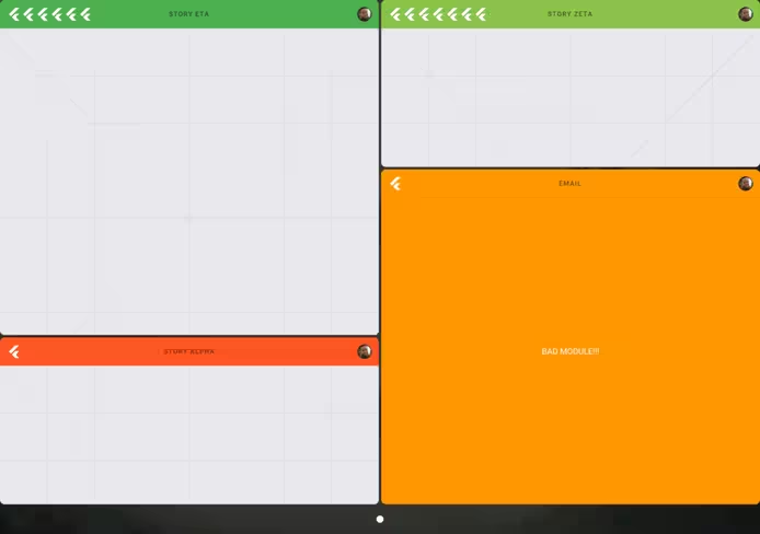
There doesn’t currently appear to be a limit to how many apps you can stack together, and they needn’t all be the same dimensions. You have the option to stack apps vertically or horizontally, which could come in handy depending on what type of app you’re using; and RSS feed works fine as a slim vertical app, but I wouldn’t want the same for, say, a text editor. The neat bit is that your stacked apps remain grouped if you return to your Stories list, allowing you to essentially create full virtual workspaces as you need them.
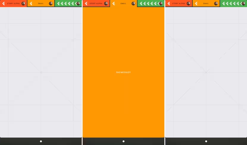
That said, Fuchsia does crash after too many apps are stacked and its possible Google could limit the number of apps depending on your screen size. You might only be able to work with two apps at once on a smartphone, but four might be feasible on a tablet.
The other curious thing about Fuchsia is that it doesn’t use Linux or the GPL– unlike Android and Chrome OS. Its interface and apps abandon Java for Google’s cross-platform Flutter SDK. Basically, Google is trying to use as much homemade code as possible to make Fuchsia work, and hopefully provide a smoother end-user experience in the long run.
But its worth reiterating that this is ultimately all speculation; Google has stayed mum on its plans for Fuchsia other than a few vague hints. If we’re extremely lucky, Google might give us some insight at this years I/O conference, but don’t count on anything concrete for probably some years. In the meantime check out Ars Technica’s detailed breakdown at the source link below for more.
Get the TNW newsletter
Get the most important tech news in your inbox each week.

