 Any web worker knows the power that Google Docs has for team collaboration and productivity. They also know something else, it has a difficult file management system.
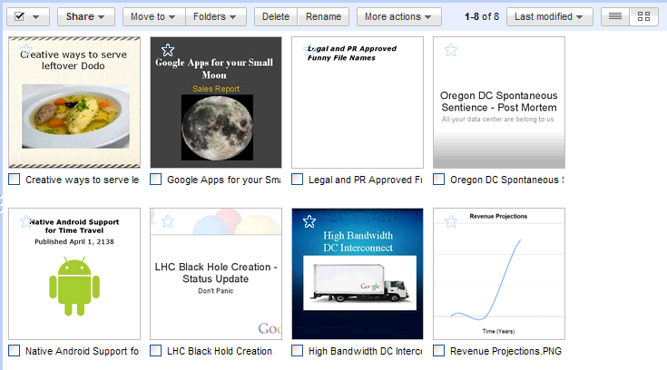
Files that had similar names were easy to confuse, and so versioning became a headache inside of teams. To combat this, Google Docs has rolled out a new file viewing system: thumbnails. This is a leap forward for Docs users who have needed something like this for far to long.
Head to your main docs page, and click on the view button to switch from the classic lined view to the new view. The view button looks like this, if you were unsure:
If you are afraid of going to look for yourself, file thumbnails appear like this:

In addition to the new thumbnail view, Docs has finally made its search capability useable. Before, any fumbling of letters in the word of a search term would ruin any chance of finding the file that you were looking for. Docs has changed that, and now knows that metallica and metalilca are the same thing.
Two small long overdue changes that are going to make Docs even more the standard for online document and spreadsheet collaboration. Now can we please bake in the wonderful Wave instant typing synchronization into Docs?
Get the TNW newsletter
Get the most important tech news in your inbox each week.


