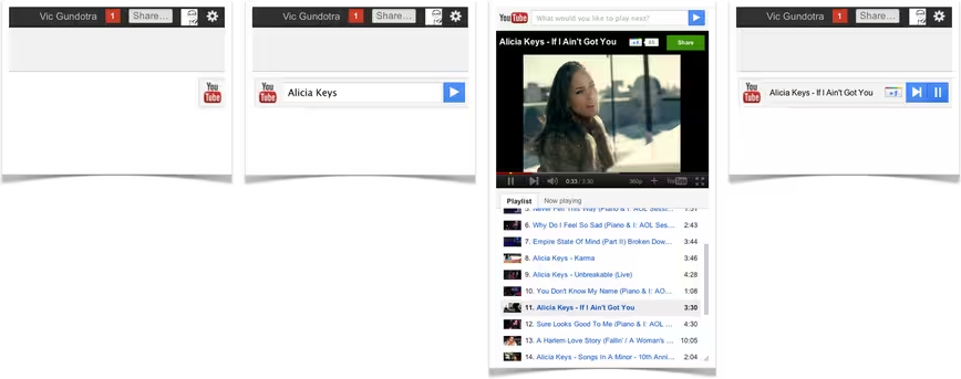
Google has today announced a new, closer integration with YouTube and Chrome in its Google+ social network. The closer integration will come in the form of two Chrome extensions and a new YouTube “slider” right in your Google+ stream.
The new YouTube slider allows you to mouse over a fresh YouTube icon right at the top of your Google+ window. When you do, it will slide out and ask, “What would you like to play”?
Then just punch in an artist or topic and you’ll get an auto-spun playlist of videos in a popup window. You can move the window wherever you like and still use the slider to navigate through the videos selected.
When you share a video with your circles, other readers can see the video, as usual, but they can now also view a related playlist right from the post. This way they can check out similar artists or videos without having to search for them.
Google+ is also getting YouTube playlist results in its search queries.
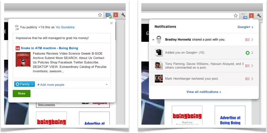
In addition to the tighter YouTube integration, Google has also dropped two new Chrome extensions that enhance Google+. The coolest of these is a ‘+1 button’ that hovers to the right of the universal URL bar in Chrome, which allows you to instashare any webpage to Google+.
The other shoves your Notifications alert into the same spot, this way you can see your Google+ notifications even when you’re away from the network.
Google’s Vic Gundotra says that this is a taste of ‘shipping the Google in Google+’. If anything is going to propel Google+ forward, amongst heavy competition, its tighter integration with the most popular Google properties.
The Chrome extensions are, as optional addons, only as effective as their installs, but I could easily see them becoming a pre-installed option in future versions of Chrome. This would place the all-important Notifications in front of your eyes constantly.
As someone who uses Google products extensively throughout the day, I can tell you that the little orange box with the white numbers does have a magnetic pull. I’ll find myself clicking on it just to see what activity I’m seeing on G+.
Take that opportunity for engagement and increase it to 100% of the time that you use your browser and that’s a huge pull.
Interested in more about Google+? Take a read of our extensive interview of Andy Hertzfeld, one of the creators of the Mac and Google+ co-designer.
Get the TNW newsletter
Get the most important tech news in your inbox each week.
