The Google+ team has just announced a new look for its +1 button, the first since Google’s social layer launched last year.
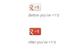
It has dropped the red and blue look that we’re used to and has gone completely red and white:
If you aren’t sure what it looked like before, here’s the colorful “Google” version:
Here’s what the team had to say about the change:
Following in the footsteps of our new red and white Google+ icon, the +1 button is sporting a fresh coat of paint. Starting today, this update will be visible first to our Google+ Platform Preview Group and shortly thereafter we’ll roll it out to the public.
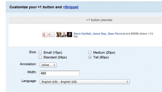
The +1 buttons you’ve already installed will automatically update; there’s nothing you need to do. Stop by the updated configuration tool to see how these changes look across all the various sizes and shapes of the +1 button.
The updated configuration tool lets you see a preview of the +1 button in different shapes and sizes and then gives you the code to put on your page or blog.
As the team mentioned, the change will be gradual and won’t require an update from site owners.
Get the TNW newsletter
Get the most important tech news in your inbox each week.
