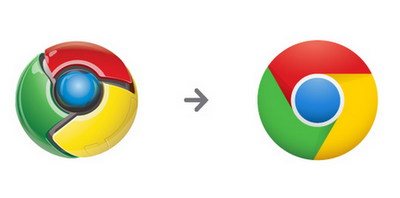
Google just announced that its lovely red, green and yellow Chrome icon got a redesign.
The makeover features a flat, 2D version of its predecessor. Since Google is “all about making your web experience as easy and clutter-free as possible,” its new icon embodies this ethos, reflecting a “quicker, lighter, easier” icon for all.

For Chrome users, you’ll see this latest icon reflected in the coming weeks.
What do you think of its new look?
Get the TNW newsletter
Get the most important tech news in your inbox each week.


