One of Google’s most-used (but least updated) apps just got a new coat of paint. Launched over a decade ago, Google Calendar, aka GCal, has coasted through existence with a series of mostly iterative updates. 2015 brought “reminders,” 2016 saw the launch of “goals” and AI-driven “smart suggestions,” but throughout it all, the looks have remained mostly unchanged.
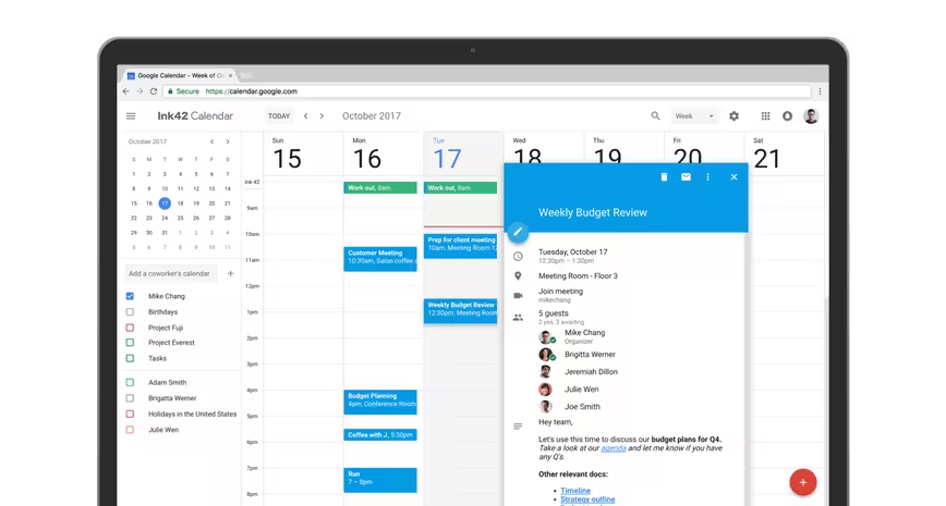
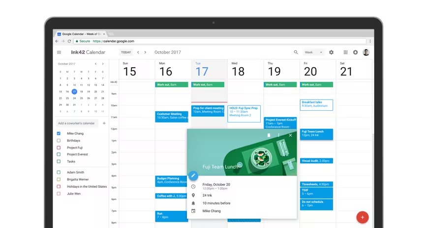
Today’s update utilizes Google’s Material Design principles to align one of the world’s most functional calendars’ UI with its already exceptional functionality.
Here’s what you’ll see:
- G Suite admins can now share information about a team’s meeting rooms so that employees who book a space know where it’s located, whether or not it has the proper audio/visual equipment, and if it’s properly accessible for the handicap, amongst other things.
- GCal’s new UI features a bevy of formatting options for better meeting agendas. Inside the Description field, you’ll now be able to bold, italicize, underline and create both ordered and unordered lists. You can also add clickable links.
- A new splits screen-like option allows you to view calendars in separate columns, no scrolling required. For those managing multiple calendars, you can already see how this makes your life easier.
- See contact information for meeting participants by hovering over their names.
- View or restore deleted items.
You’ll also see contact information of meeting participants just by hovering over their names,
The update goes live today.
Get the TNW newsletter
Get the most important tech news in your inbox each week.

