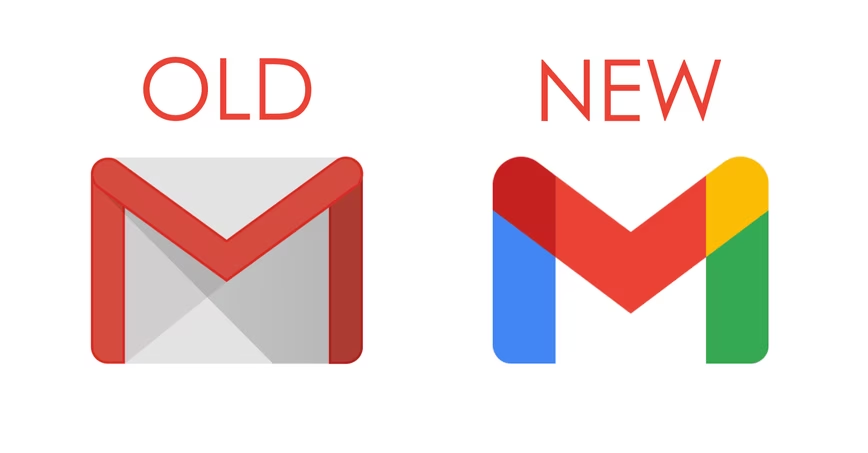
Gmail‘s red-lined envelope is one of the most iconic app logos of all time. But today that’s changing in favor of a logo that is decidedly more… Google-y.
Behold:
It’s just an M! For (g)Mail! With more Google colors now. It kinda-sorta still looks like an envelope, but it’s less skeuomorphic and more abstract. Yay?
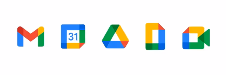
The change comes as part of G Suite’s rebranding into Google Workspace and will be rolling out to users “in the coming weeks.” Drive, Calendar, Meet, Docs, Sheets, and Slides are also getting new looks:
I don’t know about you, but I’m starting to worry a little that Google‘s insistence in using its entire rainbow of colors throughout all its apps is actually starting to make them a little more generic –even if they better match the brand identity.
Apparently, I’m in the minority. According to a feature by Fast Company, the new logos designers “relied on regular user testing and feedback to guide their decisions.” As it turns out, the envelope wasn’t “as critical to the design as they had anticipated. Instead, when they experimented with getting rid of the ‘M’ and Gmail red altogether, they found people reacted negatively to those changes. So those aspects remained.
So maybe I’m just being a Luddite. Change can be good! And thanks to the new colors, you’ll at least have absolutely no doubt that Gmail is, in fact, a Google product.
Get the TNW newsletter
Get the most important tech news in your inbox each week.