GitHub today released version 2.0 of its Windows app, which it markets as “the easiest way to use Git and GitHub on Windows.” The new version features a more streamlined design, new GitHub local features, and some general speed improvements. You can grab the new version now directly form windows.github.com (if you already have GitHub for Windows, it will update automatically).
GitHub released its Windows app back in May 2012, and has made improvements in three minor releases since. Today’s major 2.0 release comes more than two years after the app’s debut, and aims to inject new life into the app.
GitHub executives told me they saw a major bump in terms of interest for the client with the 1.3 release that was more of an overall increase rather than just a spike associated with new versions. They are naturally hoping for a repeat of this jump with the 2.0 release.
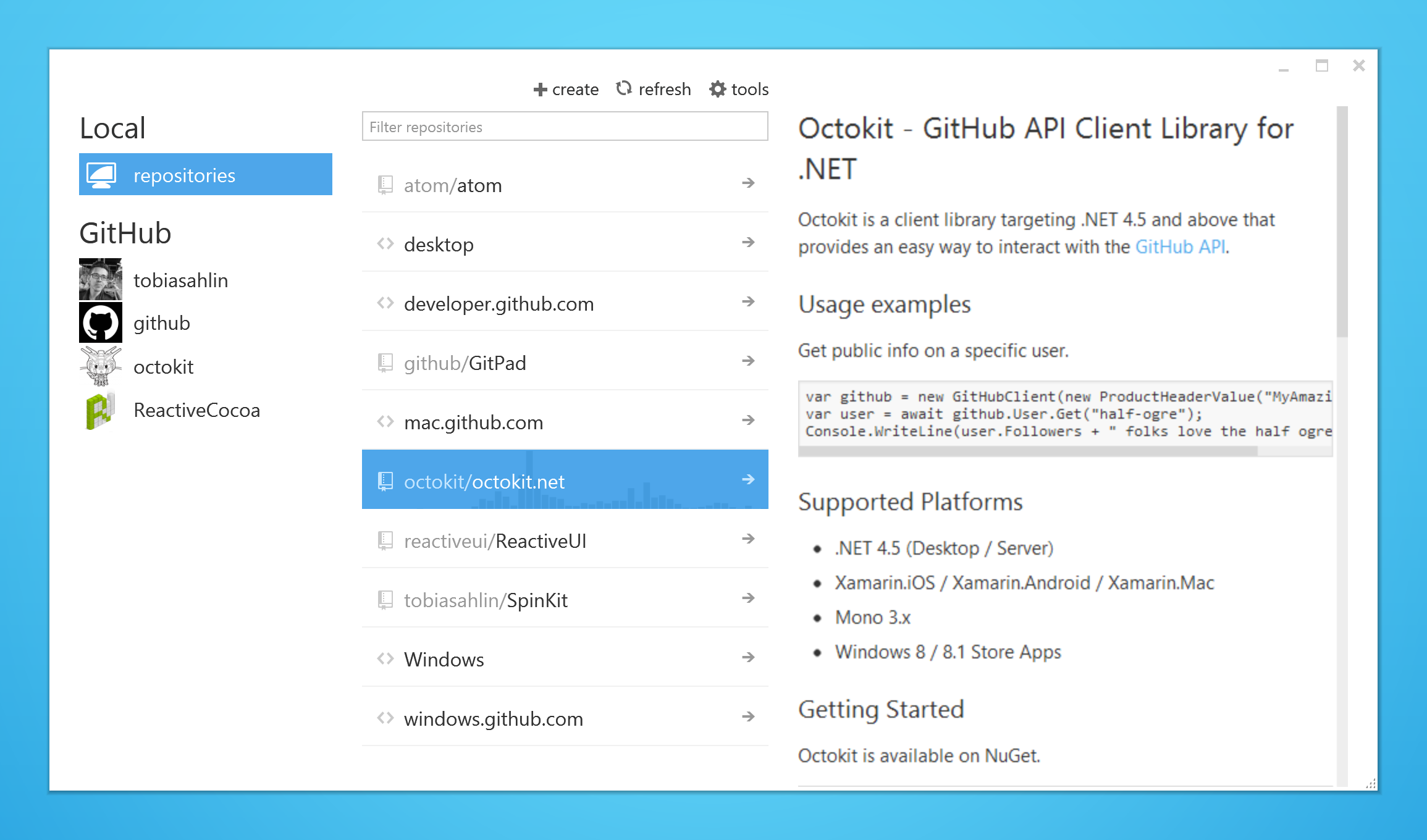
GitHub 2.0 for Windows is supposed to be simpler and cleaner, and aims to put more focus and the developer and their work. For the sake of comparison, here’s how the previous 1.3 version looked like:
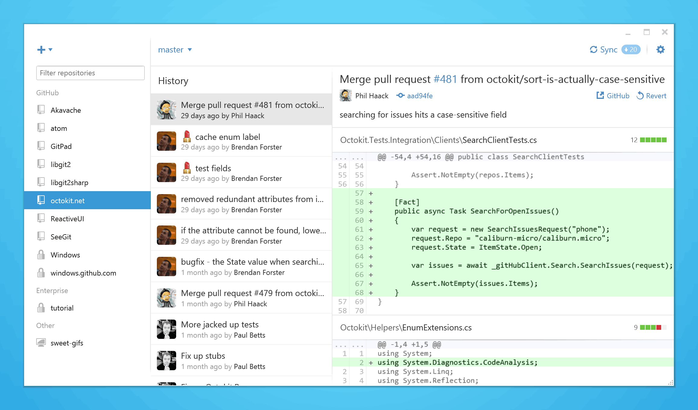
Here is the 2.0 release (the company emphasizes that your work is now ” front and center”):
Previously, there were two different views available. The company has slimmed that down so developers no longer need to move back and forth between their projects.
This is largely accomplished by adding a sidebar that reduces the need to navigate through menus and options. In short, your local repositories are always available on the left, plus you can create, clone, and publish repositories without having to navigate to a new screen. Your repositories are also grouped by where they originated from, so work projects (think GitHub Enterprise) are easy to distinguish from personal ones, and you can easily switch between them.
The new design aside, GitHub for Windows now lets you pick an ignore file template for your project when you create a repository. It also supports including emoji and gifs in your commit messages.
It’s worth noting that the aforementioned performance improvements should be felt around the app in general. Unfortunately, GitHub wasn’t able to share any benchmarks regarding the speed bumps.
All in all, this is a big redesign aimed at improving the user experience. GitHub executives tell TNW the new design language aims is a “GitHub Metro style” that takes the “best parts of Metro as well as Android and iOS.” Whether or not that’s a good thing will likely come down to personal preference.
Get the TNW newsletter
Get the most important tech news in your inbox each week.


