Moodboards rock my socks. They help bridge the gap between client expectations and a designer’s vision for a project. Before even getting started with a designer, most clients have some concept of what they want their site or app to look like and it’s my job as designer to understand what that concept is. That doesn’t mean I ever blindly follow visual direction from a client since it is very much my job to help drive creative choices, but it is critical to understand where the client is coming from. That’s where moodboards come in.
The purpose of a moodboard is to start a conversation about the visual direction of a project before fully investing in a design. By hinting at style, colors, imagery, typography and other design elements through a collage of snippets, I start to get a feel for what a client’s design preferences are. Understanding the client’s vision helps me get started with the visuals, guide our future conversations about visual direction and ultimately design the best possible site or app possible.
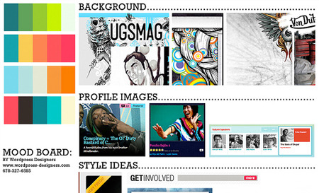
What does a moodboard look like? A moodboard can be an organized collection of design elements:
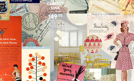
It can be a mess of inspiration that captures a direction:
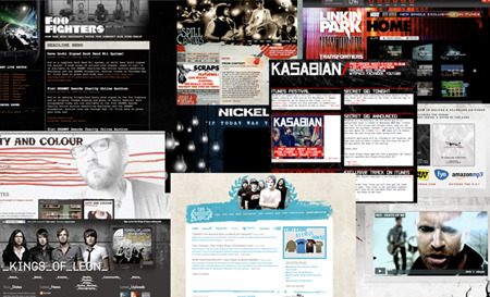
It can even be just screencaps of sites that hint at a style:
I often pull moodboard pieces from my design inspiration collection in Evernote, run them together with some quick typographic and color elements and leave it at that. It’s not supposed to be over-designed, it’s supposed to start a conversation, so keep it quick and dirty.
Get the TNW newsletter
Get the most important tech news in your inbox each week.
