Planning trips can be a real headache. After my recent trip to Italy with my wife, I started thinking how frustrating it was that there wasn’t any platform that provided all the information needed to plan a vacation in one place. That’s why I decided to put together a promo-design for a full-fledged trip booking experience based on Airbnb — which I like to call ‘Airbnb Vacation’.
Before getting into the design part, let me explain why I started thinking about a comprehensive trip planning approach in the first place.
People problem
My wife and I went to Italy last year. A lot happened before that though. I’m a fanatic planner when it comes to something like preparing for a good trip. I wanted to make sure I make the most of the 18–20 days I will be spending there.
When I started collecting information and understanding the geography of the country, I realised that there were two to three different tracks I could take. I decided to start with Rome, Milan, Venice, Florence and Pisa, Naples and end it south-east in Bari.
We had a great time. We enjoyed every single place and had a lot of fun. But I had made one mistake — I had wrongly estimated the time I required in Rome, Bari, Florence and Naples. That is four out of six places we went to. Because of this, I had to cut out two to three really interesting things I wanted to do, especially in Rome and Florence.
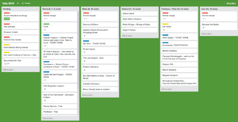
This happened because while planning, I used to jump between a few apps and websites collecting information, culling it down to what was relevant, compiled it all in Trello/Evernote. But of course this was not easy:
- It was really time consuming and overwhelming jumping back and forth different information sources — I used SkyScanner, Airbnb, Google Maps, TripAdvisor (info about museums and other attractions), indie travel blogs (some gotchas and do’s and don’t’s), The Weather Channel, and Trello/Evernote/Google Docs to compile all the information
- At times, information got lost or slipped my mind
- I lost motivation several times to include a city/place altogether because it was too much information to go through per every new added place
I still wasn’t 100% satisfied at the end of it — felt I didn’t optimise enough.
The reasons for distress
There is simply a lot of information sources. Managing them well isn’t easy and collecting information takes time and makes you set off on concurrent explorations like:
- How many days do I stay in a city to make the most of the time there?
- Attractions and points of interest may be closed on some weekdays
- What day do we reach that city on? How do we reach there (bus/train/flight)?
- What’s the cheapest accommodation available on that day(s)?
- Is my favourable accommodation far from the places I want to see?
- Am I missing out on some amazing experiences in the city? (FOMO)
I wanted to tackle this as a design problem. I started thinking about this against a design framework.
What are the JTBD (Jobs To Be Done) here?
- Have a fulfilling trip
- Not miss out on an experience/activity due to lack of information
- Reduce transit time by staying close to where the activities are
- Reduce FOMO (fear of missing out on great stuff)
And what does a user need to do, to achieve the above?
User needs
- Where to go — decide which places to go to in a country to build a solid itinerary
- What to do — easily see all interesting things to do in a city: attractions, activities & experiences
- How many days to spend — decide length of the stay in a city to accommodate all that you want to do there
- Locality of stay — balancing price & proximity to all the action as an informed trade-off
When you are planning a trip, when is a city or a location ‘confirmed’ on your itinerary? It is confirmed when you book your stay.
Current multi-city vacation planning behaviour
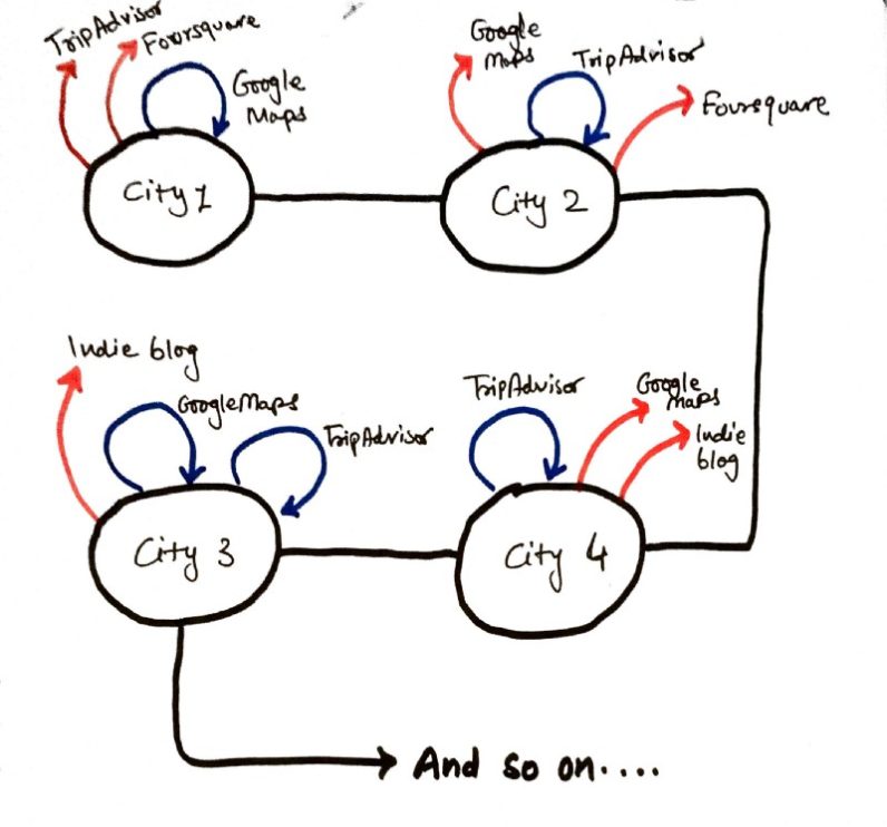
User wants to plan a long family vacation. A typical process for this goes like this:
- User Googles around and finds the cities/towns worth visiting in the country he plans to visit, and creates a rough itinerary.
- User goes and enters dates in Airbnb to check stay availability in his/her budget, per city/town.
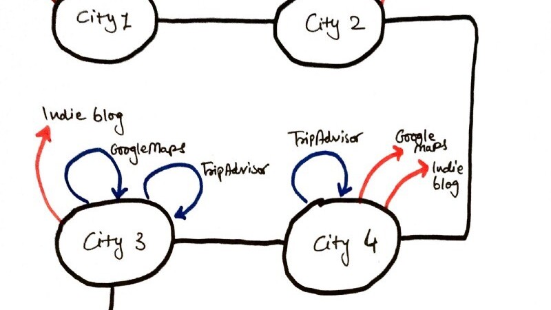
- If there’s stay available — user goes off to look for things to do, attractions to visit and mixes and matches days. During this exercise, user has to edit and modify travel dates by checking back and forth with other information sites, some of which are TripAdvisor, some indie travel blogs, train schedule websites and more.
Airbnb undoubtedly is a great place to check and compare various accommodation options and book, but there’s still constant info-fending required on other sites like TripAdvisor, Google Maps, Foursquare and all to make sure you are close to the action and are choosing the right number of days to stay.
That exercise is cumbersome and tiring. It takes up a lot of mental bandwidth and keeping track of information. There’s no AI involved that can yet make the process simpler by compiling all the useful information at a single place.
This rigmarole typically leads to two big negative outcomes:
- Many a times, user does not return to Airbnb to complete a booking, having gotten overwhelmed and sucked into information elsewhere
- User takes way too long (multiple sessions) to make a decision on purchasing a stay, ending up missing out on cheaper options due to unnecessary wait
Could Airbnb combine the whole planning experience into one coherent flow by making all the relevant information available at one single place, so you can use their product — booking a stay, in the most confident and efficient way?
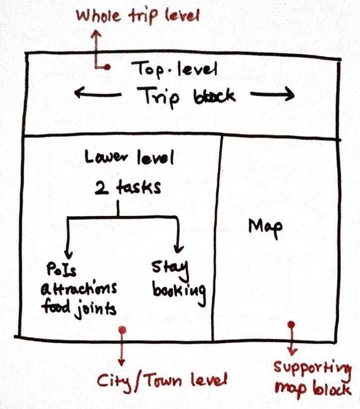
I tried out a few sketchnotes to see what such an experience would look like. How the information would be structured hierarchically into a meaningful trip-planning experience.
- I wanted to have a top-level ‘vacation’ view where you can see the whole trip at a glance — where all you are going, how many days you will spend at each location etc.
- The lower level is a city/town level view. Its purpose is twofold — first to tell me what the experiences and attractions are available, what all I can do in the city and second is to tell me what good stay options are available there.
Exploring in more detail lead me to the following set of notes where I dug deeper into detailing out each block and the information it would contain.
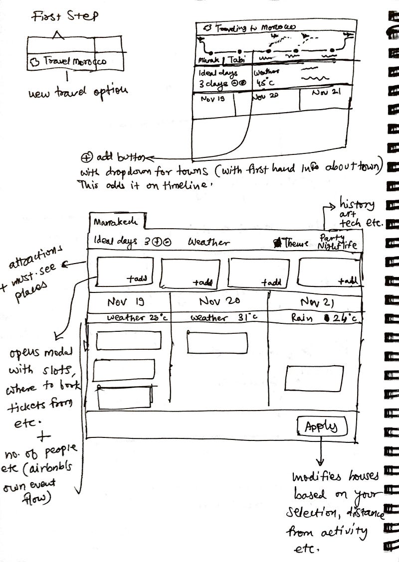
Working towards a more complete iteration, I started seeing the fruits of the efforts — this could really become a better and more hassle-free seamless vacation-planning experience.
Presenting ‘Airbnb Vacation’
Plan a whole vacation from a single place — Places of attraction, Points of interest, Experiences (of Airbnb and others), recommended number of days to spend in a city, Weather in that city, Transit options and more, all in one package.
1. Start with a country and dates
Say you want to visit Morocco (a lovely country I actually want to visit!). When you enter that in the search-field, the ‘Vacation’ option comes as an addendum to the regular city options. Choose the day-range when you want to visit the country: i.e. November 19th to 29th.

2. Primary itinerary is prepared
In the next step, Airbnb can leverage the data from past bookings and create the optimum itinerary it can for the given number of days. This already takes half the headache away from going around searching places and trying to make the most of the days you have available.
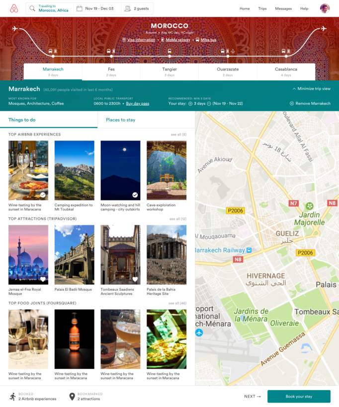
- Visa information
- What is the intercity bus service website
- Where can you book intercity trains
- What/how is the connectivity of each city (by bus/train or both)
- What cities have airports
It also gives you a full-fledged trip view and tells you how many days you should spend in each city/town to make the most of the place.
The trip view can be collapsible. When you go at a city-level exploration, you can be focused on the specific city and tuck the full trip view away.
Below is how that collapsed view looks — again as you see, we can provide information about the city like how many people have booked this city in last 6 months (positive reaffirmation by proof). By assigning tags (i.e. architecture, nightlife, pubs, culture, arts etc), we can set expectations in people about what to look forward to or what the city is known for.
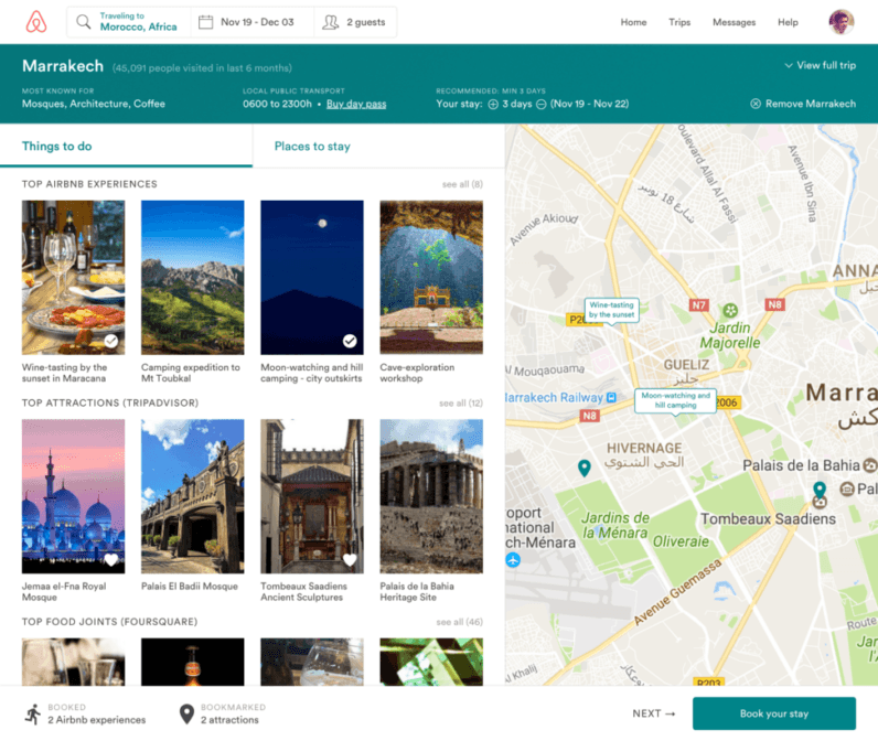
3. Taking action
Then there are the two main things to do while researching a city:
- Things to do — Airbnb has experiences for a lot of cities and that inventory can be pulled here. On top of that, we can show a lot of information from TripAdvisor, Foursquare and popular Google places and have the user bookmark them (bookmarks can then be easily accessed through Airbnb mobile app while user is in trip).
- Places to stay at — finding houses near your booked experiences and bookmarked attractions.
See in the image below, how we can show more information about a point of interest and guide the user to the right place to book tickets, opening hours, location and more.
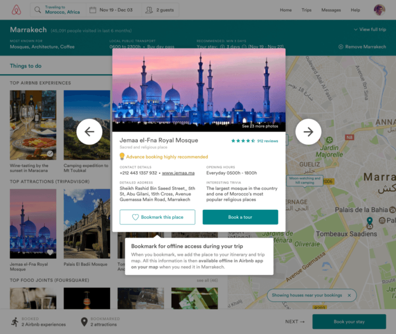
This obviates the need for making notes of things to see against cities since Airbnb app will already have the information sorted and ready when needed on ground.
Below is how a user can browse the core Airbnb product — booking a comfortable stay. When user has booked the stay, the flow advances on to the next city in the itinerary.
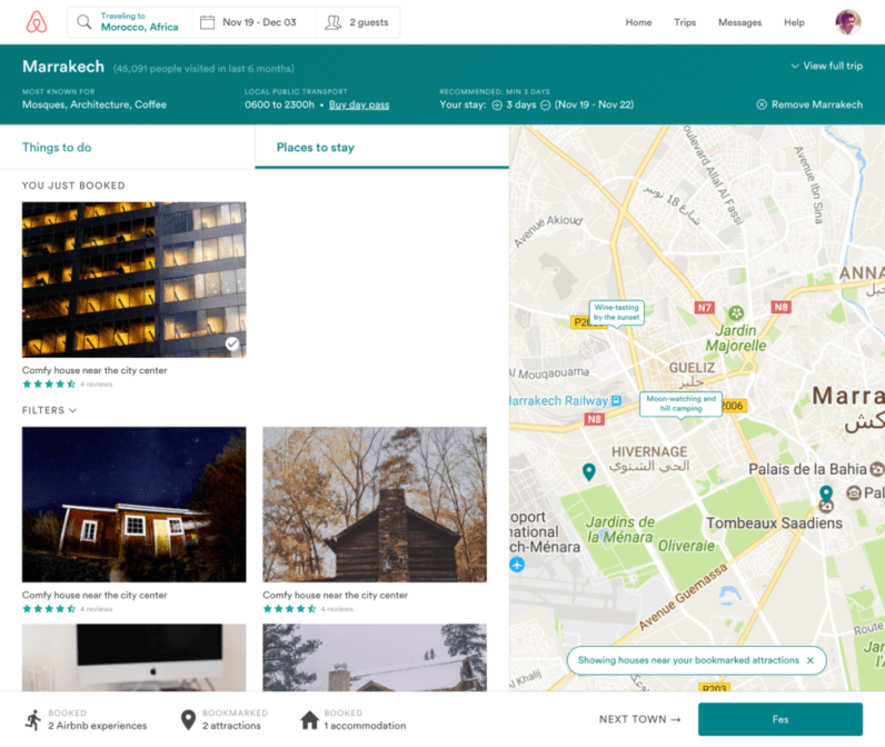
4. Making changes in the itinerary
Travel plans are always changing, the product should be flexible enough to afford all the changes.
What if the user decides that he/she wants to visit a new city their friends told them about, but it is not a part of the AI-generated itinerary? Fret not, we also have an option to add a spot to the trip.
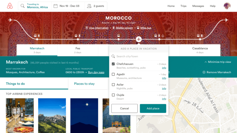
User can also add more than one spots in a single go. Adding more spots can lead to a cramped itinerary but that’s where the product can be smart and handle the cases by suggesting smart modifications.
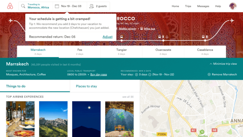
Of course this exploration omits a lot of small edge-cases but as long as the core experience provides tangible value to the user, the edge-cases can be handled gracefully.
Who is the product for?
- Users who want to travel/see a lot, but on a budget
- Users who cannot afford a lot of days of stay per city/town
- Users who want to have satisfaction of a fulfilling and a well-researched trip backed by information but do not always have time/motivation to do the research
- Users who prefer skipping lines and buying attraction tickets online in advance
Advantages for the user
- Everything happens within one single experience — “Planning your trip”
- Focus is on having a great trip and not just great accommodation = greater psychological reward & fulfilment
- Saves user loads of time not having to jump back and forth between sites + builds trust with correct information sources
- Users take long time to plan trips because a lot of variables and info-sources are involved, research is cumbersome — but this can make the process more synonymous, visual and more manageable
- Airbnb can remind user about pending ticket bookings for attractions (peace of mind for user, no FOMO), trains between towns
- Bookmarked places, experiences, points of interest and auxiliary information can be accessed from the app while on trip as a daily summary
Advantages for the business and why Airbnb should build this
Airbnb has a wealth of data about people’s trips — how many days people book an accommodation for in any given city, what order people book cities in a country for, what cities get booked the most and so on. Airbnb gets all this data as an aggregator that the competition doesn’t always have.
This would be the perfect case of building an AI engine that makes smarter recommendations to every next user using the past users’ anonymised booking information.
Then come the peripheral information chunks:
- Airbnb knows about the plan of the user, can remind him about booking tickets to attractions, POIs and earn referral from TripAdvisor ↔ TripAdvisor sends data via API and ultimately gets conversions from Airbnb
- Larger ticket-size of bookings, bigger commitments and addressing a market segment that wants such a problems solved
- All of this information could be indexed for offline usage inside the Airbnb app, that will be used as an on-the-go guide for finding or referring to information during the trip, not just before & after
- By making bookmarked places easily available while user is on trip as a daily agenda, usage of app can increase in the timeframe where it is admittedly low today
So that is it, my early iteration into designing a full-fledged trip booking experience.
Get the TNW newsletter
Get the most important tech news in your inbox each week.
