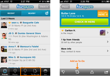
Foursquare has released version 2.0 of its iOS app today, and while the overall look and feel of the app seem to be the same, the location startup has added a few welcome new features.
On the Foursquare blog, the company makes it very clear – Foursquare isn’t just about check-ins:
“When we started foursquare, we dreamed it would be much more than check-ins. We really wanted to build tools that would help people collect and share their real-world experiences. Today we’re rolling out the 2.0 version of our iPhone app as well as a new way to connect it to the web.”
The new app splits up the To-Do and Tips in what is a pretty logical move – they really aren’t the same thing. This shows up in the main bottom navigation bar, as well as on other screens, such as the check-in screen. Also, once you’ve added a To-Do, Foursquare “dog-ears” it for you and it shows up the next time you check-in (or just check-out) a venue.
Here are the improvements listed on the iTunes page:
- a whole new To-Do List – easily organize your exploration.
- everything on a map – see your nearby friends, Tips, and To-Do items.
- redesigned venue and profile pages – more relevant information from your friends.
- more stability.
Good stuff, but one thing is for sure – no iPad app yet with this release, which is something we were really hoping for. We’ll take a deeper look once we can update the app (not showing up in updates yet for us).
Get the TNW newsletter
Get the most important tech news in your inbox each week.


