![Forget About.me, Vizify is your new online profile of choice [Invites]](https://img-cdn.tnwcdn.com/image?fit=1280%2C720&url=https%3A%2F%2Fcdn0.tnwcdn.com%2Fwp-content%2Fblogs.dir%2F1%2Ffiles%2F2012%2F07%2FScreen-Shot-2012-07-26-at-10.33.49-AM.jpg&signature=8ffb2081be37796fbfb257180ef4096e)
Update: Twitter appears to have fixed its problems, so Vizify should work for you.
One of my pain points when people ask me where they can find me on the Web is deciding where I want to send them. Professional contact? Probably my personal Website. More of a friend? Facebook or Twitter. I rarely keep LinkedIn updated, but I find myself getting connections there too. About.me is great, but a bit too constrained. Today, Vizify comes into a private beta to give you something more than a CV, but with a focus on great design.
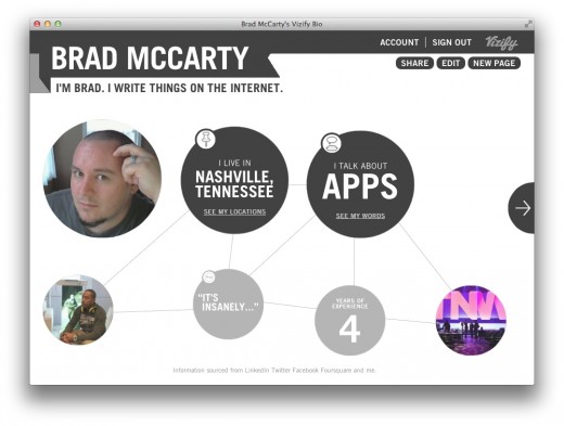
When you view someone’s Vizify (like mine, right here) you’ll see that it gives you a broad-spectrum overview of every service that they have connected. For me, you can see my years of experience, topics about which I often talk, places where I’ve lived and more. All of this information is laid out in a beautiful presentation that is easy to navigate and a joy to design via included options.
From a design aspect, Vizify is exceptionally well done. It appears that the company has used HTML5 elements so that it works on all modern browsers. The team has also made the design entirely responsive, so it looks every bit as good on your iPhone as it does in your desktop browser.
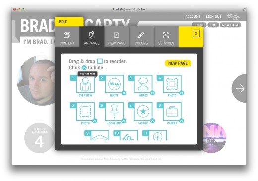
As you can see on the screenshot, Vizify pulls in data from LinkedIn, Twitter, Foursquare and your own additions such as personal websites. You have full control over your quotes, stories and photos and you can change the colors on the page as well. I just happen to like the grey scheme. You can even add sections like “Factoids” if you so choose, and all editing is done via a supremely simple drag & drop interface.
Now it’s worth noting that the team had nothing but kind words for “competing” services like About.me. In fact, I’d venture to say that Vizify’s goal doesn’t even have About.me in the picture, but instead it aims to be “something more” than what we currently have. While adding too many features can be a fatal flaw for some companies, Vizify’s singular focus on being a complete representation of your online life should keep it safe from such dangers.
Vizify is completely free for now, but the team tells me that they plan on adding a Premium package later which will give users more features and more control in exchange for a bit of cash.
The company is about to finish the TechStars program in Boulder, where we’ll be seeing them on Demo Day early next month. But for now Vizify is launching in a private beta in order to get more users and iron out any bugs that they find. Want to skip the line and get your Vizify profile right now? You can. Just head over to the site and use the code TNW. The first 500 who do will be in today.
➤ Vizify
Image Credit: Gerlos via Flickr
Get the TNW newsletter
Get the most important tech news in your inbox each week.


