With a casually critical tweet from former Apple TV software engineer Michael Margolis today, the user interface of the new version 5.0 Apple TV software became a topic for discussion. The Tweet appeared to imply that the new interface was ‘bad design’ and Margolis intimated that a similar design was rejected by Apple founder Steve Jobs.
But the new UI isn’t bad design. It’s not perfect, and it obviously has a way to go, but the reasons that it looks and works the way it does should be perfectly obvious to anyone who has been following Apple and iOS.
Margolis later clarified his statements saying that there is an effort at Apple to make everything match the look and feel of iOS and that this is probably the right way to go. And Margolis is right about that. The iPad is an incredibly popular product, and so is the iPhone.
In an article about why Mountain Lion is less about copying iOS and more about unifying user experience, I wrote the following:
Apple cares how its users feel when using its products. When a PC user who has purchased an iPhone or iPad falls in love with the experience of using it, Apple cares about making them feel the same way about the Mac. It would be stupid if it didn’t try to make the millions of people who have purchased iOS devices feel welcome on the Mac.
The exact same philosophy went into designing and producing the UI you see in the Apple TV. Frankly, I’m surprised so many people are confused by what Apple is doing here.
The simple fact is that the new UI is designed to be comfortable, familiar and welcoming to users of iOS. In addition, it paves the way for the UI to have a second-screen equivalent that is presented on an iOS device or a dedicated touch remote.
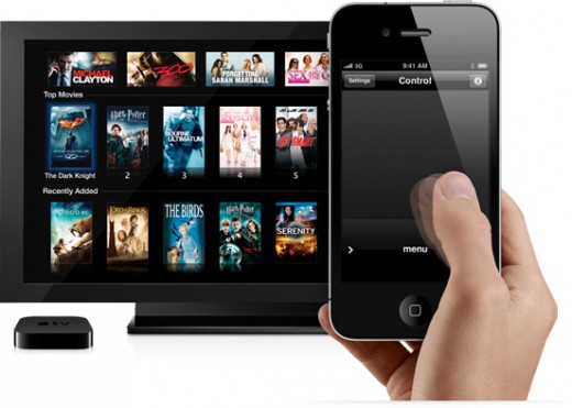
If you’ve used Apple’s Remote app to control your Apple TV then you’ll know that it has a cool factor, but beyond that its a poor analogue for direct touch control. The reason that the iPhone and iPad feel so natural to use is that you’re directly manipulating the elements you see before you, not using a proxy to twiddle a cursor around on a screen.
I had a discussion with Phill Ryu of Impending a while back on Twitter about this. Gestures are a poor substitute for direct control if you can avoid it. They hurt user discovery and feel generally sloppy if they’re not mapped 1:1 with an action taking place on the screen.
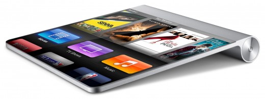
And since touching the screen of a TV to control it is stupid and impractical, that touch control will happen on a device like your iPhone or iPad, or on a dedicated remote device that has yet to be introduced.
This is why it’s inevitable that Apple will move to a full-on direct touch control method for the Apple TV, likely at some point fairly soon. You won’t be flicking your fingers around on a blank grey screen like the current Apple Remote app, you’ll be touching the icons for TV Shows, Movies, Netflix and more right on the screen, and they’ll look pretty much the same as they do right on your TV.
This is also why it makes complete sense to reinvent the UI now, in order to familiarize people with it, before it shows up in a brand new ‘Apple TV Remote’ app or as the primary interface of an ‘iRemote’.
The new interface of the Apple TV, whether you happen to think it is ‘good design’ or not, is about familiarity and preparing users for direct touch control of any future set-top or full-on television set that Apple decides to produce.
Get the TNW newsletter
Get the most important tech news in your inbox each week.

