
Today, brands envelop our lives more than ever before. Every shirt, pen, book, lamp, car, plane, etc. has been branded. There’s no way to possibly avoid the logo types, color schemes, symbols or slogans anymore.
This is why a project by branding, design, and communications strategist Andrew Miller caught my attention. Brand Spirit is Miller’s blog, where every day for 100 days, he will paint one branded object white. The results are strangely refreshing, as his process strips products into their most basic form.
Miller has set very specific rules for the project. Each object must have been purchased for less than $10, already owned, found or gifted by another person. Also, the structure of each photograph is the same every time. But why is this worth our attention?
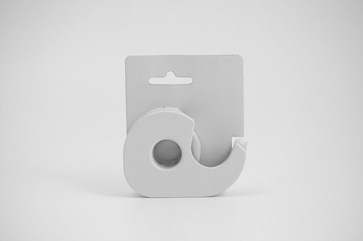 For one, it’s a break for our eyes. For just a moment, viewers are convinced that there really is such a thing as “tape,” instead of “3M™ Scotch® Tape.” The truth is, we don’t have simple objects anymore. No more markers, just sharpies. No tissues, just Kleenex. Brands are tied into everything, which is why seeing products that don’t carry associations or weight with them feels so out of the ordinary.
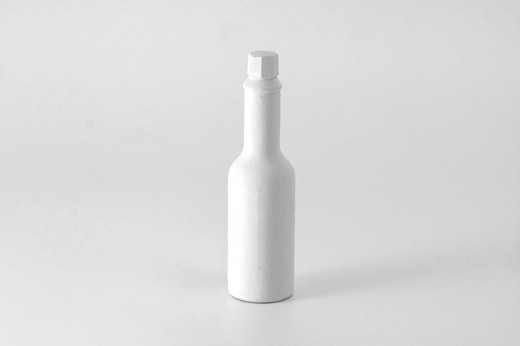
From a branding perspective, covering everything in white gives designers a chance to look at the form of objects and nothing else. Going through Miller’s first 15 entries, you’ll notice that some brands still jump out. The sharpie and the tape are both highly recognizable, while objects like the Zippo lighter and the M&M lose their identities.
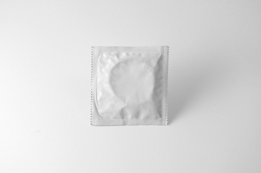 This is an excellent example of 3-dimensional branding, where even the shape of an object was considered. This type of design isn’t always possible due to physical limitations, but when it happens, it helps to reinforce a strong visual identity.
Overall, this is an intriguing experiment that’s worth a look. There’s something about its simplicity that keeps me coming back, especially as the collection grows.
Get the TNW newsletter
Get the most important tech news in your inbox each week.


