While I was studying photography in college, Flickr was the best place to store, organize and share photos. Almost everyone with a DSLR used it, poring over photosets and meticulously crafted albums.
As smartphones grew in popularity, casual and professional photographers alike adopted mobile-centric apps such as Instagram. Flickr was slow to recognize this trend, however, and its relevancy slowly faded as the volume of photos captured, edited and shared from mobile devices grew.
I’ve always wanted a superlative service that offers the best of both. A place where I can store and share all of my favorite photos, regardless of whether I’ve shot them on a smartphone, compact system camera or full-frame DSLR.
Instagram’s success stems from its simplicity, but the platform’s limited presence on the Web makes it difficult to share photos from a traditional camera. Other apps and services offer workarounds, but it’s less than ideal.
I had hoped Google+, with its excellent Auto-Backup service on mobile and extensive photo-storage options on the Web, would become the Flickr and Instagram hybrid I was looking for. In some respects Google has succeeded on that front, although its aspirations to be a broader social network arguably dilute the experience on mobile. For instance, it’s almost impossible to view just photos in a single feed at the moment, similar to Instagram.
Flickr, reborn
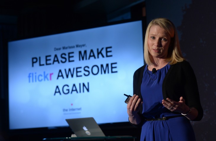
Under Yahoo chief executive Marissa Mayer’s stewardship, Flickr has been making a comeback. It has been a glacial rebirth, but inch-by-inch the renowned photo-storage service has been rethought and modernized.
Last week, the company released new versions of its Android and iOS apps. Both were given a radical redesign, combining the user experience of Instagram with the endless supply of beautiful photos already stored on the Web. Yahoo is one of the first companies to successfully bridge those two worlds and create a single, unified photo-sharing and storage service. A truly platform-agnostic service where everyone’s favorite smartphone and DSLR photos can coexist.
A fresh start
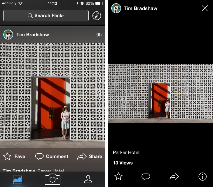
When you first open the Flickr app, you’ll be greeted with a vertical feed for recently uploaded photos. It looks almost identical to Instagram, with square-crop images and prominent icons for resharing, comment and favoriting. Everything is fast, clearly labeled and simple to use.
I suspect many will criticise Yahoo for “copying” Instagram, but personally I don’t have any complaints. The latter cracked the ideal UI for a mobile photo-sharing app, so why shouldn’t Yahoo follow its successful blueprint?
Moreover, in some ways Flickr actually improves upon the Instagram formula. Although the feed shows each photo as a square-crop, a single tap reveals the original image and pixel dimensions. The transition is seamless so you can quickly bounce between the two as you hurtle down the feed.
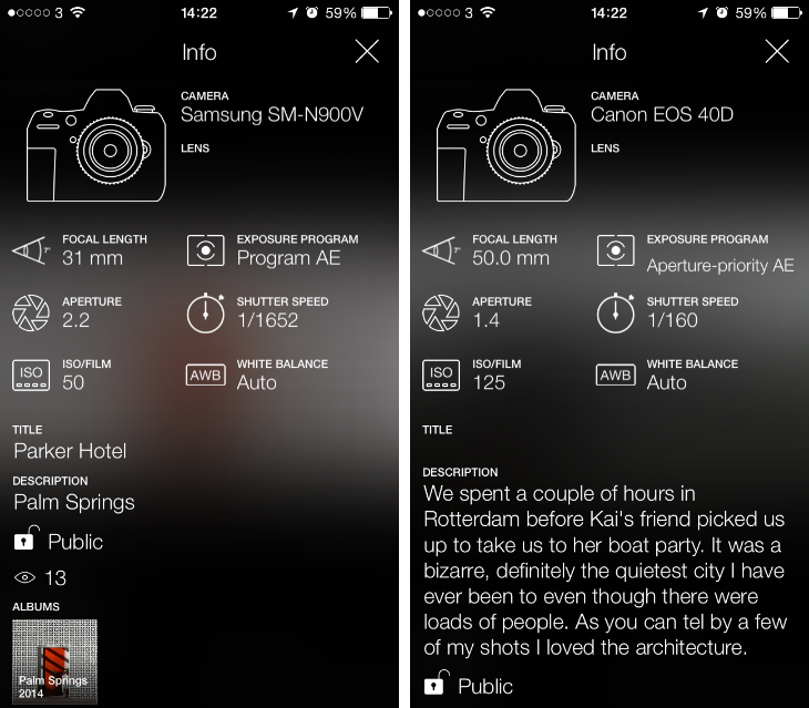
Flickr also offers a novel information pane for each photo. In the tapped view – where the original image dimensions are shown – it can be activated by selecting the “i” button in the bottom right-hand corner. Where possible, an illustration of the device is displayed alongside various exposure settings, including aperture, shutter speed, ISO and white balance.
It’s an area that Instagram has never delved into, due to the fairly restrictive manual controls available to iOS and Android devices. Inside Flickr, this feature is an important tool to help users differentiate between smartphone shots and those taken with a more serious, standalone camera. That’s not to say one group of photos is more important than the other, but when you pull them together into a single feed it’s just nice to know when curiosity grabs hold.
Unlike Instagram, Flickr supports albums too. The feature is a staple part of its web-based service, but it’s now tightly woven into the mobile experience as well. You can easily organize photos and group them together, or view other people’s collections from within their profile page. It brings a much-needed sense of order and hierarchy to people’s collections.
When multiple images are uploaded and shared, Flickr instantly groups them together in your feed. They appear as a collage, although you can swipe through to see each of them in turn. Photo essays are an established part of photography and Flickr is one of the first mobile apps to appreciate and cater for the format.
Change is afoot
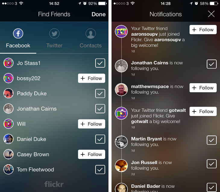
I’ve already witnessed a few promising knock-on effects from the redesigned mobile apps. A revamped set up process gives you the option to follow users that you already know through Facebook and Twitter. In the past, I’ve only used the service to follow inspirational photographers, but this approach encourages a more personal network of friends, family and colleagues.
Since they arrived on the App Store and Google Play, I’ve connected with a bevy of people on Flickr that, until now, I had no idea were even using the platform. Likewise, I’ve picked up new followers; some of which I know from Facebook and others, presumably, have found me through their Twitter following list. It’s a simple but effective way for Yahoo to rebuild and reinvigorate the community on Flickr. With a flood of new people and photos to interact with, users are more likely to open the app on a regular basis and post new photos of their own.
A long road ahead
Flickr isn’t in a position to dethrone Instagram any time soon. The Facebook-owned photo-sharing service is still incredibly popular and that’s part of its appeal – because so many people open the app on a daily basis, users know their photos will be seen and appreciated by the largest possible audience. Flickr just doesn’t hold that sort of clout just yet.
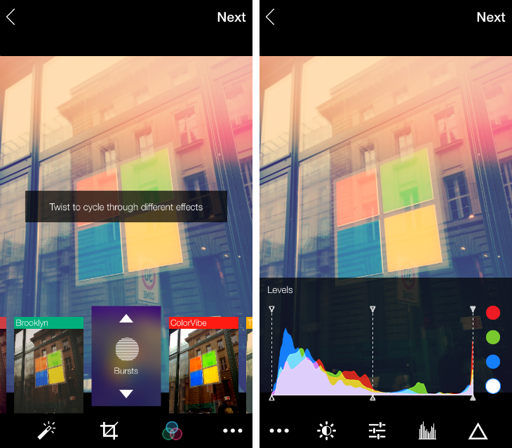
The editing tools could also be improved, especially in comparison to renowned photo-editing apps such as VSCO Cam and Snapseed. The real-time filters are a nice touch, but most of them are overblown and the modifiers – which you access by swiping vertically on each filter card –can be difficult to grasp.
Even so, Yahoo has created the foundations for a rich, unified photo-storage and sharing service. Flickr’s mobile apps are now completely different to its website, but that’s entirely the point. Both platforms are fundamentally different, but that doesn’t mean they can’t relate to the same users and content.
It’s been a long wait, but it seems Flickr is finally on the right track again.
Image Credit: EMMANUEL DUNAND/AFP/Getty Images (2)
Get the TNW newsletter
Get the most important tech news in your inbox each week.
