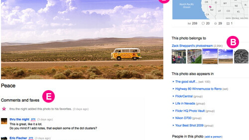
Flickr is rolling out a brand new design for its photo page, details of the new release are below. If you want to opt-in or out here’s how.

It’s Bigger!
- The photo: Default size from 500 to 640 pixels.
- Page width: Width of the photo page to take advantage of the new photo size, and you may see other pages getting the same treatment.
- New! Light box: A Click on the photo or on the magnifying glass icon. Screen dis and you can scroll through photos in the light box using the buttons or arrow keys.
New Navigation
- Navigation buttons: new navigation buttons at the top of every page. (Psst. Try the arrow keys, too.)
- Film strip: The film strip previews photos related to the currently viewed photo (e.g. photos in the same set, group, etc.)
Improved Page Layout
- New! Actions menu: To focus on the photo and unclutter the page, most actions have been moved into the actions menu.
- Who, what, when & where: To the right of the photo you can see who uploaded it, when & where it was taken, and with what camera, if that info is available.
- Favoriting is now more visible: Favorites are now alongside your comments to show off more of the activity that happens on each photo.
Controls and Settings
- Privacy options: More specific information about privacy, permissions, and content filters are right on the page in ‘Owner settings’.
- Licensing: Licenses set for each photo are more visible.
Get the TNW newsletter
Get the most important tech news in your inbox each week.
