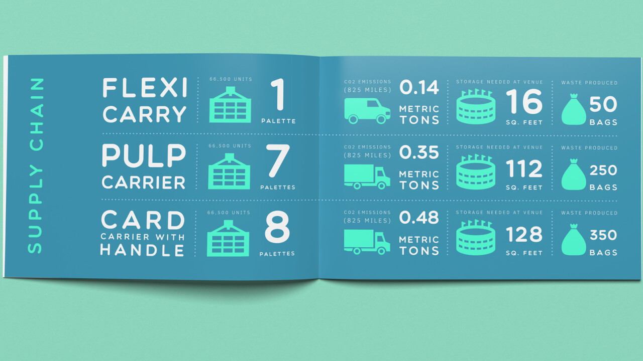
Over the past decade, brand communication shifted to digital spaces in much larger shares, with many companies existing exclusively online. This has pushed design trends towards a simpler, more organized form of design – flat design – that is easily implemented via code, suited for every screen type and size and altogether less overwhelming.
As the pendulum shifts and digital trends start reverting to influence the “analogue” world, design and branding are the first identity pieces to adopt a flat style.
One notable difference is education. Education is, at its core, the communication of knowledge. As such, any design trend that emphasizes simplicity in order to communicate more clearly and without additional visual barriers should be adopted by the education community and integrated into their products sooner rather than later.
How the education world is going flat
Flat design in education also started in a digital space. Online education has become increasingly prevalent as a means for existing institutions to offer courses taught by their professors to non-students (e.g. edX and Coursera), and for small companies to offer short classes on a variety of topics and skills (e.g. Udacity and Treehouse).
Development courses make for a particularly popular business model because of both the rise in demand and the ability to develop an interactive platform that tests skills as they are learned. But development courses have a lot of material that needs to be communicated, and online education platforms in general have a lot of features – libraries of available courses, discussion forums, supporting materials for courses, videos and interactive elements that teach students, etc.
Flat design is integral to keeping all these features organized and accessible in a way that does not overwhelm the user, or distract from the material being taught.
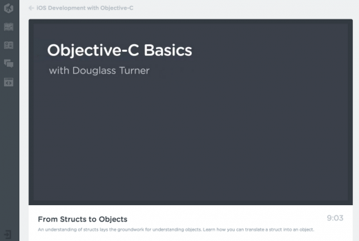
Take the above example from Treehouse, just one of the many online education services that has successfully adopted flat design. The layout is incredibly simple and neatly organized, with a focus on the lesson content (in the case the video).
Other platform features are accessible via the navigation bar on the left, but they remain a grey hue until hovered over which allows them to be semi-hidden and not distracting. It’s obvious to the student where they should focus their attention, and where they can go for supporting materials and information if necessary.
Transforming into the physical world
What’s interesting about this trend is that it has already moved beyond digital education and into how people are thinking about textbooks, the stalwart tool of traditional education.
Over the years, textbooks have adopted print trends – but they still largely focus on text first, small images and important facts and tidbits in the margins. This layout works well for students who learn in various styles since they can pick out usable information from the materials presented.
Computer science, however, doesn’t necessarily do well with this format. Coding and development relies heavily on syntax and the structure of lines of code, and this, in addition to the introduction of concepts that are foreign to many students, make for a difficult two-dimensional learning experience.
This also doesn’t take into account the lack of interactivity in a textbook, which is a particularly useful feature of online courses. The challenges are big, but there are a few examples of textbooks that are rising to the occasion.
One example I’ve enjoyed in particular is JavaScript and JQuery, a followup to the equally well designed HTML & CSS.
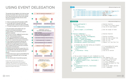
One of the biggest challenges when creating a development textbook is being able to recreate the dev environment in a way that’s not overwhelming and can still impart useful knowledge. JavaScript and JQuery does a great job of pulling out code snippets and explaining what they mean and why they are organized the way they are.
In the example above, flowcharts, line numbers, and comments are used in various colors to clearly differentiate and explain the concept being presented. One of the most important principles of flat design – visually pulling out important information and letting less important information take a back seat – is clearly exemplified here in a way that can be adopted beyond development textbooks and into many other areas of education.
Educating your clients
Beyond textbooks and lesson-based education, flat design principles can be used to elevate client education through marketing materials. As I stated at the beginning, branding and marketing communication has been one of the first channels to adopt flat design.
The reasons are numerous; brands want to appear relevant, marketing communication is constantly being created and published and messages need to be easily translatable from print to digital so that all communication presents a solid front.
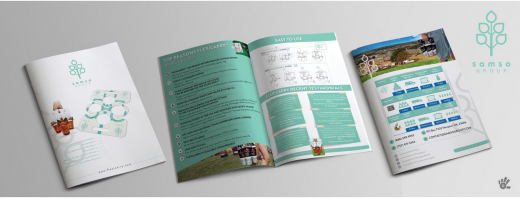
Successful client communication drives client understanding and action, and flat design emphasizes both of these things. For example, Samso Group, an ethical packaging company, has a lot of information it needed to relay to clients about its product.
To do this, it created a print brochure that outlined the mission, product and journey from creation to consumer, how to use the product and, most importantly, provided call to actions to get in touch and order.
Flat design principles provided a framework with which these different objectives could be easily presented to consumers, and still yield results. The call-to-actions are highlighted, and product information is cleanly and simply presented in a structured and easily digestible format.
Fancy fonts, skeuomorphic icons, and overly complicated elements are forsaken in an effort to let the content and information be at the forefront. Clients come away educated, interested and aware of next steps.
Flat design is increasingly pervasive in both digital and print design, but nowhere more than education has it been so successful at helping elevate content in a natural way that better accomplishes the original goal.
Education is a natural space for flat design, because the underlying design principles and the objectives are inherently aligned. Whether it’s in digital education, traditional education or client education, materials should be created with these principles in mind so as to increase user understanding, ease the learning process, and provide a better user experience to everyone involved.
Read next: When to trust your instincts: Choosing the logo you love vs. the logo you’re suggested
Get the TNW newsletter
Get the most important tech news in your inbox each week.


