You’d be forgiven for not having used reader/aggregator Feedly in a while, the app has repeatedly dipped and risen on the popularity scale since its launch in mid 2008. It was around long before Flipboard and other “readers” but has seemingly been left to catch up.
Today it aims to change that by launching a dramatically improved mobile offering. The company has completely revamped its tablet and mobile apps as it aims to carve itself a niche between a social magazine like Flipboard and RSS readers like Google Reader.
What’s New?
For all intent and purposes, everything about Feedly’s mobile product, aside from its deep integration with Google Reader, is new. Feedly’s desktop app, which relies on a browser extension, has not been updated.
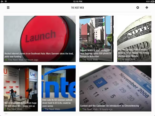
The most instantly obvious change is Feedly’s look and feel. Whilst always being clean and easy to use, Feedly’s never had that “wow” factor. That has now changed. The app equals, and arguably surpasses, the likes of Flipboard and Pulse to provide a UI & UX that’s just as elegant and easy to use.
The inspiration for the new Feedly is the company’s aim to “combine the visual appeal and curation of social magazines with the control and depth of traditional readers. The result is a faster, more appealing, yet predictable way to browse your web. Anytime. Anywhere.”
Back to discuss that goal shortly; but first, the specifics of what’s new.
In summary this is a better, faster, slicker Feedly. Which is still essentially Google Reader re-engineered but with a huge lick of paint and a dose of social.
Google Reader Re-engineered:
Google Reader has provided the back-end to Feedly from day one, and that hasn’t changed. So you still need a Google account to use Feedly, something I’m somewhat disappointed by but will address later.
For those using Feedly for the first time, you won’t realise that Feedly is built on top of Google Reader (unless you visit Google Reader itself) but the moment you try to add a source, a Google account will still be necessary.
Adding sources is a piece of cake and Feedly comes kitted with a directory of recommended ones. These are, for the most part, only websites as opposed to Twitter profiles, Google+ profiles, Facebook pages, etc.

Huge Lick of Paint
This I’m certainly not disappointed by. As I’ve already mentioned, Feedly’s new design is a work of art and elegantly put together. The app is beautiful, easy to use and gives content the attention it deserves. Icon selections, white spaces and the new notable touches mentioned below bring a rich usable user experience even Apple would be proud of.
Healthy Dose of Social
The biggest dose of social comes in the form of a brand new “today” section that “bubbles up” the freshest and most talked about content from the sites you’ve subscribed to. From my limited experience with the feature, I was rather impressed. Of course, I’m not exactly sure what content I’m missing, but ignorance is bliss I suppose.
Feedly also highlights each piece of content’s engagement counts – powered by Facebook likes and Google +1s. I’m not sure I find the value here but it’s there if you do.
Feedly has also added a number of other notable features including:
- Integration with Pocket and Instapaper
- Day and Night Theme
- Better integration with Chrome Mobile
- Customize fonts (Soho, HelveticaNeue, Sol, Roboto)
- Swipe down to mark as read
- Press and hold to save for later
- Double tap to close articles
- Swipe from edge to open home panel
- Auto-mark as read on swipe
- Automatic transition from one section to the next
- Search for feeds by topic using #hashtags
- Predictive feed search results
- Remove clutter
- Press and hold to make the home panel editable
- Automatic feedback category suggestions
- Adaptive image resizing and caching
And now for the video tour of the new Feedly:
Feedly’s Vision
Essentially, Feedly feels that social magazines like Flipboard lack organisation and provide a rather “shallow experience.” Feedly wants to offer a more “structured, efficient read” where finding your favorite sources of content is a breeze and reading the content is equally as pleasurable.
So what’s wrong with Google Reader itself or apps like Reeder that are also build on top of Google Reader’s API? Feedly believes these apps don’t provide enough “social relevance” and “serendipity” and don’t provide the “visually appealing” user experience readers deserve. Fair point.
Our Take
It’s a tough one.
I do adore the new Feedly mobile app – both tablet and phone – and if I were still an active Google Reader user or if I subscribed to websites only (i.e. not Twitter accounts, Facebook pages, Instagram feeds etc.) Feedly would have a place on my home screen. But as rich, fast and elegantly-designed as it is, Feedly’s heart feels outdated…
…What Feedly does do is give me the motivation to try and get my Google Reader account organised. And that’s not what I want to be doing in 2012.
Let’s face it, Feedly’s immediate competitor is Flipboard and with a plethora of ways to subscribe to content in Flipboard (including its own Google Reader integration), I’d be hard pressed to find reasons to divert someone away from Flipboard to Feedly – particularly in the age of Twitter, Facebook and G+. If any, the only reason I can think of is Feedly’s far simpler integration with Google Reader.
But that’s Feedly’s other problem: its deep integration with Google Reader. Feedly’s stuck between a rock and a hard place here. It needs to move beyond Google Reader, it needs its own catalog of content and it definitely needs to immerse itself deeper into social the same way Flipboard has. Today’s social update is a start but could have been so much more. That said, moving in social’s direction will ultimately lead to even more comparisons with Flipboard and may mean it losing its devoted current user base who perhaps rely on Feedly for its simplicity and Google Reader integration.
As I said, a rock and a hard place. And it’s doubly difficult because I genuinely want to see Feedly succeed.
If it were my company — and it’s not so it’s very easy to say this — I’d go all in and detach myself from Google Reader completely, build a web app that doesn’t require a browser extension, collate my own catalog of popular blogs and news sources, integrate a variety of popular social media sources so I could subscribe to individuals and brands as well as websites and attempt to provide our own take on what Flipboard has smartly executed.
If there’s one area Flipboard fails in, its organisation and ability to find the source you’re looking for. For non-geeks it can be very confusing. If Feedly can solve the conundrum of providing a smartly-categorised listing of millions of news sources, websites, RSS feeds and social media profiles, it might still be able to win a serious base of users.
There’s absolutely no denying Feedly is a beautifully put together product — its mobile apps are some of the most elegant I’ve seen. But for domination, it needs to move beyond Google Reader and think mainstream. Unfortunately Google Reader has never cracked the mainstream nut and nor did RSS.
Download
Get the TNW newsletter
Get the most important tech news in your inbox each week.


