WantList is a new fashion discovery app on iOS from London-based shopping site Styloko.
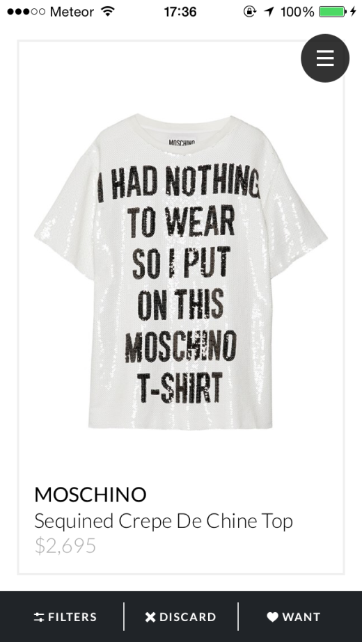
The app provides a Tinder-like approach to shopping. You swipe right if you like what you see, and left if you don’t.
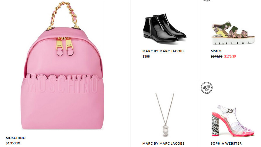
You add things that you like to your WantList and sort into Collections. Then, you can price compare different versions of the same product, which WantList calls “Luxe” and “Less.”
I’m not a fan of Tinder, so my swiping experience is limited, but the gesture certainly lends itself well to the shopping experience.
First impressions
The sign-up process is straightforward. You only need to give three pieces of data – name, password and email – then you can start creating a personalized profile.
The interface is simple and clean. Your main view is the Discover page, which gives you a full page view of each product to swipe on. This is a nice change from a lot of mobile shopping apps with tiny thumbnail images crammed into one page.
In use
One of my favorite things about using WantList has been the fact that it caters to the way I browse. I’m forever switching between devices, I use my iPhone in the mornings, my laptop all day and then my iPad if I’m relaxing on the sofa in the evening.
The app is compatible across devices so it let me pick things up where I left off. Given the way we consistently browse in short bursts throughout the day, this feature is sure to be appreciated.
WantList records data on what items you click on, how long you look at them for and what you’ve been saving, which it then uses to build an in depth style profile and more accurate suggestions in the Discover section.
After using the app a few times, the suggestions were definitely accurate… and tempting.
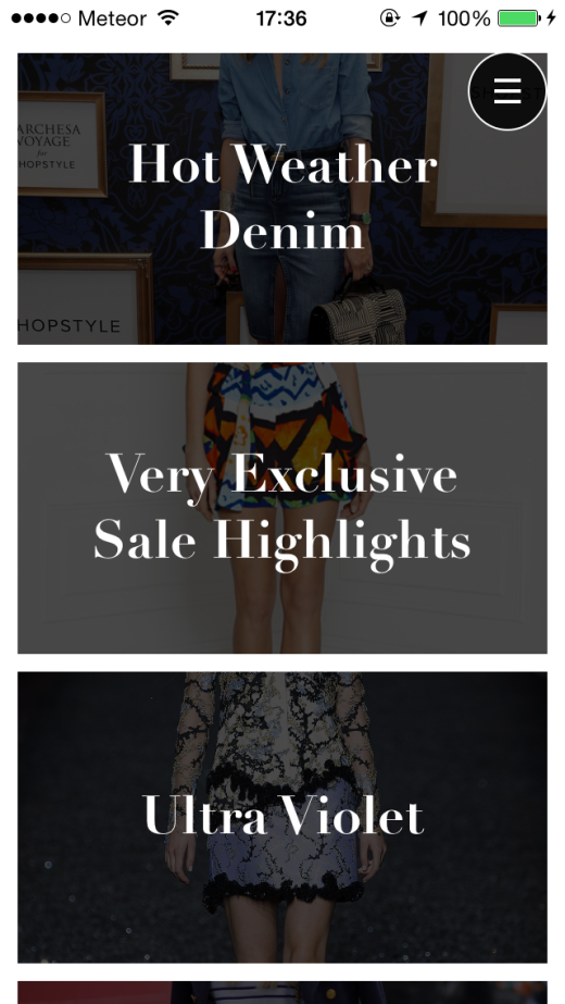
From the main Discover page, you can use the menu access Search, your WantList, Inspiration (content on trends and weekly updates), Most Wanted (list of the overall most coveted items on the app), Who to Follow section and settings.
The layout of the Inspiration page is aesthetically pleasing. In an endless-scrolling list, each article has its own rectangular box displaying an opaque image on a white background with white text.
Each of the articles are quick and easy to read, and are displayed alongside related Instagram feeds or shoppable content.
The number of brands available on the app from high-end to high-street is impressive. A lot of them are UK-based given the app’s birthplace, but it is expanding rapidly so there’s still no shortage of choice for US users.
A nice touch is the ability to follow other users. You can see what items they’ve favorited and add them to your own WantList if you’re interested.
This feature would be particularly useful for fashion bloggers with devoted followings. It’s easy to show the products you’ve your eye on and if it’s an expensive designer piece, you can browse the less expensive alternatives underneath.
Admittedly, it’s not as integrated as Instagram shopping tool LIKEtoKNOW.it, but it’s another platform to build a following on, which is never a bad thing in the blogging world.
Wrap
In comparison to other popular shopping sites and apps, WantList’s interface is one of the most appealing. Its intuitive Discover feature makes it stand out from the others in terms of accurate suggestions, and its vast range of high end to high street gives it a broad appeal.
Its only limiting feature is that it only stocks women’s at the moment, but that could change in the future.
Shopping apps are always going to be similar but WantList won me over with its ease of use, minimalistic and tasteful design and wide selection, making it a serious contender.
➤ WantList
Read next: Retype for iOS fashions your photo message with stylish 3D shadow effects
Get the TNW newsletter
Get the most important tech news in your inbox each week.
