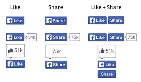
Facebook unveiled new, redesigned Like and Share buttons for its social network today, both of which use a bright, blue background and Helvetica typeface.
TNW noticed the new Like button last month, but it appears that both are now official and will be rolling out to everyone over the coming weeks. Facebook says that if you’re using the old Like button on your blog or website, it will be upgraded automatically as part of the roll-out.
This is what they look like:
These tiny buttons might not seem like much, but it’s worth noting that the current Like and Share buttons are shown across over 7.5 million websites and seen more than 22 billion times each day.
The design of these tiny UI elements are therefore critical for driving engagement with Facebook pages and encouraging users to share interesting content that they find across the Web. The famous mark hasn’t been dropped entirely, but it suggests that the word ‘Like’ is now ingrained enough in Internet culture to stand on its own.
➤ Introducing new Like and Share buttons
Featured image credit: ROBYN BECK/AFP/Getty Images
Get the TNW newsletter
Get the most important tech news in your inbox each week.


