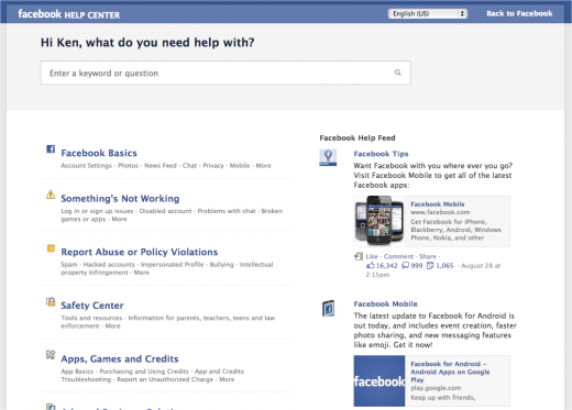
Facebook has just undergone a drastic redesign of one of the most important parts of its site that you probably never have been to. Its Help Center has just been redone to make it easier to find the information you need.
Since its launch in 2007, the Help Center was supposed to curate answers to thousands of questions users had. After making tweaks a couple of years later, the social network is updating it again in a way it claims will make it “even easier for you to find the information you need” so that you’ll be able to get back to using the service.
Improving the user experience in finding answers is key to the Help Center, but this has been a major issue when searching for answers. Can you imagine how annoying it can be when you can’t find answers in the Help Center that’s supposed to have them?
Prior to this, the social network simply tried to help by using in-line answers on your current page so you wouldn’t have to jump to the Help Center — a clear sign even they knew that going there was an endless maze of frustration. Seemed Facebook decided to rethink the entire user experience.

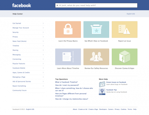
The Help Center homepage now features an area that focuses on six major topics, including content relating to things like “See What’s New on Facebook”, which is a general overview of new features and products on the site, and “Learn the Privacy Basics”, which offers details on sharing and controlling your content.
The remaining topics are listed based on popular searches, so they won’t necessarily be showing 100% of the time — they could rotate based on what people are asking at the time, but they’re also tailored to your account. It’s also organized so that any information you need is available within a few clicks.
What you see below is a preview of the new version:

Other updates include a highlighted list of popular questions asked by the community as well as top Facebook pages that you can subscribe to in order to get notified of any updates, feature announcements, or tips. The navigation in the Help Center has also been updated — it’s now on the left-hand side, which Facebook tells me will help make it easier to browse for what you’re looking for.
Naturally the Help Center isn’t finalized. Expect to see some improvements on this latest iteration over the next few months. It’s important to note that this new design only affects the web version — the mobile Help Center was slightly updated a few months ago and may experience a redesign later on, but right now, this new redesign is for the main site.
Facebook is also announcing that they’re also rolling out their Support Dashboard to 100% of all users around the world. Since its beta launch in April, only a few users had the ability to track the reports made surrounding photos and profiles (e.g. spam photos/profiles, etc.).
The company tells me that it received great response from test users regarding the dashboard and so it decided to implement it for the entire population. Starting today, anyone who flags content for Facebook to review can log into their dashboard to check on the status of that review and what action was taken, if any.
According to Facebook’s Chief Privacy Officer Erin Egan, the streamlined Help Center design and full-implementation of the Support Dashboard will help to “provide the people who use the service with access to the information they need from Facebook as quickly and as efficiently as possible.”
Do these new updates help you better understand and use Facebook? Please let us know in the comments below.
Photo Credit: FAQSocial.org
Get the TNW newsletter
Get the most important tech news in your inbox each week.


