If you’ve been sharing links or done ads on Facebook a year ago, you would have noticed that the images were the size of thumbnail and really weren’t that helpful in leading to conversions. Today, the social networking company has rolled out larger images for link shares on desktop and mobile ads to make stories “look even more beautiful”.
As the adage goes, a picture is worth a thousand words and enticing users through larger images will surely help to better convert readers from simply understanding what’s going on to actually reading it.
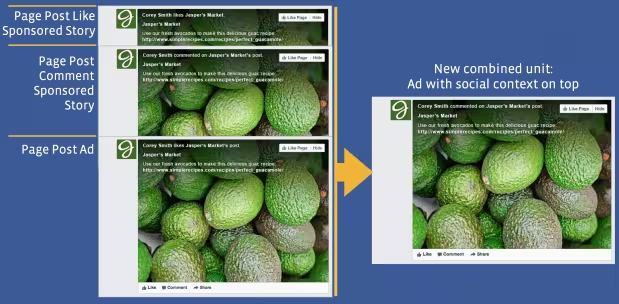
This is actually a continuation of a program Facebook announced in June whereby it was asked to simplify its ad product offering. In the program’s infancy, marketers were able to have three different ad placements, including Page Post Like Sponsored Story, Page Post Comment Sponsored Story, and Page Post Ad. The company did away with all of those and consolidated it all into a new ad unit where social context would be overlaid on top of the image.
The new format affects Page post link ads, Page like ads, offer ads, and event ads. In addition, organic link shares will also be affected, meaning that if you post a URL to Facebook, you should have the ability to have a full-width image to help entice more click-throughs.
Facebook suggests that the minimum image size be 560×292 pixels, but in order for it to work for everyone, it should be 1200×627 pixels. When posted, the entire image and text box will become a giant link that will point people to the respective website.
Photo credit: Justin Sullivan/Getty Images
Hat-tip Scott Aryes
Get the TNW newsletter
Get the most important tech news in your inbox each week.
![Page post link[2][2]](https://media.thenextweb.com/2013/09/Page-post-link22.avif)
![Page like[2][3] (1)](https://media.thenextweb.com/2013/09/Page-like23-1.avif)
