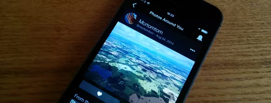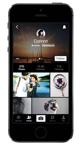
EyeEm, the photo-sharing startup aimed at photographers rather than casual snappers, has today rolled out a completely revamped iOS app.
The main goal here is to bring the iOS app into parity with the recently-launched Android redesign. As such, the photos are bigger and there’s been careful consideration given to details like fonts sizes, ensuring the images are the main focus. The ‘hamburger menu’ (which many developers have found to be a false economy) is gone, replaced by smarter use of tabs.
A first in the iOS app is ‘EyeZoom’, an interesting new approach to zooming a photo. Rather than just use the standard iOS pinch-to-zoom, tapping anywhere on a photo zooms it straight into that area of the image, very much like tap-to-zoom works for text more generally in iOS. You can then scroll around a high-resolution version of the photo that was loaded in the background, rather than simply expanding a lower-res version. The Android app will get this feature soon.
As with the recent Android update, there’s a greater emphasis on photo ‘missions’ here. Indeed, to mark the launch of the reworked app, Foursquare and the Huffington Post have published sponsored missions, following in the footsteps of the likes of Uber and Amnesty International.
Speaking to The Next Web today, EyeEm’s Chief Product Officer, Markus Spiering and Head of Mobile, Matias Castello explained that the Android redesign had boosted engagement levels within the app – especially when it comes to missions, where the number of people browsing has doubled, and a third of visitors now take part in a mission.
The updated version of EyeEm for iOS is out now.
➤ EyeEm [iOS / Android]
Get the TNW newsletter
Get the most important tech news in your inbox each week.


