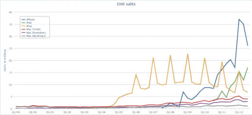
Apple may have ‘missed’ industry estimates in its third fiscal quarter (surpassing its own expectations) but the company still pulled in revenues of $35 billion, as its net profit reached $8.8 billion on the back of 26 million iPhone and 17 million iPad sales.
If you, like us, are always looking to see how that compared to previous quarterly earnings, or want to see how Apple’s cash flow compares to those of its major technology rivals, a new tool called Bare Figures has you covered.
Created by Francesco Schwarz, Bare Figures collates all of Apple’s financial data from over the past decade (and more), allowing you to switch between different datasets to see unit sales, revenues, profits, and other statistics.
Select the specific piece of data you wish to display, add whether you want to see quarterly breakdowns or year-on-year changes, and even chart it against earnings from Microsoft, Google, Dell, Amazon and HP, to see how well Apple competes in its space.
Once you’ve selected the data, you can export the chart in the data format you need and embed it in a presentation or your article.
Bare Figures serves as a great tool to Apple’s sales figures and product performance at-a-glance, not just as a way to plot performance graphs.
Want to know how many Macs Apple sold in 2000? This will tell you in seconds.
[Image Credit: Roger Schultz]
Get the TNW newsletter
Get the most important tech news in your inbox each week.


