This post originally appeared on the Buffer blog.
Where do email subscribers fall on your list of priorities?
We’ve recently pushed email toward the top of our most valued sources, and it doesn’t seem like we’re alone in that. While social media might be the hot place to push your marketing efforts, there are many who choose to rely instead on building a valuable email list. And they couldn’t be happier.
Here’s Michael Hyatt, speaking about his email list of 115,000:
I have literally built a multi-million dollar business on the strength of my email list. Ninety percent of my income comes from it. Even today, my email list is still my number one business priority—and asset.
Douglas Karr, writing on the Marketing Tech Blog, about his list of over 100,000:
Without a doubt, our email list is the best investment we’ve ever made.
Michael Stelzner, Social Media Examiner:
Email is the most important channel for you to cultivate.
We recently passed the 20,000 mark for subscribers on the Buffer blog, and it’s safe to say we have a lot to learn to grow a successful list. We’re inspired to learn from some of the smart and well regarded sites who have made email an emphasis. For example:
- The Help Scout blog has over 60,000 subscribers.
- James Clear has more than 70,000.
- Michael Hyatt has 115,000.
- Social Media Examiner has 250,000.
Combined, that’s nearly 500,000 email subscribers. How do they do it? I took a close look at each of these heavyweights of email (plus several other amazing sites) to see what methods they use to gain new subscribers. Here’s what I learned.
The simple formula for growing a massive email list
In analyzing the websites and techniques of some of these awesome email list builders, a certain formula started to emerge. If I could boil down the process of building a massive email list to just the most basic parts, I think it would look like this:
Amazing blog content + crystal clear calls-to-action = massive email list
Can it really be that simple? I think so.
Basically, everything begins with content. People will find your site because of your amazing content. They will keep coming back for amazing content. Your amazing content will be the foundation of what you email to them, which will be the reason they stay subscribed (or not.) It all starts with amazing content.
Once you have the amazing content, the next step is to ask for emails. People who adore your content will be primed to receive that content as often as you can create it, delivered straight to their inbox. It’s up to you to make sure they find your call-to-action (or, in this case, a call-to-subscribe). Make it obvious. Make it crystal clear.
With this in mind …
6 key strategies on how to grow your subscription list
Examining these top blogs (plus some bonus research, too) shows that there are many different ways to go about growing your list and creating those crystal clear calls-to-action that drive subscribers. Here are a few of my favorite ideas.
1. Treat your blog home page like an email capture form
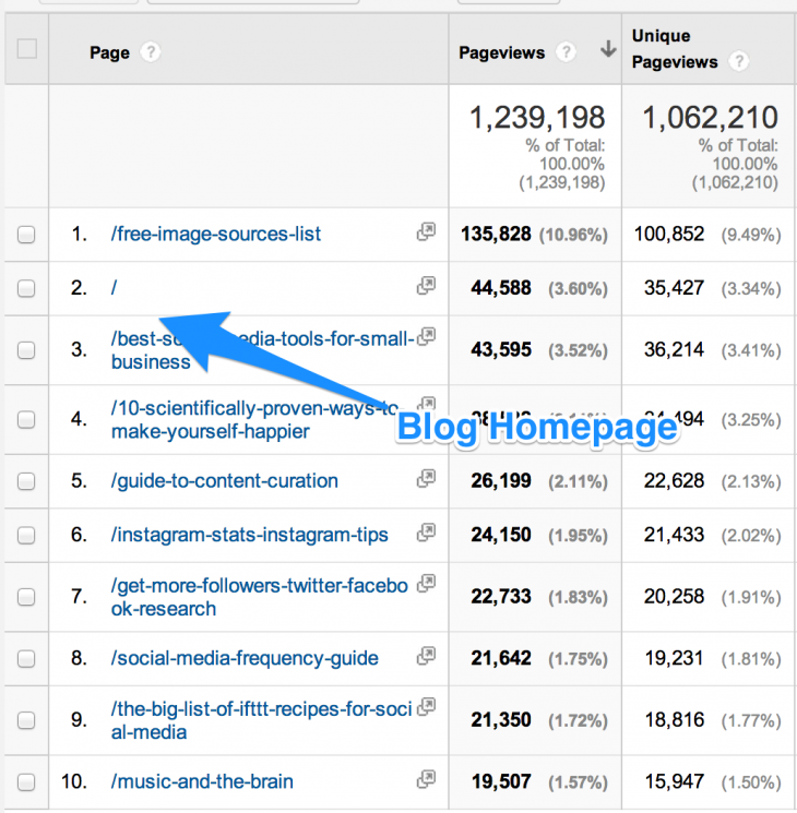
Every month when we pull our list of the top ten best-performing blog posts on the Buffer blog, we end up grabbing 11 because always, without fail, one of the top ten results is the root domain for our blog—the home page at blog.bufferapp.com.
Last month the root domain was our third-most-popular page on the blog, and it is consistently among the top five month-after-month. Here’s our report from Google Analytics, with the root domain represented by a backslash (/). Does this report look familiar to you?
That’s 35,000 visits per month that land on the same page. Seems like an ideal opportunity for a clear call-to-action.
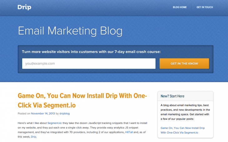
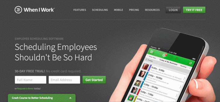
For those who focus on building and growing an email subscriber list, their home pages reflect how vital email is to their content strategy. Big, bold signup forms dominate the home pages of many email-savvy blogs.
2. Include a can’t-miss call-to-action: Popups, slideups, menus, and popovers
It’s rare to read an article on growing an email list without coming across a recommendation for installing a popup. The reason: It’s sound advice, backed by good numbers.
- How I Increased Email Subscribers 532% in One Month
- A Popup Quadrupled Our Daily Subscribers
- How Social Media Examiner Grew Its List 234% (Spoiler: It had to do with popups)
These are all cases of sites installing a popup (or variation of a popup), followed by immediate boosts to email signups. Why the big boost? Well, popups are a can’t-miss call-to-action. Literally. It doesn’t get more can’t-miss than a window appearing over the content you’re trying to read.
Of course, this method of email capture can be hotly debated for just this reason. I really enjoy the way that Hunter Boyle of Aweber puts it:
Every time I present, I ask who hates popovers, and 2/3 of the crowd nods and groans. The other 1/3? They’re usually okay with popovers because they’re getting good results from them!
Fortunately, there are options for popups, as the strategy covers a wide variety of different implementations. I’m throwing all these under the umbrella of “popup.” Let me know in the comments if I’ve missed any favorites you’ve used or seen.
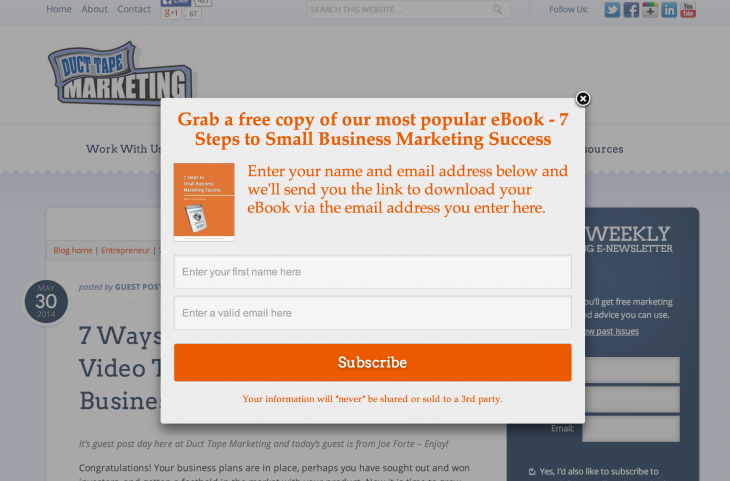
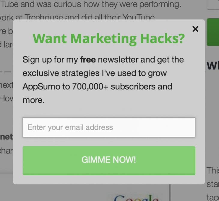
There’s the ubiquitous “popover” style, which displays a popup over a slightly grayed-out background. Here’s an example from Duct Tape Marketing. (A popular plugin for this popover form is SumoMe.)
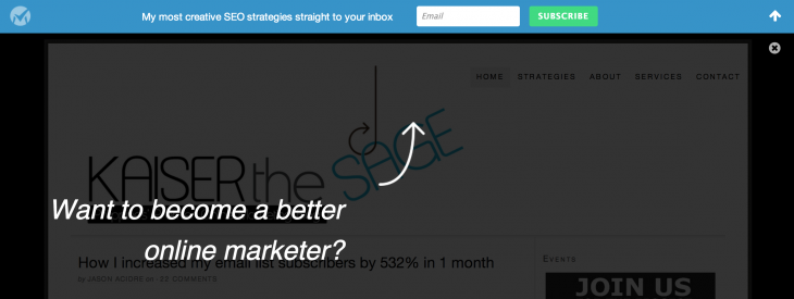
There’s the top-bar method that draws attention to the email signup form pinned to the top of every page. Here’s an example from Kaiser the Sage, using the popup plugin from Many Contacts.
And there’s the email-on-scroll, which pops up once a user scrolls down a certain distance on a page. This is a demo of how a “slideup” popup looks.
3. Multiple CTAs: Give readers infinity+1 opportunities to subscribe
Seems like those who build lists best make email an unmistakeable part of their blog design and calls-to-action. You cannot escape the calls to signup.
There might be a signup in a popover, a signup at the top of a blog post, another one at the bottom. Basically, the design assumes that people will view the site differently and that in order to maximize the chances that a potential subscriber sees a signup form you’d best put sign up forms everywhere.
We’ve got several spots for CTAs here on the Buffer blog. They’re currently set to send visitors to sign up for Buffer, and we may adjust them to focus on email in the near future. If you scroll down just right on the Buffer blog, you can see all of our CTAs at once.
Think you’re going overboard with the email signup requests? Listen to your audience, who will likely let you know when you’ve crossed the line. You can also adhere to the old colloquialism, “You’ll know it when you see it.” Go with your gut.
Here are some top places to try placing an email signup form (or two or three) on your blog:
- Top menu bar
- Header of your site
- In your byline
- Sidebar
- Inside the blog content
- Footer of the content
- Popup/popover
- Your bio
4. Got something valuable? Give it away
Your potential subscribers—even if they differ across demographics and industries and target audience—are still human. They’ll like free stuff.
Attaching something valuable to your email signup form is a surefire way to pique interest. Basically, give something away for free, for the price of an email address (which we all know is worth way more than free to the site that gets it). Here are a few suggestions.
- Ebook
- Cheat sheet
- Email series
- Video
- Private blog content
- Early access to new features
HubSpot is one of the industry leaders in giveaways (so it’s probably no surprise they’re industry leaders, period). In an article about email list growth, Ginny Soskey shared HubSpot’s two-part view of giving something of value to potential subscribers:
We suggest starting with two types of free offers. One top-of-the-funnel, educational piece of content like an ebook, and one middle-of-the-funnel offer to let someone speak with your sales team to get a demo or a quote or a free consultation or whatever works for your specific business. By having these two types of offers on your website, you can capture potential leads and convert customers that are in different stages of the buying process.
5. Keep the subscription link handy
I so often forget that people can sign up to an email list in places other than an email capture form on my site. Depending on your email software, there is likely a landing page devoted to acquiring email signups. You can get the link and share it in a huge number of different places like email signatures, social media messages, and guest blog bios.
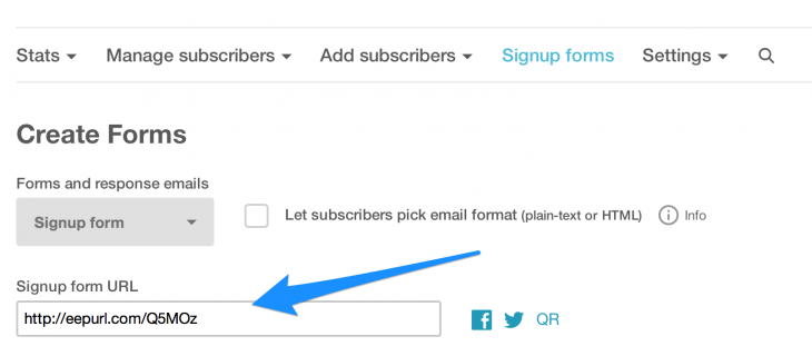
Here’s how to grab it from MailChimp:
Go to Lists, then choose the list you want, click on Signup Forms, click on General Forms, and the signup link should be right there for you.
Once you have the link, keep it handy. You never know when you might have a chance to use it.
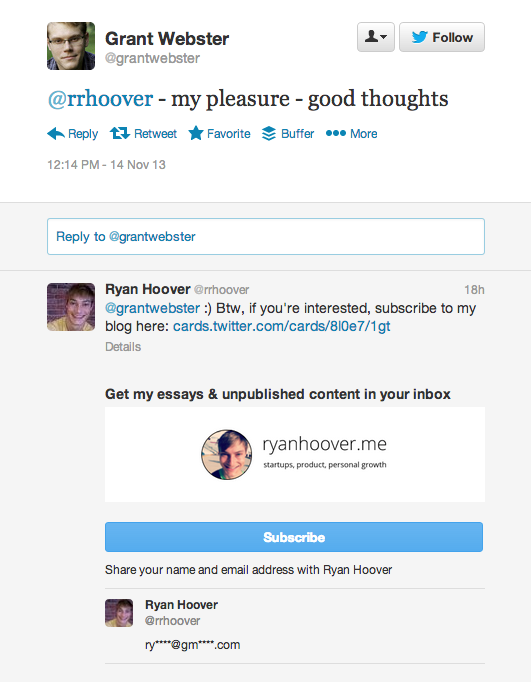
Ryan Hoover has a neat trick for gaining more email signups with this link. He replies to each and every mention on Twitter, often starting a conversation with folks who have shared his content. As part of this conversation, he’ll drop in an offer to sign up for his email list, sending over the direct link to do so.
The results: 60 to 80 percent of people convert.
6. Test your messages: Start with social proof
Would you be more apt to join an email list if you knew 8,000 other people were already signed up?
The concept of social proof says yes, which is why you see many sites advertise the size of their email list on their signup form.
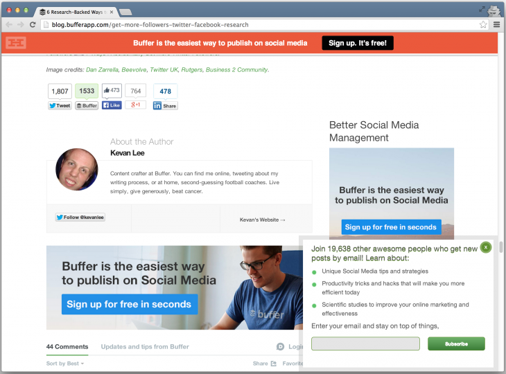
We do the same at the Buffer blog with an email popup calling attention to the number of subscribers we’ve gained.
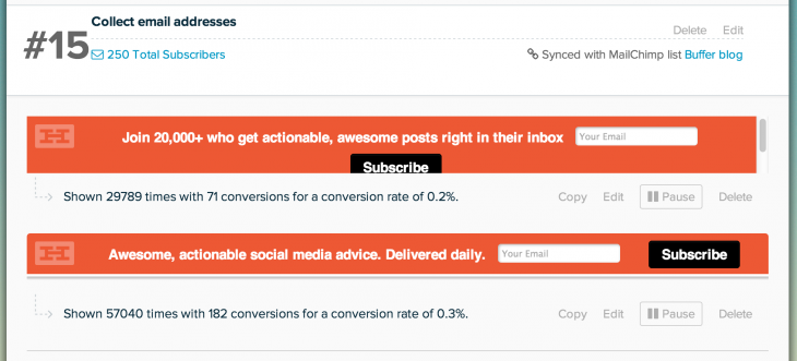
Like anything, though, this tactic bears testing. In addition to our popover signup form, we’ve also been experimenting with a signup form in our HelloBar (the orange bar at the top of the site). Here are the two different versions, along with the stats so far:
The version without social proof has been outperforming the social proof version. The takeaway here: Test everything. Your headings, buttons, and CTAs could all be opportunities to improve.
Next: Let’s take a look at how the best sites gain new subscribers
Case studies: How the best sites gain signups
Now that you’ve seen the many different ways to grow an email list, I’d love to show you how some of the top sites implement these ideas. Here is what I found when browsing around some of my favorite sources of email inspiration.
James Clear – 70,000 subscribers
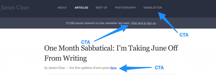
The above screengrab is from an article on James Clear’s site. Before you get to any words in the article itself, you’ve been hit with three CTAs for his newsletter. Clearly, email is a priority for him!
- His homepage is an about section with a call to action to subscribe.
- His main blog index includes a call to action at the top.
- There is a call to action at the end of the article and one at the end of the comments (and another in the footer, to boot!).
One thing you won’t notice when you’re browsing on his site: social sharing buttons. He removes choice from the equation. To interact with his posts, the easiest decision is going to be email.
Help Scout – 60,000 subscribers
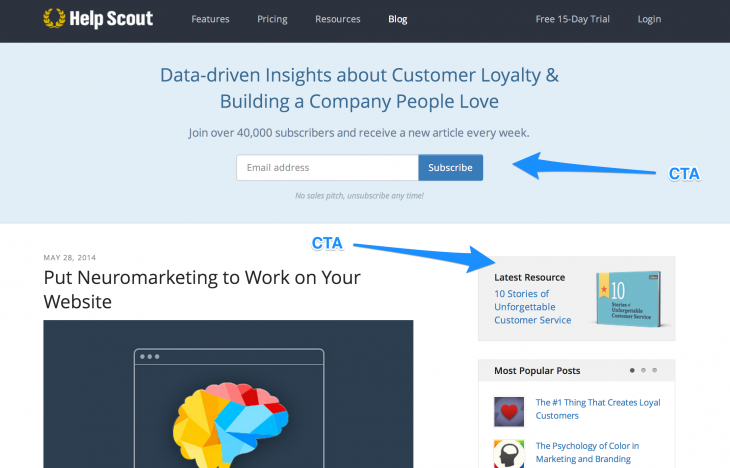
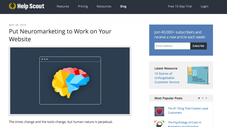
Help Scout is one of the best at putting focus on an email signup at the home page of their blog. The image above is from the blog landing page. When you navigate deeper into the blog, the subscribe form moves to the sidebar.
Also on the main page (and subsequent pages) is an ebook giveaway. The ebook is web-based so you can view the full thing in one click. At the end of the ebook is a call to action to sign up for email updates.
Andrew Chen
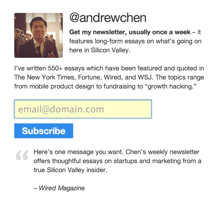
Andrew Chen was one of leaders in implementing the homepage-as-signup-form. His main page has an additional little trick. When you first land on there, the email form is highlighted automatically, and you can start typing your email address without needing to even click.
You may also notice that Chen takes a different approach to social proof. He does not advertise the number of subscribers to his list but rather mentions recommendations from Wired magazine and 500 Startups.
Michael Hyatt – 115,000 subscribers
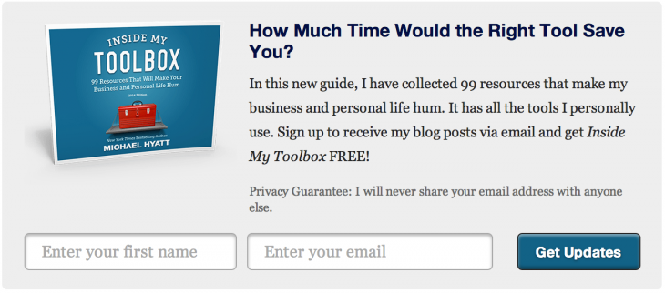
One of Michael Hyatt‘s secrets to building an incredible list is with giveaways—and probably a good amount of A/B testing. His calls-to-action for downloading a free ebook are really excellent. Here’s the one that appears at the bottom of his posts.
The text here is entirely focused on benefits to the reader. Who wouldn’t want to get behind a guy who’s looking out for your best interests like that? It’s a great CTA; a little testing and optimization can get you one of the same.
Social Media Examiner – 250,000 subscribers
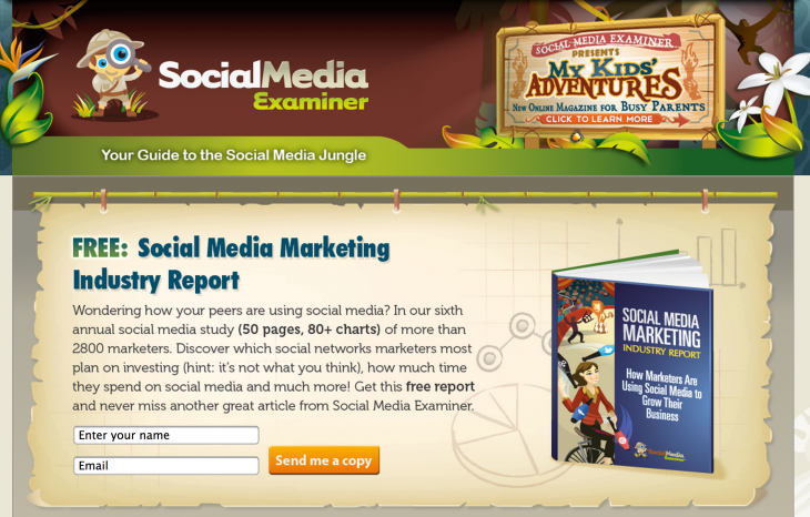
Much like Hubspot, Social Media Examiner is really good at giving things away. Their homepage has a huge call-to-action to sign up for a free ebook. When you’re scrolling down an individual blog post, you see another CTA—a popup offering instant access to a free video.
With events and webinars and many different forms of media, Social Media Examiner has lots of opportunity to appeal to subscribers in many different ways.
Which email growth method do you find yourself using?
Which methods do you find yourself using to sign up on blogs? What have you used for your own site to attract email subscribers? I’d love to hear from you.
Get the TNW newsletter
Get the most important tech news in your inbox each week.


