Dorking around on travel sites is my weird little self-soothing, time-wasting extravagance. I don’t know what’s so exciting about plane ticket listings, I just like them. I like them in the way I like cheesecake and Pearl Jam.
I once wrote gushing fan-mail to Adioso because I thought their human-centered approach to ticket search was hotter than Jorah Mormont in full plate mail.
My first experience with Chinese travel sites was booking tickets on eLong many moons ago – 2007, I think? They had an English language interface and though they didn’t take any international payment methods at the time, I could swing by their office and drop off cash.
I’ve since booked with or followed most of the major Chinese travel aggregators, those being cTrip (they of the transcendent English-language customer service), Qunar, and to a lesser extent AliTrip, Alibaba’s recent foray into the industry. Notable differences between these and most Western-based abound:
Customer touchpoints for aggregators
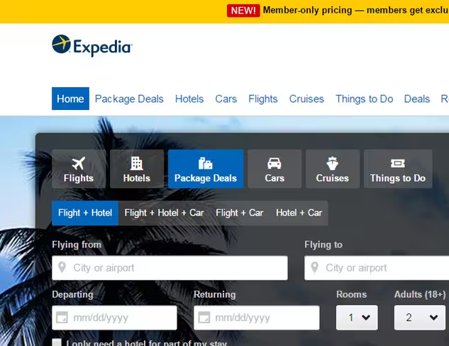
Responsibility-shirking by Western travel aggregators (except you, Agoda) has become an accepted norm, the understanding being that sites are there to facilitate search, and that if you need help with your booking, you call the airline or hotel directly. The customer service hotline number for Expedia is buried under five clicks:
Home
Support (dropdown) > Customer Support

Contact Us button
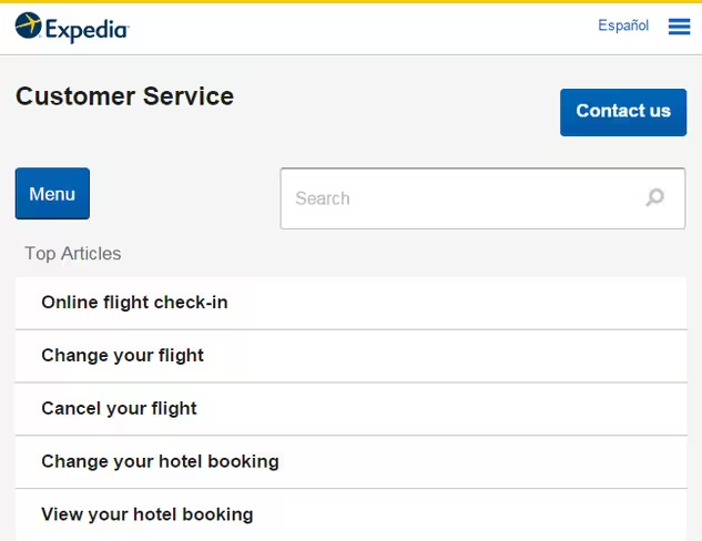
Choose Topic > Choose Category

And finally, at long and dreadful last, a phone number

And then there’s this agoraphobic customer service landing page from Orbitz:
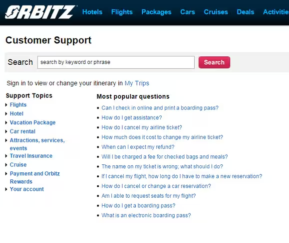
The message is crystal: these people would rather do any earthly thing besides field a phone call from you. They would rather have a popcorn kernel stuck in their teeth forever. They would rather smell their own farts.
The top travel companies in China don’t behave like this. They do not toss the plebs an email address and access to a knowledge-base and call it a day.
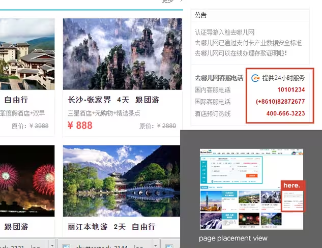
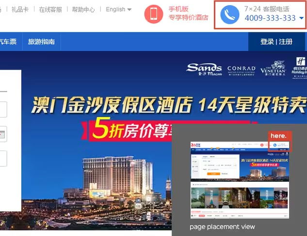
Customer touchpoints are immediate and accessible. Look at these Chinese UIs. Look where the phone number is. It’s right there, usually above the fold (if such a thing can be said to exist):
Ctrip
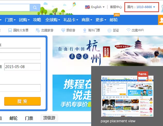
Qunar (ooh, 24-hour service)
eLong
Epsilon’s most recent study on Chinese consumer behavior backs me up on this, finding that brand loyalty is highest when a seamless online and offline customer service experience can be provided by digital brands:
SHANGHAI, Feb. 26, 2015 /PRNewswire/ Epsilon, the global leader in creating connections between people and brands, completed its study on the habits of Chinese consumers.
The report revealed that 61 percent of Chinese study respondents are loyal to e-commerce players like Taobao, JD and Tmall, the highest across all sectors surveyed…
Goes on to say:
Epsilon’s research report uncovered several other China loyalty trends: Those companies most adept at integrating online and offline touch points to deliver a seamless customer service experience are now commanding the loyalty of Chinese consumers.
Apple received the highest score for loyalty of any brand cited, registering 17 percent of brands respondents and cited across all categories. Lifestyle brands directly impacting consumer health, including grocery chains and restaurants, and financial services, also received high loyalty scores.
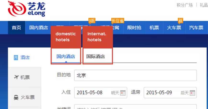
Heavy separation on domestic and international search and labeling
One for one, Chinese travel sites require users to actively select whether they’re traveling domestically or internationally, toggling between different search features for each, a distinction that we don’t see in U.S. travel interfaces.
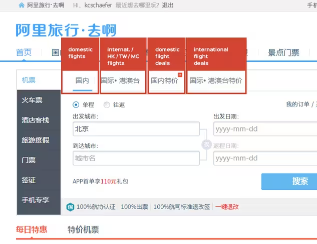
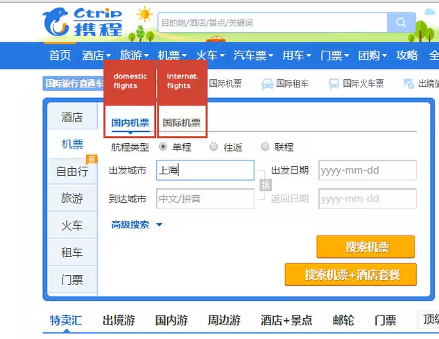
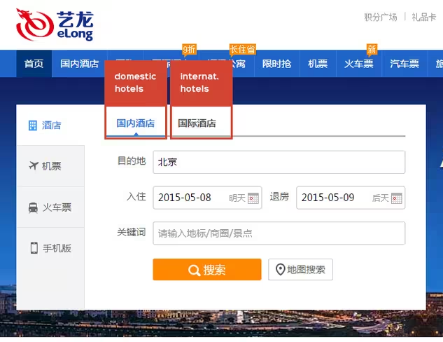
International and domestic flights even have their own landing pages, with deals and callouts separated by destination type. Let me be frank: I’ve pawed through a few piles of research and I can’t get handle on why this is, and I don’t see an answer to that question online. From a UX perspective, it seems redundant.
There are slightly different form fields for each search type, but nothing that couldn’t be consolidated into a single interface with a little clever thinking. So, either there’s a copycat issue happening here (everyone does it, therefore I must), a technical issue, or – I suspect – a user behavior issue that perhaps alludes to the possibility that Chinese consumers think about domestic and international travel as two separate things.
I am in the process of tracking down some answers, fingers crossed.
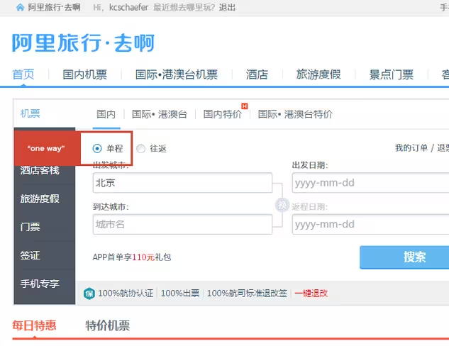
“One-way” domestic is default
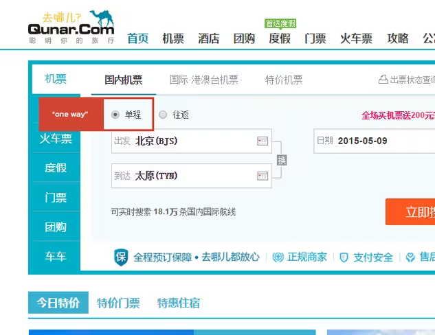
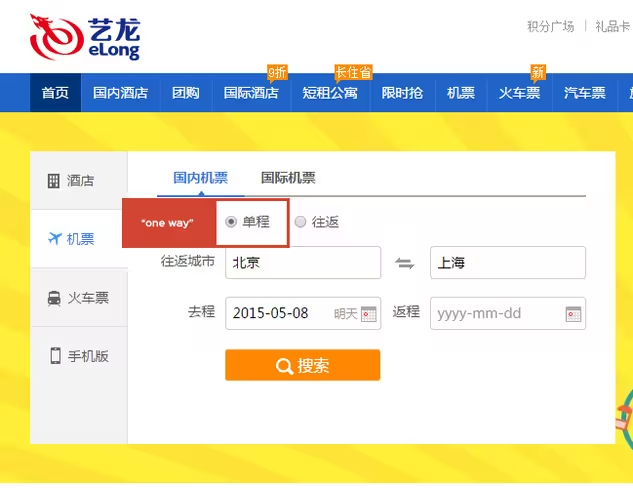
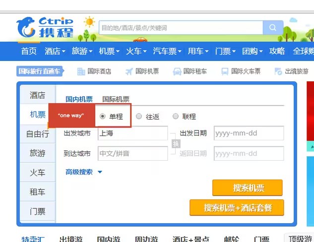
Assuming that these front-end choices are driven by data, default settings can tell us a little bit about what features are most popular. The default settings for flight ticket search is “domestic, one way”. (“Round-trip” is the default setting for the international tab).
Again, still looking for definitive answers, but there are a few possible reasons I can think of here:
- Trains are super convenient and cheap, so Chinese consumers are more likely to buy a plane ticket there and a train ticket back
- Chinese consumers are more likely to take domestic trips where the return date is decided upon arrival
- Chinese consumers prefer to buy two one-way tickets, rather than a round-trip.
Some screenshots, again from the Big Four:
Focus on travel as a gift
Most Chinese and Western travel aggregators offer similar services in the main navigation. There’s the focus on flights and hotels, there’s secondary booking services for activities, car rental, and some cruises here and there.
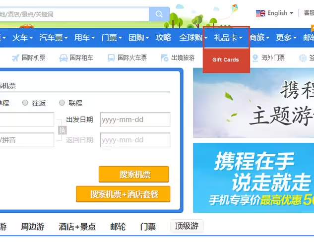
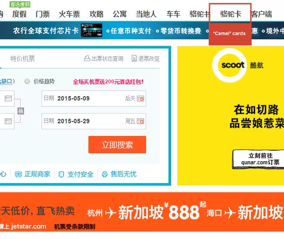
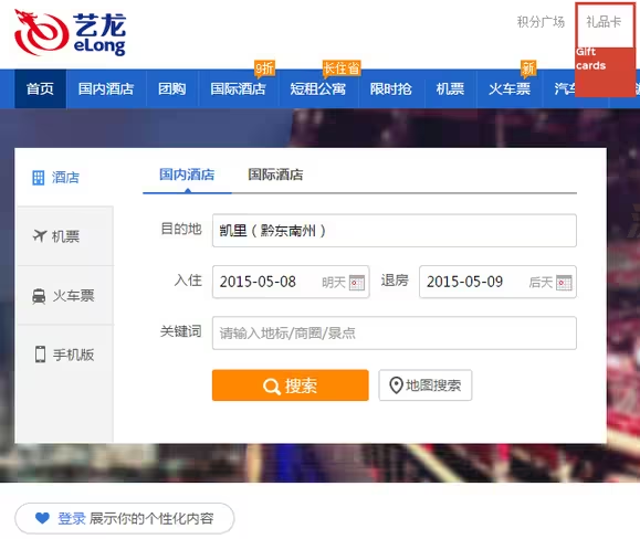
But the main navigation areas on Chinese travel sites also include gift and charge cards, a focus that is conspicuously downplayed in Western UI.
The exception here is again, Alitrip, probably because their payment platforms and account management systems are integrated with Taobao, and Taobao offers its own gifting schemes.
Ctrip Gift Cards
Qunar “Camel Cards”
eLong gift cards
We are totes legit
And finally, though this is not universal, Qunar and Alitrip both take great care to place product guarantees in relatively important screen real estate positions.
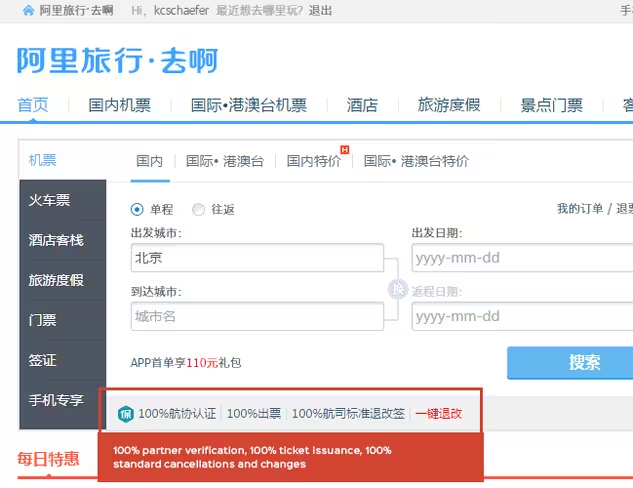
I don’t think there’s a lot of mystery as to why. Alizila, a site offering ecommerce news and commentary from the Alibaba group, cites recent findings that suggest Chinese consumers need more surety than consumers elsewhere:
“Unsurprisingly, Chinese consumers need more hand-holding and assurances during the shopping process. They are comparatively demanding, wanting far more information about products and vendors than shoppers elsewhere.”
Get the TNW newsletter
Get the most important tech news in your inbox each week.


