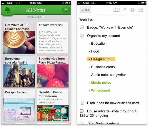
After teasing us last week, Evernote has just released version 5.0 of its iOS app, featuring a fresh look and a new way of navigating between notes and the homescreen — showing off what the company calls “views.”
As Evernote explains, the “new Home Screen lets you quickly jump to content in your Evernote account, making it easy to browse, search and organize notes however you like.” The company’s main goal with the new navigation, it seems, is to make its app more efficient, and so everything needs to be particularly speedy, while being flexible enough to allow for customization and various use cases.
A number of noteworthy features were included in this release, including a new Places view, an improved Page Camera and an overall sleeker feel that replaces the app’s previously default-looking design.

Here’s more new features, from Pinterest:
- Notes View allows you to easily visualize and browse note contents
- Notebooks View brings all your Notebooks, personal or shared, to one single list
- Tags View sorts your tags alphabetically or by note count
- Premium View helps you view and manage your Premium features
- iPad only Recent Notes view gives you the ability to quickly go back to recent notes you’ve looked at and worked on
On the iPad, users may draw a connection between the app’s new Card View and Pinterest’s pins.

Today’s release follows the launch of Evernote 5 beta for the Mac, which also showcases a refreshed design and places view. Mac users can head here to snag a preview copy.
You can download the iOS new app now via the link below:
➤ Evernote 5.0 (free, for iOS)
Image credit: Tom Brakefield / Thinkstock
Get the TNW newsletter
Get the most important tech news in your inbox each week.


