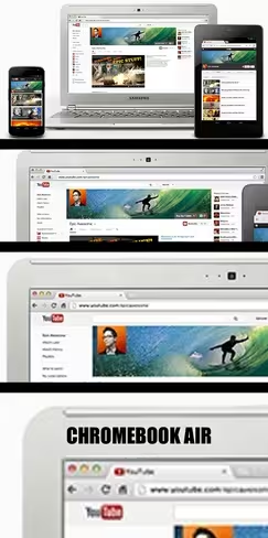
Ok, so this is obviously a simple designer’s error, but it is one rich in karmic potential. Sharp-eyed writer Kyle Gray picked out an interesting graphic on a section of YouTube’s site here.
The section is dedicated to YouTube’s efforts in unifying the feel and look of channels across devices like smartphones, tablets and traditional computers. Google uses an Android phone and tablet, and a brand-new Samsung Chromebook to illustrate the page.
Here’s the illustration:
 Notice anything wrong with the Chromebook? Look closer.
Yep, it’s running OS X, which you can clearly see from the trademark window buttons, not present on Chrome OS. When the new Chromebook was introduced in October, a lot of people noticed that it looked almost exactly like the MacBook Air. Apparently, it’s so close even Google designers can’t tell.
Get the TNW newsletter
Get the most important tech news in your inbox each week.
