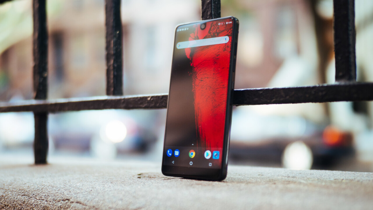
Few devices in recent memory have managed to create as much hype in so little time as the Essential Phone. The brainchild of Android co-founder Andy Rubin, the PH-1 (as the phone is technically known) promises the purest version of Google’s OS this side of a Pixel, with a premium, nearly-bezel-less design to make Apple raise an eyebrow.
After using the PH-1 for a week, I believe that hype is largely earned, despite some baffling flaws. The Essential Phone is so spartan it borders on feeling incomplete, but I’m also convinced Essential will quickly become an important new pillar of the Android community.
The Essential Phone is defined by its minimalism, so much so that it’s baked into the name. What is essential to the modern smartphone, and what can be left out?
The obvious answer is ‘it depends.’ What’s essential to one person may not be the same for everyone.
Maybe you really need an unbreakable screen, a la the Moto Z. Perhaps you’re heavily invested in Apple’s ecosystem, so you’ll need an iPhone. Some people can’t live without waterproofing or wireless charging. And, the most egregious omission for many will be the lack of a headphone jack. That alone will turn off many potential buyers.
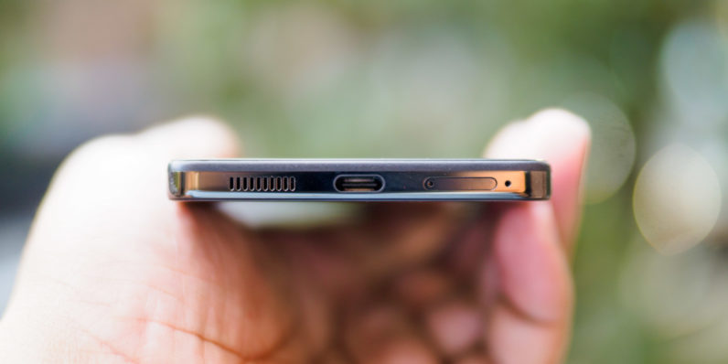
And yet, Essential COO Niccolo de Masi tells me that the company’s name refers not only to what is important today, but what will be years down the road. The headphone jack is paramount to many users today, but with companies like Apple, HTC, Motorola and (probably) Google removing it, it’s not clear how long that will be the case.
But to putting aside the philosophizing for a bit, the PH-1 offer a particular combination of qualities Android users have been dreaming of for years:
- Premium build quality
- Minimal bezels
- Modularity
- Stock Android
- Flagship specs
You can find competitors that tick a few of those boxes, but not all. Samsung has a heavy skin, Motorola is bezel-tastic, and Google doesn’t have the modularity. And none of those phones feel quite as premium.
Those specs by the way, include:
- 5.7-inch LCD display
- 2560 x 1312 resolution
- Snapdragon 835
- 4 GB RAM
- 128 GB storage
- Dual 13-MP cameras, RGB + monochrome
- F1.85 aperture
- 8MP Front facing camera
- 3,040 mAh batery
- USB-C with fast charging
- Bluetooth 5.0
- Modular accessory pins
- Colors: Black Moon, Pure White, Stellar Grey, Ocean Depths
A week after I first laid my grubby hands on the device, I still find myself admiring the design. I thought it was pretty enough in photos, but it wasn’t until I actually held it that I appreciated how well-built the device really is.
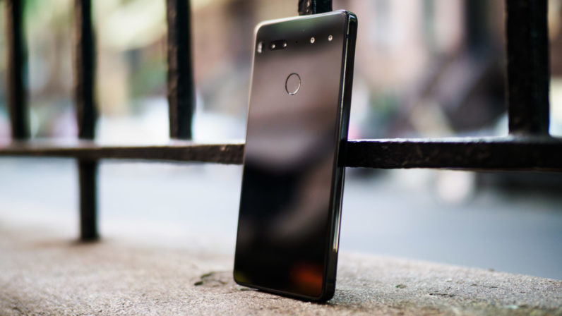
The first thing you notice about the Essential phone is its density. It’s noticeably heavier than a phone its size should be, and you can thank the combination of titanium and ceramic instead of the usual aluminum and glass for that. At 185 grams, it weighs more than a Google Pixel XL (168 g), even though it’s nearly the exact same size as the smaller Pixel. It’s actually one of the smallest Android flagships you can buy.
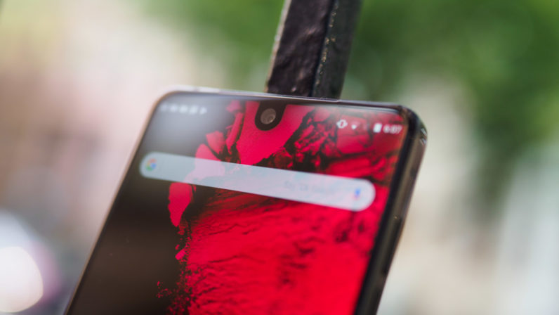
Then you notice the screen. 2017 has been the year of the shrinking bezels, but the PH-1’s screen almost floats in the air in front of you. I thought the notch would bother me, but I actually grew to kind of like it. It doesn’t really affect how you use the phone; apps that don’t wrap around the notch will simply letterbox. I wish you had more control over the letterboxing, but more on that later.
Otherwise, it’s an excellent LCD display, that feels about on par with the LG G6. OLED would’ve been better to help the cutout blend into the screen, but it’s still one of the better displays I’ve used.
I’m also really fond of the ceramic back, a material I’ve only seen on Xiaomi’s Mi Mix before. It adds to the PH-1’s vibe of durability, as it’s much harder to scratch than glass or metal. Pretty much the only way you’re going to scratch this is if you also happen to carry precious gems in your pocket. It’s nice to be able to set a phone down on a table and not have to worry about scratching it.
That said, though Essential claims the Titanium and ceramic combo is more durable than the competition, ceramic can still shatter. Also, be warned the mirror-like finish is a fingerprint magnet. On the plus side, smudges seem to wipe off much more easily than the glass-back phones I have lying around – they’re usually gone by the time I take the phone out my pocket.
The hardware reflects the software’s minimalism. This is as stock as stock Android gets. For the most part, that’s a good thing, but if you haven’t used a stock Android phone in years, it might feel a little… barren.
The good: The Essential Phone feels faster than any phone I’ve used to date, except maybe the OnePlus 5 and Pixel. The Snapdragon 835 blazes through apps. There are no dropped frames, scrolling is smooth, unlocking is instant. Battery life from the 3,040 mAh battery has also been excellent, consistently netting me about 6-7 hours of screen-on time even after loading all my apps on it.
But as phones get faster each year, I find myself noticing speed improvements less and appreciating useful features more. The Essential phone adds virtually nothing to stock Android, and I’m not sure that’s a good thing.
Sure, the Essential Phone is faster than my S8, but I’ve come to appreciate having features baked in, like the ability to capture GIFs, use apps in floating windows, or activate a one-handed mode. Some of those features you can’t just add through an app.
The spartan software approach means there’s some odd behavior around the notch. Essential basically expanded the notification bar to cover the entire cutout (and then some). The thickness of the notification bar bothered me much more than the notch itself. Thankfully you can somewhat mitigate this.
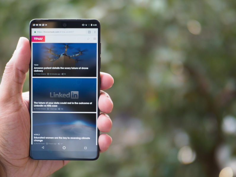
Pro-Tip: Unless you have poor eyesight, adjust the display scaling to the smallest size as soon as you get this phone (Settings> Display > Display Size). It lets you fit more content by shrinking text and UI elements. The notification bar will now up perfectly with the cutout, save a couple of pixels. This way, even when there is letterboxing, the empty space will still be smaller than the S8’s top bezel.
(If you really want to go crazy, you can adjust the ‘smallest width’ value in the Developer Options to adjust the scaling to any size you’d like. I set it to 510).
Still, I couldn’t help but wish Essential had done more to deal with the notch in the software. For example there’s no way to have videos and images fill up the area next to the notch in landscape mode, for instance, even though some apps do so in portrait mode.
It’s a little frustrating when watching I’m watching video and want to use the entire screen’s real estate. Samsung lets you toggle between a crop and letterboxing. LG leaves it up the apps to decide. On the PH-1, you just have to deal with it.
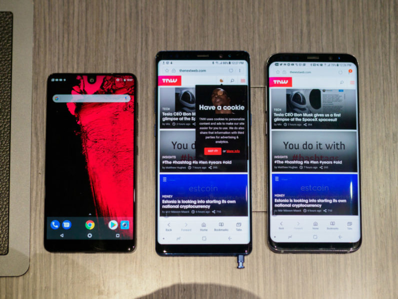
A different company might have used software to turn the notch into a feature instead of a design compromise. If Essential had put all the notifications and status icons on one side, for instance, it could have used the other side for functionality like shortcuts or recent apps.
Even other stock-ish Android phones try to include at least something unique. Motorola adds genuinely useful gestures, OnePlus phones are infinitely customizable, and even Google adds extra functionality to the fingerprint reader.
But that’s okay – I can respect Essential’s decision to modify Android as little as possible, given its founder. What’s harder to forgive is the camera, which is simply not up to 2017 flagship standards right now.
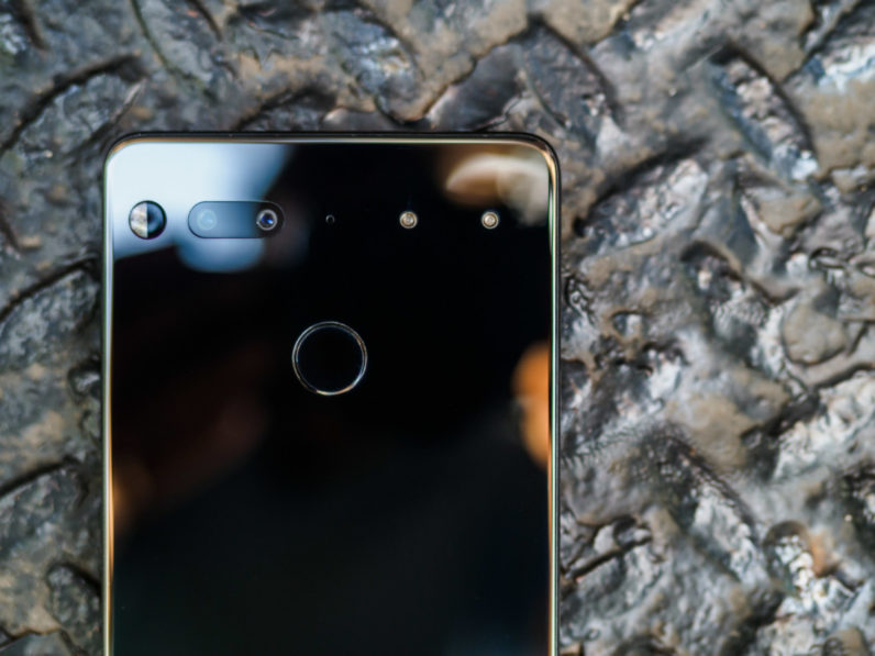
Essential makes a big deal out of its camera on its website. It takes the Huawei and Motorola approach of pairing a color and monochrome sensor to ostensibly improve low light performance, yet somehow performs worse than similar devices. And it doesn’t even include any fancy depth effects, though that’s apparently in the works.
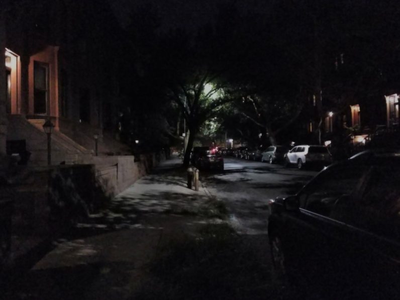
Colors and detail are just decent, low light performance was laughable, and without an auto-HDR option, dynamic range is mediocre by default. If you manually turn on HDR, it’s still a step below the competition, and worse, the camera doesn’t even remember your settings between sessions. The app is slow to load and slow to focus. And the icon is terrible.
Point is, I’ve had better shooting experiences on midrange phones. Fortunately, it mainly seems to come down to software: as disappointing as the camera is now, it was much worse when I first tried it. Essential has since pushed at least three updates, each of which has noticeably improved performance.
Moreover, I installed Google’s camera app for the Pixel (modified to run on other devices), and the results are night and day. I don’t think I’ve seen a single photo where Essential’s app out-performed Google’s.
For comparison, here’s a particularly bad night time photo on the Essential camera:
And the same photo using GCam:

Let’s take a look at the difference in dynamic range, with HDR enabled on both phones. Essential’s app on the left, the modified GCam on the right:
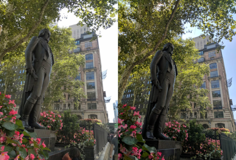
Google’s software wins, even though it’s not optimized for the phone. Another comparison:
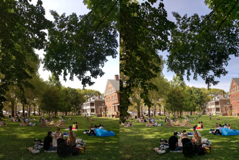
Again, no contest. It goes to show how important good processing is on mobile devices. The middling camera app is a serious demerit, but the availability of better software softens the blow a little.
In most other respects, the PH-1 is a remarkable phone. It’s the most premium build I’ve felt in years, in a refreshingly compact body for an Android flagship. Even the $700 price tag isn’t so ludicrous when you consider that it comes standard with 128 GB. The 128 GB iPhone 7 Plus costs $869, has a smaller screen, and uses cheaper materials.
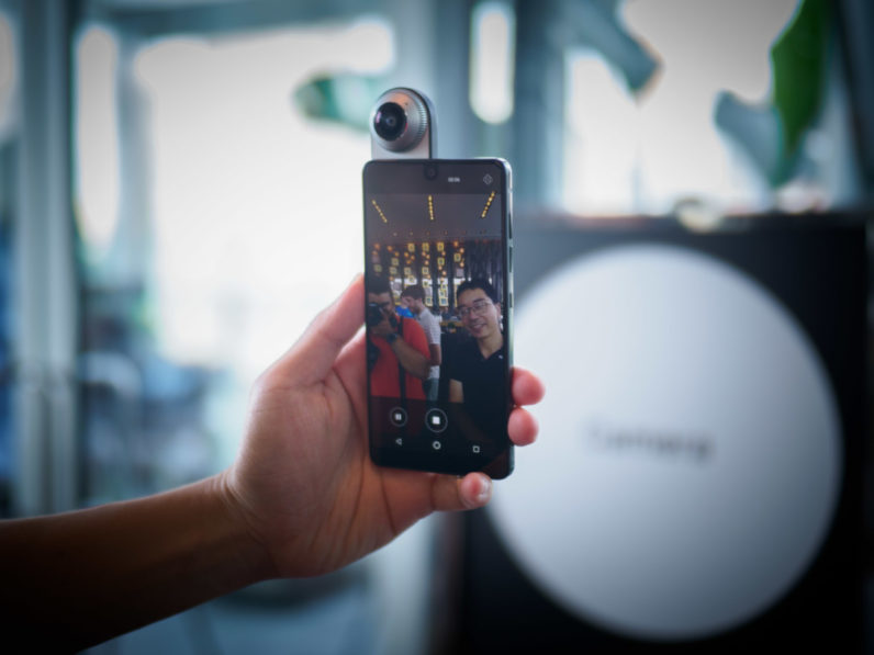
With neither the mindshare nor resources of Apple and Samsung, Essential still has a lot to prove. It only has one module out so far, and shipments of the PH-1 were delayed by nearly two months. For all the talent and money behind it, Essential’s questionable additions (or lack thereof) give away its position as a startup. And until the stock camera app is fixed, it’s hard to recommend to the less tech-saavy.
But Essential was never looking to capture the mainstream with its first product anyway. It’s a product aimed at Android purists, and I’d take software that’s a little austere over bloat I can’t get rid of. And it’s still remarkable that a small startup managed to match or outclass everyone else’s design on its first outing.
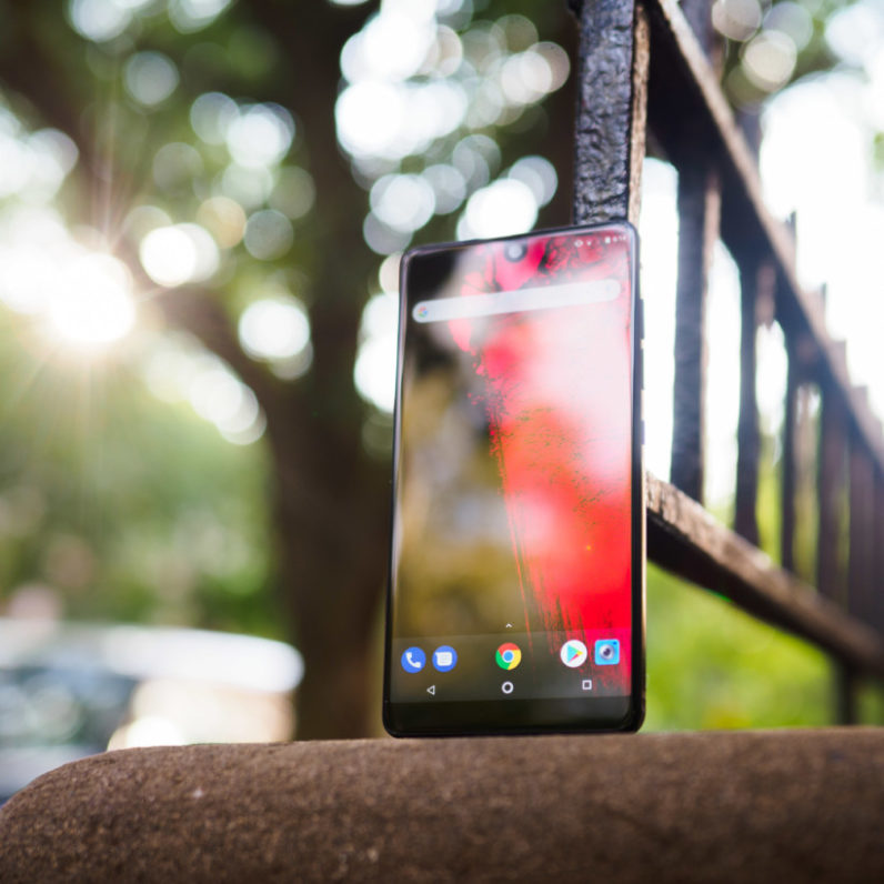
The PH-1 makes compromises like every other phone, and its default camera experience is confusingly poor. But its blend of premium hardware, great battery life, small bezels, powerful specs, and stock Android is hard to find elsewhere. That combination alone makes the PH-1 one of the best phones of the year for Android purists. If Essential can do something about its camera app, maybe it will be a great phone for everyone else too.
Get the TNW newsletter
Get the most important tech news in your inbox each week.
