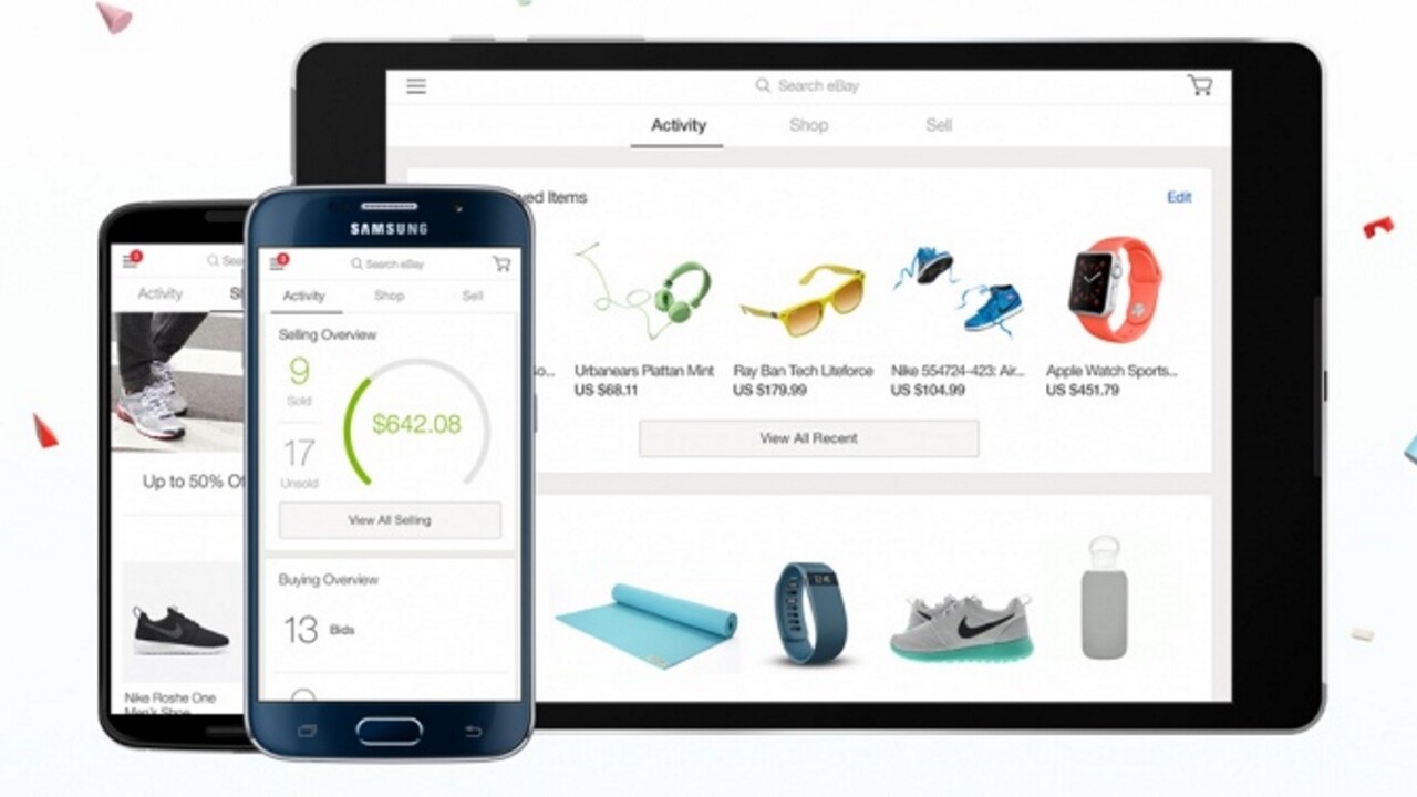
eBay has rolled out a major update for its iOS and Android apps today, which brings the two platforms together in look and feel for the first time.
The company says the update makes the app “more browsable” and gives easier access to sections like ‘top deals’, ‘promotions’ and ‘events’. Previously, it wasn’t a very inspiring app if you weren’t on the hunt for a specific item. It should also now be easier to jump between the ‘Activity’, ‘Shop’ and ‘Sell’ tabs.
For sellers, eBay has changed the way its app offers information based on activity. New users, for example, will see more information on best practices for selling their items.
If you’re a regular eBay seller, there’s a new in-app dashboard to keep you up to date on what you’ve sold and whether you’re approaching your limits.
eBay says the new apps are available to download now, although in our testing, the Google Play store is still showing version 3.0, rather than version 4.0.
➤ Introducing eBay 4.0 [iOS | Android]
Get the TNW newsletter
Get the most important tech news in your inbox each week.


