Hugely popular file-sharing service Dropbox has announced a redesign of its Web-based service, as it looks to provide a more intuitive layout and better accommodate the increasing amounts of photos being stored there.
The company says it has been testing new features and layouts quietly over the past few weeks, but the new design has now rolled out in full. The changes are aimed at giving users a “simpler, more powerful, and more beautiful web experience”, Dropbox says, and the new design is certainly lighter than before.
One of our main goals was to slim down dropbox.com and focus on the star of the page: your stuff. We’ve put all the tools you need at your fingertips, but only when you need them.
Users than log-in to the website will notice a new action bar, which is much more compact, but still provides the same options for sorting and managing files and content held on the service.
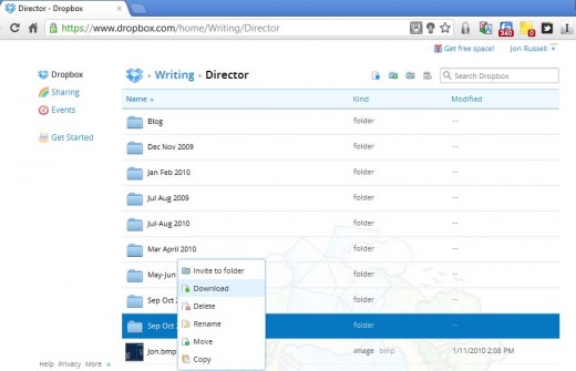
Dropbox has also added a right-click option that further optimizes space by taking away clunky menus, allowing files to be edited and managed as and when is necessary using a right-click to kick things off.
The biggest winner, for those that use the service to store or share files, is the addition of two new features for photos.
The service now has a photo viewer, which shows images on a large, dedicated screen.
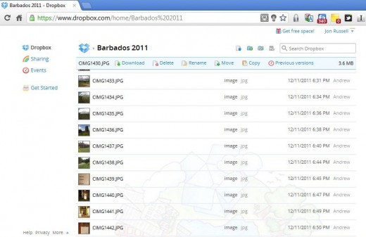
While Dropbox has tackled a frustrating issue by introducing image thumbnails for photos. This addition means users can see images that have been shared with them without need to open them first, while they can sort through their own photos on the service with greater convenience and ease.
However, we haven’t found a way to enlarges the thumbnails, as they are a little small:
Finally, Dropbox has introduce a ‘live’ search, which fetches results as users type into the search box. The company has wisely put the search box in the browser itself, which makes looking through files and content a lot easier and more intuitive.
Overall, we found the changes to be simple and yet highly effective. The redesign sees Dropbox lose a lot of the baggage and annoyances that have bugged loyal users for some time, making its Web-based service more enjoyable usable.
With increased competition, this is likely to stand the company well, although this sleek new layout is “only the first step”, according to Dropbox. It seems that we can expect more developments this year, which we suspect are likely to be around its mobile versions as it looks to gain increased traction and activity from its users, and recruit new users too.
Get the TNW newsletter
Get the most important tech news in your inbox each week.


