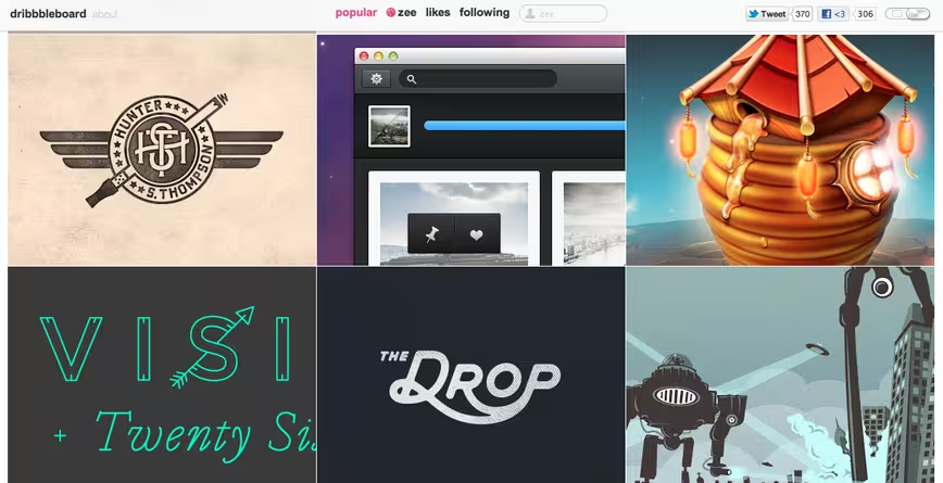
While searching for design inspiration today, tons of people recommended Dribbble, the slightly exclusive “show and tell” site for designers. I’ve been a big fan of Dribbble, but while I wholeheartedly agree that the site houses tons of talent, it doesn’t give viewers a truly frictionless experience for browsing beautiful work.
 Dribbbleboard, which touts itself as a more convenient way of browsing Dribbble, has solved this hangup for me, with its full size images shoved together into an infinite scroll. It’s entirely simplistic, but exactly what some designers are really looking for when they ‘re exploring the work of others.
From the creator:
Dribbbleboard is a web-app based on dribbble.com website which is created to improve and simplify your inspiring by the best designers of the world. Using it you can get access to large shots without opening a shot page, easy and fast. But if you want to like a shot or leave a comment – just click on it and you will see a shot page on dribbble.
With its endless supply of beauty pulled from Dribbble’s own popular feed, Dribbbleboard works like you’d expect. Dribbbleboard lets you search by different players using the search box at the top, and if you find something you really appreciate, click on the image and you’ll be taken to its official page.
 One interesting feature is the fact that users can change the image sizes from thumbnails to 3 full images via the toggle in the top right corner of the site. Note that the about section is pinned to the top, but can be simply X’d out of the way if it bothers you.
All in all, it’s quite simple, but given the amount of inspiring work on Dribbble, it’s great to see other designers playing with the presentation for a finer-tuned experience.
➤ Dribbbleboard
Get the TNW newsletter
Get the most important tech news in your inbox each week.


