We’re intrigued by Chinese phone brands at TNW. The idea that relatively-obscure (at least, in the West) companies can make iPhone and Galaxy-rivalling handsets at a fraction of the cost is fascinating, and this has been reflected in our coverage. My colleague Napier recently reviewed the tantalizing Nubia Z17, while Abhimanyu’s long appreciation for all things Xiaomi is well known.
Now it’s my turn, as I cast my eye to the intriguing Doogee Mix. You might not have heard of the brand before, but the Mix has been making waves, and it’s all due to its near-bezelless screen — very á la Galaxy S8, and dare I say it, the upcoming iPhone 8.
And just so I’m not accused of burying the lede, I should probably mention that it costs just $229 on Amazon. It’s undeniably cheap, at least by the standards of borderless phones, which are still a bit of a novelty. But is it any good?
Kinda.
Specifications
Before we get into the nitty-gritty of the device, and what it’s like to live with it as your day-to-day phone, it’s worthwhile talking about what’s under the hood. The Doogee Mix packs the following:
- 5.5-inch Super AMOLED display
- Helio P25 Octa-Core 2.5GHz
- 64GB storage (expandable with a MicroSD card)
- 4/6GB LPDDR4x
- Android 7.0
- Dual rear-facing cameras (16MP main camera, with a 8MP secondary camera)
- 5MP front-facing camera
- Fingerprint reader (which also doubles as a back button)
- Dual-sim support
It comes with an all-metal unibody design (which, I add, is a magnet for fingerprints). Charging is done through the phone’s MicroUSB port. Alas, Doogee seems to have missed the memo on USB-C.
All about the screen
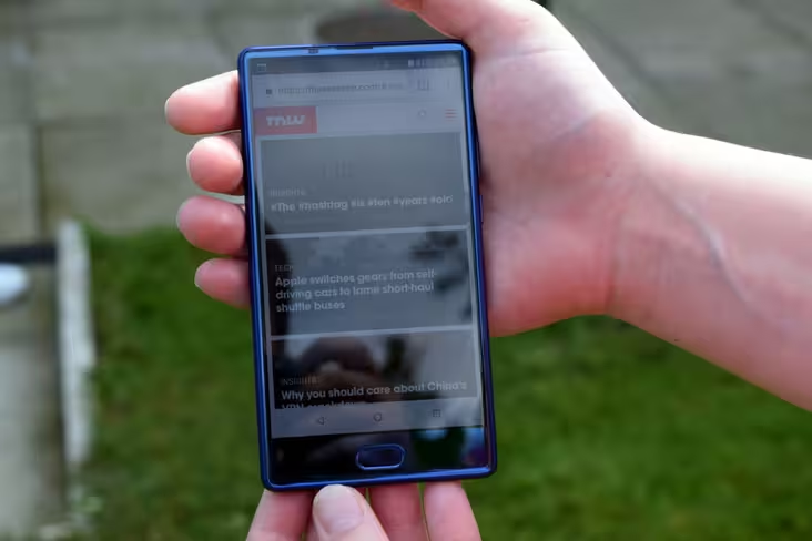
The Doogee Mix’s unique selling point is its screen, which is as close to being completely borderless as you’ll get in a device at its price point. The screen measures 5.5-inches, while the bezels measure roughly 1mm. This gives it a screen-to-body ratio of 93-percent.
That said, bezelless-screen is only worthwhile if it’s any good. Personally, I found it to be a mixed bag. It’s gorgeously bright, and is eminently readable in bright weather.
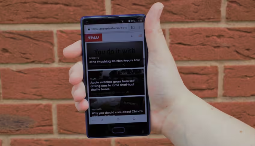
Unlike many phones of its stable, colors simply popped — they weren’t dull, although you wouldn’t know that from the photos. Feel free to blame the turgid, perennially-overcast British climate.
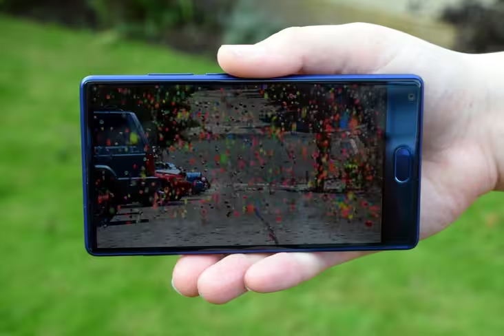
The biggest downside is that it’s pretty low-resolution — at 720 x 1270, it’s not even full HD. At the price you’re paying, you should expect 1080p goodness, and the step-down is eminently obvious.
Software and performance
Unlike a lot of its Chinese stablemates, the Doogee Mix ships with a recent version of Android. It runs Android 7.0 Nougat, and mercifully little has been done to modify it.
I’m familiar with Doogee. When my fiancee moved to the UK, I bought her a cheap Doogee X5 to hold her until she got a ‘proper’ phone. While it was good value, it was infuriating how most of the stock Android apps (like Chrome!) were replaced with an obviously inferior alternative. After a few weeks, it was relegated to a drawer, where it’s remained ever since.
The Doogee Mix is pretty much stock Android 7.0 — which is a relief. However, it seems Doogee couldn’t resist adding a few extras. It comes with a set of animated backgrounds, which I feel are a little bit distracting.
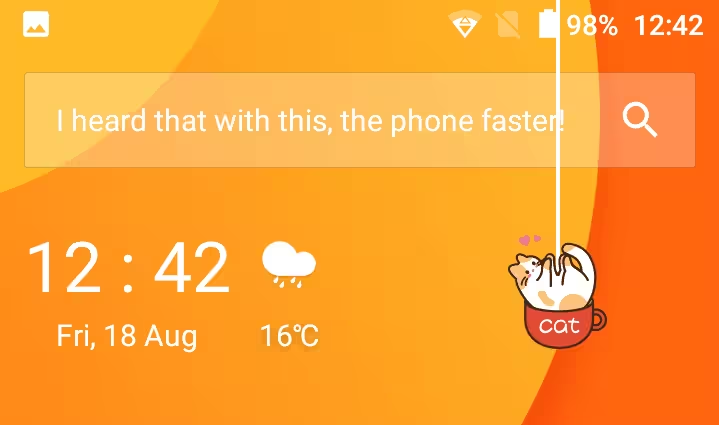
Swipe right from the homescreen, and you’re taken to a news feed app, which pulls stories from the likes of The Independent, Reuters, and the LA Times.

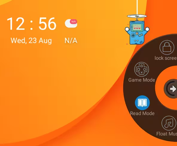
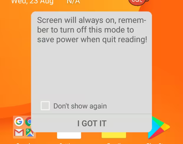
There’s also a little floating widget, which lets you put the phone in all sorts of different modes. Read Mode keeps the screen on at all times, for example, while Game Mode disables the menu and back key, in order to prevent you from inadvertently bailing from what you’re playing.
The workhorse powering the Doogee Mix is the Helio P25 — which boasts eight cores. The processor (or, if Qualcomm has its way, ‘platform) in the Mix comes clocked at a respectable 2.5Ghz. Backing this up is yesteryear’s Mali T880 GPU.
The review model sent to me comes with 4GB of RAM, although as previously mentioned, Doogee sells a 6GB variant.
It handled the day-to-day stuff admirably. As someone who ‘hoards’ (for lack of a better word) tabs and open apps, it was able to cope with my profligate phone habits without breaking a sweat.
I’m not much of a mobile gamer, but I did try it out with some games — like the awesome aquatic racing game, Riptide GP2 — and there were scant signs of slowdown or lag. It was all very smooth.
Camera
Usually, in phones at the Doogee Mix’s price point, the camera is just serviceable. Not awful, but not amazing either. They’re okay for blurry concert photos, or Instagrammed snaps of your dinner. Anything more, and you’d better spend more.
The Doogee Mix’s setup is different. It’s weirdly decent, and packs two rear-facing cameras; a main 16MP camera, plus an 8PM assistant camera. These use a Samsung’s ISOCELL CMOS sensors, which first emerged in 2013 with the launch of the Galaxy S5, and are designed to perform well in low-light conditions.
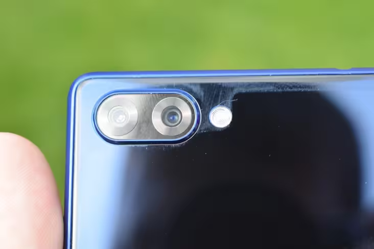
I was impressed. Photos were bright and didn’t feel particularly saturated, and I got some lovely depth-of-field when taking close-ups.
Incidentally, the Doogee’s camera app comes with a ‘blur’ feature which uses software trickery to create the same effect. Although, in my opinion, it looks transparently artificial when compared to the real McCoy.

With that out of the way, let’s talk about the 5MP front-facing camera. This was a bit of a mixed bag.
Typically, a phone’s selfie-snapper is positioned on the top-right, right next to the earpiece. But obviously, due to the form-factor of this device, this is a non-starter.
So, Doogee has decided to place it at the bottom-right corner of the device, right next to the fingerprint reader. This felt strongly reminiscent of the awkward webcam placement on the InfinityEdge monitors, found on Dell’s XPS and Precision laptops.
There’s a pretty major consequence of this. Photos taken from the bottom-up are seldom flattering — they’re like the reverse MySpace angles, capturing your double-chin in all its protuding glory. As a result, when you take a selfie with the default camera app, it’ll tell you to flip the phone upside down.
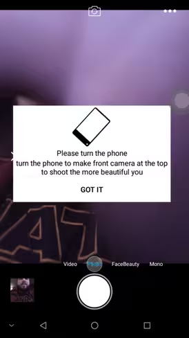
The placement of the camera posed further problems, as it’s easily obscured by the palm of your hand, as you grip the device. To avoid that, you have to shift your grip further up the device, which feels a bit awkward and unnatural.
Don’t get me wrong, it’s a perfectly fine camera. Snapchatters and video-callers won’t be disappointed, but it’s certainly something to be wary of.
Final thoughts
The Doogee Mix is an intriguing device. Its standout feature is its borderless screen, although this felt more like a gimmick than anything. In many respects, I felt it was poorly executed, and undermined the overall experience.
It just doesn’t feel natural, having to flip the screen 180-degrees every time you want to take a selfie. Similarly, the positioning of the front-facing camera makes it all-but impractical for video calling (unless you hold the phone in a super-awkward fashion).
On the bright side, if you look past the display, you end up with a decent handset at a compelling pricetag.
It runs a contemporary version of Android with scarcely-any tweaks, and has enough ‘oomph’ to handle whatever you throw at it. And the camera is pretty solid too — certainly above-and-beyond what you should expect at that price range.
And — perhaps a rarity for budget phones — it looks really good.
Even if you don’t buy the Mix, you should pay attention. This device is indicative of the fact that bezelless screens are soon to become the norm, and will be available at almost every price tag.
It also shows that some handsets will be better than others, although that’s a bit of a given.
If you’re truly desperate for a bezelless phone, the Mix absolutely fits the description, and it does it at an unfathomably low price point.
That said, competition is heating up. Earlier this week, Hong Kong rival Elephone opened up pre-orders the Elephone S8, which boasts a similar form-factor (with an awkwardly placed camera, too).
There’s also the Maze Alpha, which boasts similar specs, as well as the ultra-pocket friendly Bluboo Edge, which bears more than a passing resemblance to the Samsung Galaxy S8.
And It goes without saying that there are better executed specimens at the higher echelons of the phone spectrum — like the Xiaomi Mi Mix, and the Galaxy S8. These cost more, but they’re largely better executed. The S8 in particular is an amazing phone.
I don’t know if I’d recommend it over the myriad of other mid-drawer handsets, like the Moto G5 Plus or the Samsung Galaxy A5. But if you’re desperate to jump on this particular form-factor bandwagon, you should definitely check it out.
Get the TNW newsletter
Get the most important tech news in your inbox each week.

