It’s been a little over three months since Twitter #Music was launched on the Web and iOS. The release signalled Twitter’s desire to broaden its influence on the Web. To be more. To leverage the ever-increasing number of tweets to disrupt the status-quo.
Yet for all its hype, Twitter #Music has been a disappointment. The mobile app sits patiently in a folder on my iPhone, gathering virtual dust and a sense of increasing irrelevancy. I have no desire to open it. Perhaps that’ll change with a future update, but for now it remains rather useless.
It’s not just me either. I’ve asked friends and family what their go-to app is for listening to music on the move. Spotify, Rdio and the default iOS Music app rank high. Twitter #Music does not.
Admittedly, that’s a small group of people to poll. But a quick inspection of the top free music apps in the App Store tells a similar story. Alongside the apps I just mentioned are Deezer, Soundcloud and Shazam, as well as a bunch of emerging services such as Bloom.fm filling out the top 20.
Twitter #Music isn’t featured. Nor is it in the top 50. Top 100? Nope. Top 200? Nope. At the time of writing, the app sits ranked 285. Ouch.
So why is no-one using it?
The purpose of the Twitter #Music app is three-fold; help listeners discover new music; act as an overlay for playing said music; incentivize the music industry – particularly artists and labels – to continue engaging with their fans on Twitter.
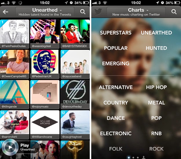
To help users find a bunch of brilliant new records, the app offers five charts with rather ambiguous names such as ‘Emerging’, ‘Unearthed’ and ‘Hunted’. They all sound inviting, but I couldn’t tell you what the difference is between any of the three.
Tapping one reveals a very compact grid filled with tiny square display pictures. Each of them represents an artist and they’re ranked in accordance with their popularity. The interface is pretty terrible though and at times completely bewildering. The various images are the size of my fingernail and reveal next to nothing about the artist or the sort of music they play. Twitter has also chosen to show their Twitter handle by default – rather than the artist’s name – which only adds to the confusion.
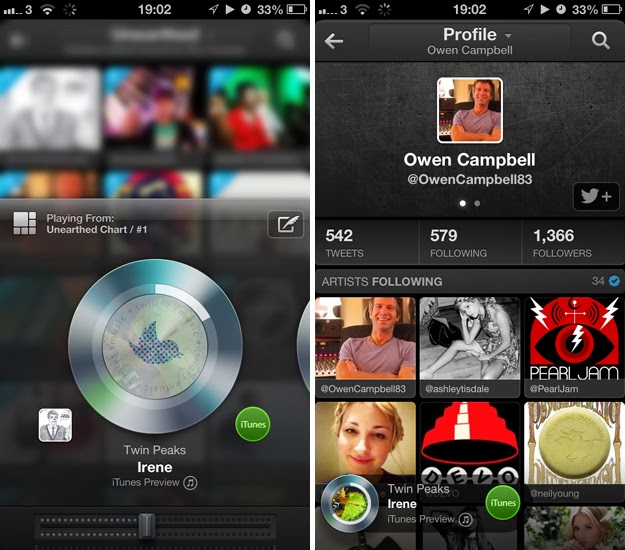
Selecting a specific artist then reveals a jarring profile page that tries to blend both their Twitter account and more of these tiny cuboid images. It’s the same story in the app’s ‘Suggested’ and ‘#NowPlaying’ sections. Everything feels unrefined and lacks consistent aesthetics.
Too many alternatives that are just better
Discovering new music should be a visually stunning and frictionless experience. Soundwave, Bloom.fm and even the ‘Discover’ tab in Spotify do a much better job of this than Twitter #Music by keeping their respective interfaces refreshingly simple and uncluttered. Twitter’s mobile app just feels messy in comparison.
Twitter #Music would also be a novel proposition if it offered its own digital storefront or an on-demand streaming service. But it doesn’t do that either. Tracks are either 30-second previews from iTunes with direct store links – another bid to get music labels and artists on side – or only supported with an active Spotify or Rdio subscription.
It begs the question though: why would a Spotify or Rdio subscriber leave their dedicated mobile app for this? There’s no way to create custom playlists, queue tracks or access premium features offered by these more robust and expansive services. The idea, presumably, is to reinforce Twitter #Music’s discovery options by giving users the ability to listen to new tracks in their entirety.
Twitter #Music lacks a defining feature or hook to keep users engaged. It’s an odd blend of ideas that never seem to mesh or offer a significant value proposition to the listener. There’s some potential here though and plenty of time for Twitter to turn it around – but no wonder it’s performing so poorly in the App Store at the moment.
Image Credit: David Ramos/Getty Images
Get the TNW newsletter
Get the most important tech news in your inbox each week.


