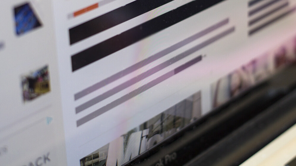
Lorem ipsum, the Latin placeholder text often used when submitting designs to clients, has long been a popular choice for designers. As we’ve previously noted, Latin isn’t much like English, and so it can be misleading to use Latin filler text when designing type-heavy sites.
But sometimes, using any filler text at all can be too much at the earliest stages of a design. Especially when exploring possible layouts and doing thumbnail sketches (or the digital equivalent), a simple way to suggest where type will go is all that’s needed.
That is the role BLOKK fills; it’s a font made up of dashes (almost like what you’d find in a cartoon newspaper) for quick mock-ups and wireframing, and it’s awesome.

Yes, BLOKK is quite simplistic, but there’s something clever about it; it’s both a useful and comical way of rethinking filler text.
As an alternative, you can also take a look at Redacted, an open source project by Christian Naths based heavily on BLOKK, with interesting script variants. Incidentally, a developer by the name of Cullen MacDonald has even created a bookmarklet, dubbed “Redactor,” to let you try Redacted on any site. Check that out by dragging this link: Redactor into your bookmarks bar, and try BLOKK via the link below.
➤ BLOKK
Get the TNW newsletter
Get the most important tech news in your inbox each week.


