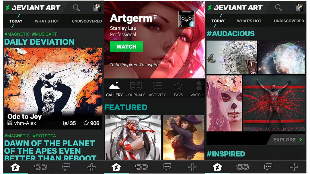
DeviantArt, the online artist community that showcases user generated artwork and photography, has upgraded its mobile app for iOS and Android.
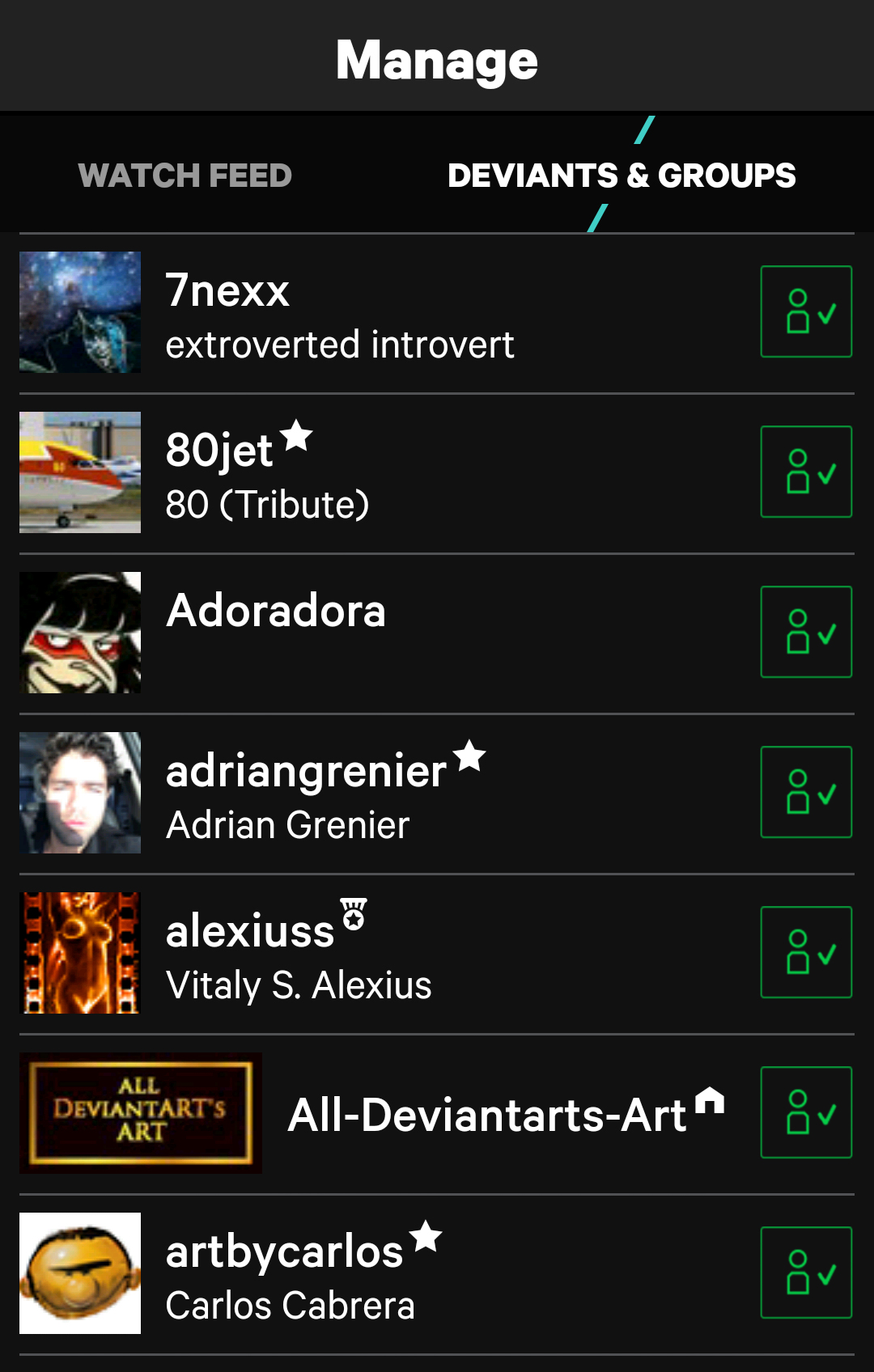
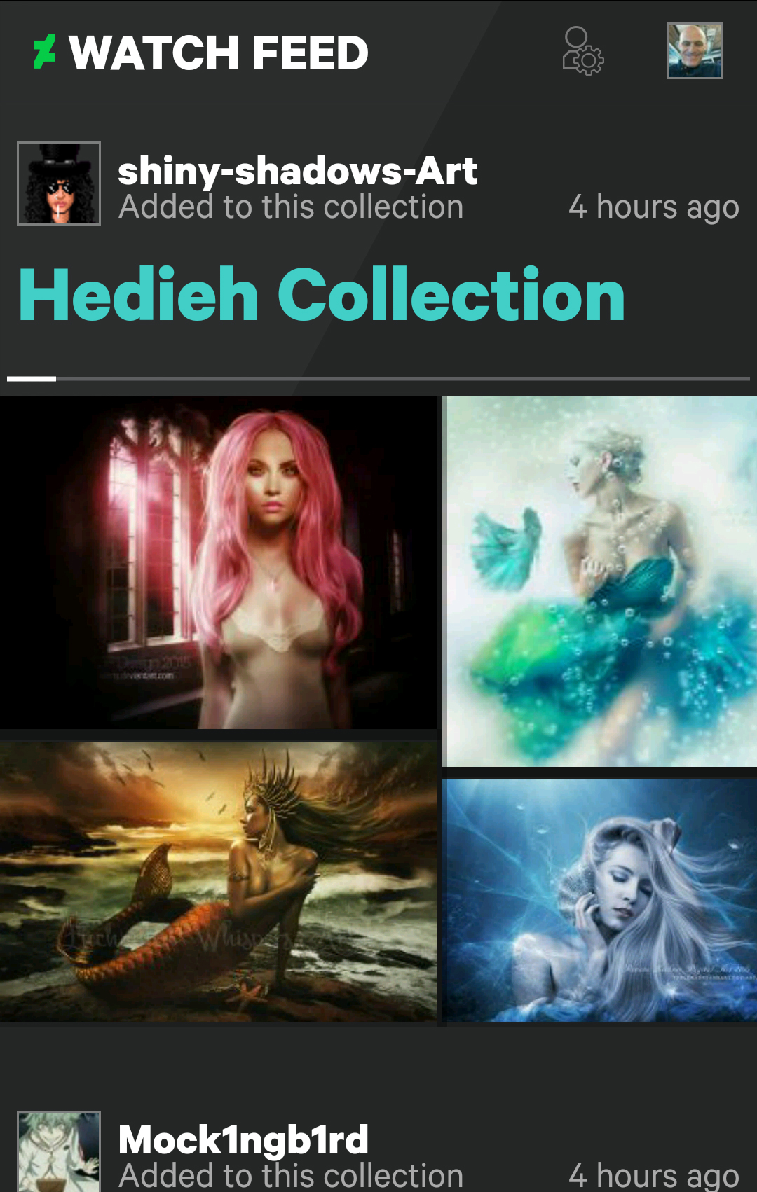
Major revisions target the app’s Watch Feed and Notifications features and apply an assortment of performance and organizational enhancements. The Watch Feed, which connects members with the people they watch, has been updated with an activity stream that includes deviations, journals, favorites and status updates. You can now filter your Watch Feed, choosing exactly what you want to see.
Notifications, the app’s communication center where users manage mentions, replies and messages, has also been enhanced. The app now separates group deviations in notifications. On the backend, image processing has been improved to speed up delivery and improve rendering.
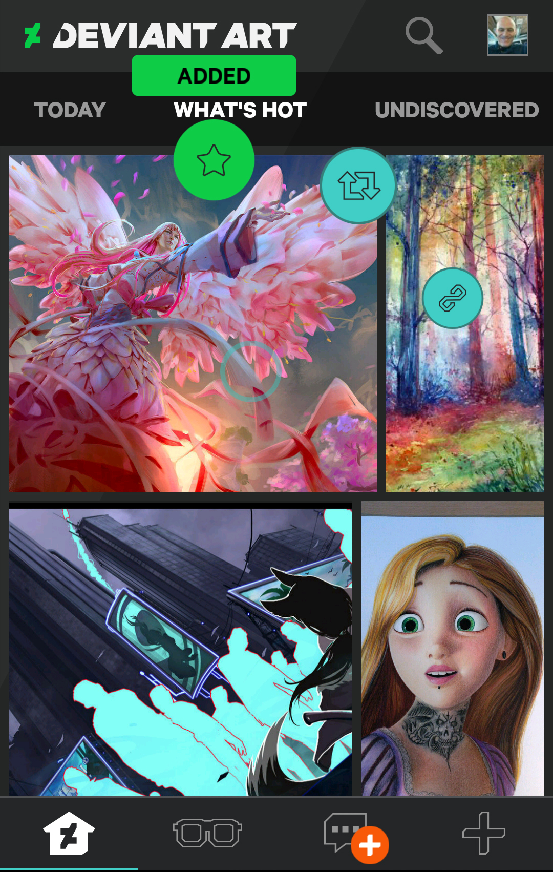
Other updates have art submitted to a group rolled into a single update. You can now swipe horizontally to scroll through collections and group deviations directly from your Watch Feed. Scrolling down on a Today article will show a preview of the next article. Tapping and holding on art thumbnails let you quickly favorite, share and view similar art.
We had a few quick questions for the UX team about how and why these changes were implemented to the site and Ian Campbell, DeviantArt’s VP of UX, gave us some insights.
TNW: What will the new changes accomplish in terms of making the site more usable and accessible?
DeviantArt: The biggest change to the DeviantArt Mobile App involves the Watch feature, which we also released across the entire DeviantArt ecosystem. Our platform establishes a special social relationship with an artist that doesn’t happen anywhere else. When you Watch an artist, you receive all of the materials and artwork the artist posts, the Journals that the artist produces and you see the collections that the artist makes of other works.
With the new update, you can now select which of these categories you want to view from an artist in your Watch. You may prefer the curated collections over the artist’s own work, for example. This efficiency lets you actually interact with more artists on a more meaningful level.
We also improved the interface and function of the “tap and hold” feature that permits you tap on an image to reveal a menu with options to favorite, share or see more similar content.
Aside from audience requests, what other reasons do you have to tweak the site in this new way?
It’s our responsibility to continue to improve our website, our apps and our mobile web experiences. We owe that to the community and to the public. Design is a constantly iterative process – we’re watching the data closely and reviewing the feedback.
What new audiences, if any do you hope to attract?
The new Watch features, the easier process for building collections and the improved image quality should all make it much easier for people to appreciate the art of DeviantArt and will hopefully encourage even more artists to explore our community.
Will any processes change for contributors? If so, which ones?
In the future we plan to streamline the submission process further. We are exploring ways to have a one-click process that places your work onto DeviantArt and shares it automatically to other social network accounts.
It seems obvious that the site, which was launched in 2000 and is one of the oldest art sites on the web, has continued to grow in relevance for users. DeviantArt reports that as of today there have been 1.2 million downloads, over 5,500 new users added every day with 65,000 users using the app daily from over 200 countries.
➤ Deviant Art [iOS and Android]
Get the TNW newsletter
Get the most important tech news in your inbox each week.
