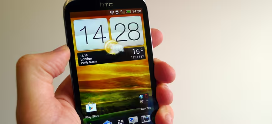
The HTC Desire was an innovative device two years ago; well loved for its slim design, quick performance and fluid Sense user interface. The smartphone giant has moved on since then though, seeking out better functionality, greater processing power and larger displays in a bid to topple Samsung and Apple.
HTC has been criticized though for launching too many devices over the last eighteen months. For a while it seemed like the company had something new to promote every few weeks, assigning a dizzying number of new brand names and letters to try and stay ahead of its competition. Thankfully, HTC noticed that this was having an adverse effect on the perception of its brand. Consumers never really knew what the company’s flagship handset was, or what device in its range was best for a specific budget.
Was it the Desire HD? The Sensation XE? Or what about the Incredible S? Even the most avid technology enthusiasts found it all a little confusing.
In an attempt to start afresh, HTC announced the One series of Android devices earlier this year. It was a simple premise; three smartphones, each given the letter V, S or X to denote a low, middle or high-end product respectively. It was a fantastic idea, but recently the firm has started slipping into its old habits once again. The Desire C, the company’s new entry level device, has been on the market for a good few months now and storming behind it is the brand new Desire X.
The latest entry is no doubt an attempt to try and tease former Desire owners into buying a new, similarly specced HTC handset. On paper the Desire X is a mid-level device, sitting somewhere above the Desire C and its predecessor the Desire S, but below the One S. In some ways it’s actually on par with the One V too.
So does it do enough differently to justify its existence? Or is it just another forgettable HTC handset? We took the chance to put the new and improved Desire through its paces, with all the results detailed below.
Design
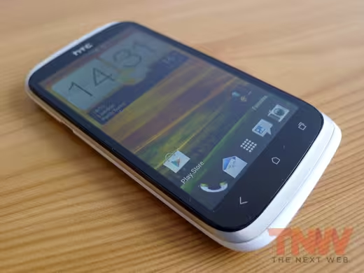
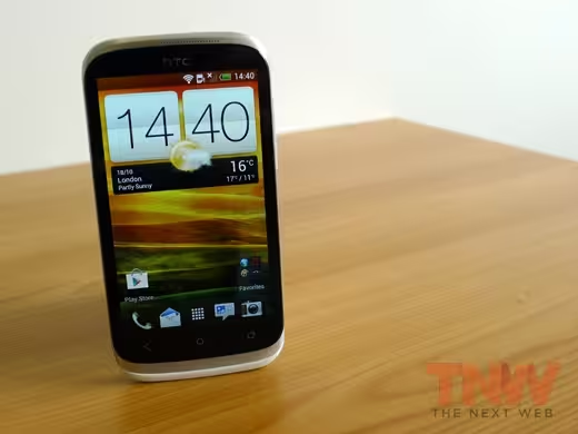
The original Desire was a great success because it was small, slim and pretty powerful. Luckily we discovered that the Desire X is no different. It houses a very bright, 4-inch Super LCD 800×400 display, which on paper sounds a little small compared to its own monstrous brother, the One X, but in everyday use we found it was more than enough to take advantage of.
The smaller screen size actually makes the Desire X a better smartphone to own too. We found that it fits very snugly in most hands and trouser pockets; in fact you can expect to go out in public and handle doors, train tickets and drinks while still swiping around on the device with minimal fuss.
HTC’s new smartphone is powered by the Qualcomm Snapdragon S4 processor, which we discovered to be pretty fast but nothing like the Tegra 3 nestled in the One X. Under the hood the Desire X also has 768MB of RAM and 4GB of internal storage. That might sound a bit weak to some, but on the flip-side it supports additional memory cards through a MicroSD slot. While the Desire often struggled with onboard memory (and it’s still true that some data just can’t be stored on an external card) we think it’s a welcome addition, especially when you consider that the One X doesn’t support that option.
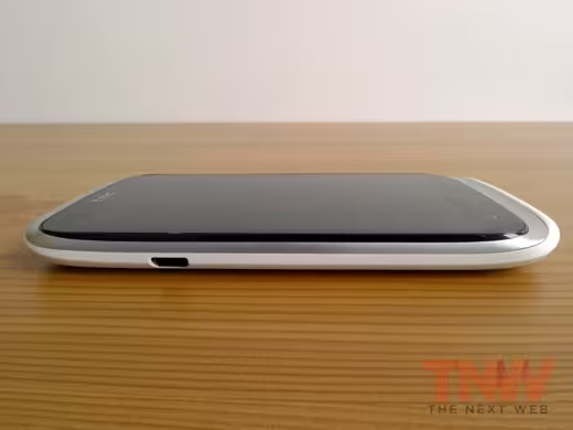
The One series of Android devices are thought, in general, to be pretty attractive in their design. It therefore comes as no surprise that the Desire X is a continuation of that theme, giving rise to a two-tone shell that can be easily taken off at the back. Together it all feels reasonably robust, and you can expect it to endure the odd drop and knock that everyone is occasionally prone to.
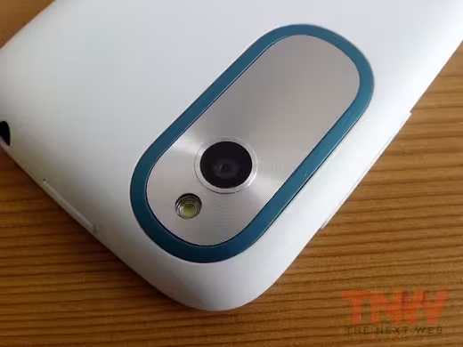
You might notice that the back of the device has a rather irksome new plate for the camera, ignoring the more subtle stylings pioneered by the One X. It’s unclear what inspired this decision, but coupled with both the HTC and Beats audio logo on the bottom, we think looks a bit messy on the back. Thankfully it’s a much better story elsewhere; the 5-megapixel camera is very capable and the lack of hardware input buttons (other than the power button and subtle volume rocker on the right-hand side) give the rest of the device a nicely curved, seamless look.
Software
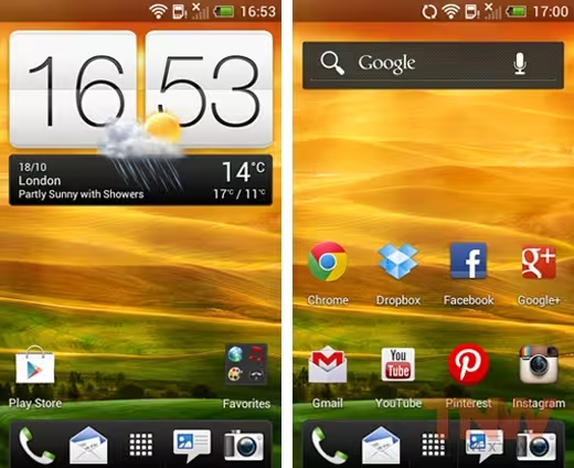
The Desire X unit that we tested came with the most recent version of Ice Cream Sandwich, version 4.0.4. It would have been nice to see it running on Jelly Bean, but perhaps owners will get that in an update later. Similar to the One series, the Desire X has been tweaked a little thanks to the HTC Sense interface, which has come under fire in the past for its bloated and unnecessary aesthetic tweaks.
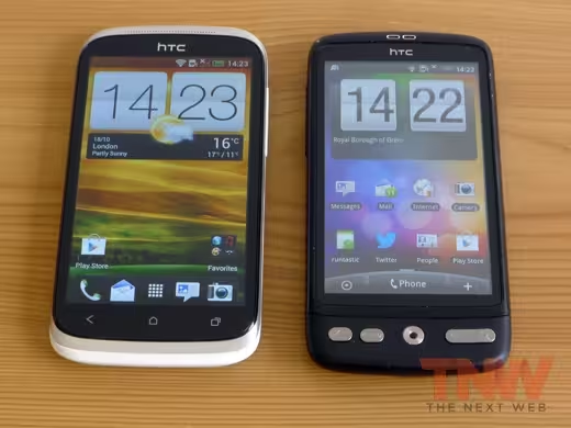
With version 4.1 of Sense though, you can expect the Desire X to be a much subtler, much smoother and much more, well, Android like device. We found that skimming across the different home screens was incredibly smooth, with menus vanishing and emerging with the slightest swipe. Unlike the rather bloated feel of the Desire S, the Desire X is much cleaner and minimalistic in its appearance. If you’ve chosen Samsung over HTC in the past because of the Sense interface now is the time to rethink your position; this is one of the lightest and most intelligent versions of Android that we’ve seen. Sense is still a long way from being perfect, but it definitely feels like HTC is moving in the right direction.
The Desire X, just like the One series, also has a tweaked keyboard to show off. The keys are noticeably larger than Google’s own offering, so you will find it a little bit easier to rattle through words without making hilarious spelling mistakes. It never feels truly innovative like Swype, but it’s a welcome improvement all the same.
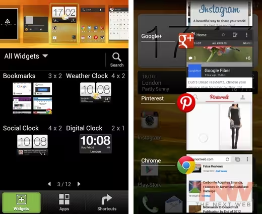
Anyone still using the original Desire will be taken aback not only by how the homescreen looks, but the way that it can now be tweaked and customized too. You may notice that rather than hitting the menu button (or the plus symbol on old versions of Sense), you simply touch and hold the home screen now. This brings up a window where either a widget, app or shortcut can be added to any of the five individual home screens at will. While we found it to be only fractionally faster than before, there are more options shown at any one time, making it much easier for you to compare and decide between individual widgets.
Unlike the HTC One X, our review unit also used the default app switcher that comes with Ice Cream Sandwich. This will be seen as an improvement to many who felt that HTC’s own incarnation, which resembled the tab-switcher in Windows 7, was nice to look at but ultimately a bit over the top. Perhaps it’ll be brought back in later incarnations of Sense, but for now we’re happy to see it left by the wayside.
Of course, because this is a new HTC smartphone it also has to have Beats audio integration. Once you enter HTC’s new Music Hub, which on its own is a clever little way of selecting different audio applications, you’ll notice the recognizable Beats logo in the menu bar at the top. The audio tweaking itself offers small improvements to most music genres, but by and large we felt it was pretty insignificant. No doubt a great feature for the marketing team though.
The Desire X also comes with 25GB of free Dropbox storage, which you can either ignore or use it to bump up your storage if you are already a user of the popular file synchronization service.
Camera
HTC has slapped a 5-megapixel camera on the Desire X, which is leagues above the rather woeful kit put in the original Desire. That is pretty much the standard amount of megapixels for a smartphone at the moment, although the device is also supported by some of the new sensor and interface tweaks found in the One series.
These tweaks really show when you’re shooting out in the field. For a start you may notice that the camera seems much more reactive to difficult lighting conditions, adjusting the white balance as you look to shoot outside or start to frame the skyline. There is still the occasional problem with getting the camera to focus for macro images and close objects, but we found the final results to be much better than before.
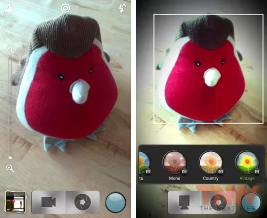
Unlike the One X though, it’s very difficult for us to recommend the Desire X as a professional photographer’s backup device. Low-light conditions seem to really wash out some of the images, and in general the contrast offered by the sensor leaves a little to be desired. If you’re a casual user that just uploads images to Facebook, Twitter and Google+ though, it’s a lot of fun. The instant filters such as vignette, country and vintage are very reminiscent of Instagram, and the ability to capture images while shooting video at the same time still feels quite remarkable.
Burst mode is also incredibly useful. Simply hold down the shutter release button and the camera will continue to capture photographs in millisecond intervals. Gone are the days of touching the display and waiting for the camera to slowly refocus, by which point the crucial moment has already passed. We found that the ability to review and save only the ‘best shot‘ from burst mode was also helpful if you’re ever running low on storage space.
The video mode is a little lacking on the Desire X. It shoots at 480p, which is enough for quick uploads to social media websites but useless for anything else these days. You will find all the same functionality from the camera mode, but it’s a significant step down in quality. The audio is serviceable, but also nowhere near other mid to high-end smartphones.
Photo Samples
Video Samples
Battery Life
The Desire X has a pretty decent 1650 mAh battery, which is also replaceable thanks to the removable back cover. After a full charge we managed roughly 8 hours of battery life on the first day, although this did increase substantially later in the week as we began to use the Desire X like we would our own smartphones (with a bit more restraint, basically).
Even while checking Twitter, Google+ and Instagram on a regular basis, as well as some lighter apps and keeping WiFi/cellular data services switched on, we found that the Desire X easily lasted a full day. This will no doubt vary depending on how hard you push the device on any given day, but as a rule you shouldn’t have to bring the charger into the office.
Of course, this will drop if you do a significant amount of web browsing or gaming on your smartphone. The robust battery life can be attributed not only to the decent milli ampere-hour battery, but the slightly smaller screen size and mid-range processing chip. It’s always a balancing act between performance and budget, but across the board we thihk the Desire X makes all the right choices.
Conclusions
The Desire X is another capable and sensible smartphone from HTC. It’s not the most powerful or the best looking device on the market, but for mid-level users it has pretty much everything you would want and need.
The good size and shape, as well as the fast processor and intelligent Sense user interface contribute to a handset which is pretty easy for us to recommend. There are a few issues here and there, such as the design for the flimsy back cover and the sometimes sub-standard camera, but it’s incredibly nippy and will take you through daily tasks such as reading email, social networking sites and the occasional YouTube video with minimal fuss.
The biggest problem, however, lies in its own existence. While it’s a fantastic device, it sits in the same space as the lowest handset in the One series, the One V. Both are aimed at low to mid-range users, and offer remarkably similar specifications out of the box. In some areas the Desire X actually surpasses the One V, placing it somewhere just below the more attractive One S.
Is there really a need for all of these devices? It’s clear that HTC wanted to capitalize on the Desire brand name, but it doesn’t do anything very new or different enough to really stand out from its siblings. Anyone looking to upgrade in the next few weeks will be perfectly happy with the Desire X, but perhaps it’s time HTC thought about dropping the brand name completely.
Get the TNW newsletter
Get the most important tech news in your inbox each week.

