Digital accessibility enables people with disabilities to independently use websites and technology.
Accessible design often focuses on people with vision or hearing disabilities. Designing for cognitive accessibility (COGA) rarely receives as much attention, but is equally important.
At first, COGA may feel too complex because of the wide range of cognitive disabilities. The medical terms may be overwhelming. Yes, accessible design can help people with dementia, Alzheimer’s, aphasia (loss of ability to understand and express speech), autism, attention-deficit/hyperactivity, dyslexia and dyscalculia (severe difficulty in making mathematical calculations) and more. But these same accessible designs can also help anyone use their mental energy more efficiently.
[Read: How to shake up your content creation strategy and boost engagement]
With so many types of cognitive disabilities, there are hundreds of site design modifications that can create a better user experience. Rather than attempting to modify a site for each medical cognitive condition, organizations could choose to focus on shared categories of challenges underlying these impairments: attention, memory, and processing speed.
Do you even have my attention?
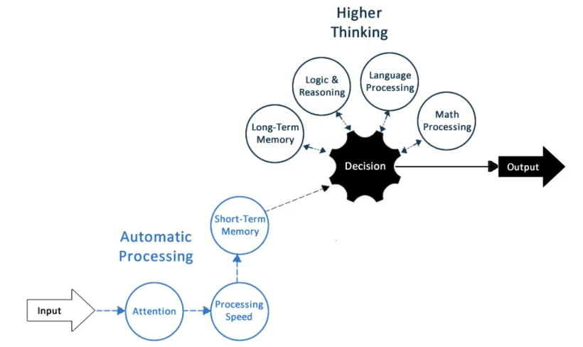
The diagram below shows how the brain processes information.
At the start of a website interaction, if a user’s attention is not captured, the user cannot proceed to the next steps.
Without attention, there is no information processing, authenticating, or making the decision to complete a transaction.
All of this makes attention — capturing, increasing, maintaining, and regaining it — so critical to the process.

There are many techniques that can be used to enhance attention, including:
- Pausable website carousels – these are multiple pieces of content which rotate across a single coveted space on a webpage. Carousels that are automatically moving content need the ability to be stopped once a particular image captures a visitor’s attention.
- Restart capabilities – they allow users to save their data and their place in forms and multi-step transactions, like ecommerce. This makes it easier for sites to regain customers’ attention in the event of a distraction.
- Retracing capabilities – this is a “go back” option which enables site visitors to easily return to recognizable points in their transaction or journey, so they can seamlessly pick up where they left off before becoming distracted. For example, a student in an online learning module needs to be able to go back and rewatch, reread, and rethink about a lesson as many times as necessary.
- Filtering – the ability to hide non-related content and later unhide it. For example, in an online learning platform, students should have the ability to turn off the chat feature while they are focused on a learning module (and then turn the chat back on when they are finished).
Relying less on short and long-term memory
Numerous studies have shown that the older people get, the less likely they are to shop online. Furthermore, a person’s ability to use websites effectively declines by 0.8% every year over the age of 25, according to Nielsen Norman Group.
This is based on the loss of short-and long-term memory that happens naturally as we age. Optimally designing for memory limitations will be especially important as the population ages. Some techniques include:
- User authentication – offer at least one alternative method that does not rely on a user to memorize character strings. These include options such as biometric methods (ex. fingertip sensor). In addition, don’t block copy/paste functionality from password manager software.
- Don’t hide important/frequent controls; also, show both the text and icon labels for controls making it easier for users to remember their purpose.
- Grouping content – In ecommerce, group similar items semantically and visually with a suggested maximum group size of five. This reduces reliance on memory when evaluating and making choices between similar items.
- Path markers – to remind site visitors where they are in a process.
Processing speed
Processing speed refers to the speed in which a person can understand and react to the information they receive, whether it be visual (letters and numbers), auditory (language), or movement.
Slower than normal processing speed is a common characteristic of many cognitive impairments.
Techniques used to accommodate slow processing speed are centered on the use of time limits.
[Read: Everything I wish I’d known before we rebuilt our product]
Websites should avoid setting time limits on transactions; or at a bare minimum, allow the user to have control over the time limits, including turning off, adjusting, or extending time limits.
In all instances where time limits exist, advance alerts should be provided when a time-out is about to happen.
In conclusion
Interestingly, the techniques described here will enable a better experience for people without disabilities as well, because everyone can experience similar challenges under different circumstances (attention can suffer when people are tired or hungry; memory can suffer when one is simply stressed or not feeling well).
Some might believe these techniques are just common sense usability. But that is false — if you have a focus and attention-related cognitive impairment (ADD/ADHD, depression/anxiety, or even recently had chemotherapy), these techniques are critical in enabling accessibility.
Effective COGA design is all about using mental energy wisely. Do not waste anyone’s cognitive effort on overly complex or distracting user interfaces. Help people efficiently use their minds to accomplish the goal that brought them to your site in the first place.
These recommended techniques are a solid place to start addressing COGA needs. Discover for yourself how good design is cognitively efficient design.
Get the TNW newsletter
Get the most important tech news in your inbox each week.


