
Hamish McNeill is the QA Manager at Realmac Software, a small, award-winning independent iOS and OS X development studio behind Clear, Ember and Rapidweaver. The original version of this article was published on the Realmac Software blog.
One of my favourite things to do with new apps is to check out and screenshot the first-run experience. After navigating any initial welcome screens, I go in search of empty states; views within the app typically devoid of content or data.
Essentially a blank slate, an empty state can be used to form the first impression made on a user. It’s the importance of these views that I find so interesting as they can often be a good indicator as to the level detail put in to building the app.
As you’ll see, empty views can often be far from empty.
Warm welcome

The 💜 of EU tech
The latest rumblings from the EU tech scene, a story from our wise ol' founder Boris, and some questionable AI art. It's free, every week, in your inbox. Sign up now!
It may just be the nature of a QA engineer, but I’ll openly admit that when using an app for the first time I’m incredibly skeptical of its quality until soundly proven otherwise. A good first impression goes a long way to pacify such doubts.
“First impressions are crucial. If you fail to design a thoughtful blank slate, you’ll create a negative (and false) impression of your application or service.”
– The Blank Slate, Getting Real by 37signals
It’s common courtesy to greet new users upon arrival, even a simple “Welcome to [App Name]” can help show a user they’re valued. However, it’s as important to decide what to say next:
Do any gestures which perform key functions in the app need to be introduced?
Is there ‘dummy’ content designed to be manipulated by the user?
Does the user need to be shown how to add content of their own?
Ensure the tone of the copy used in such first-run or welcome views is helpful and friendly, also take care not to appear condescending.
When showing helpful information to assist users in getting up and running, avoid overwhelming them with too much information on the first run. Don’t even think about pointing an arrow at a new feature just for the sake of highlighting the new.
Would new (or existing) users find this feature easily themselves? If so, then there might not be a need to annotate it.
Apple provide a good point of reference for gauging how much useful information should be shown to new users. Both iBooks and iTunes use similar first-run experiences on the Mac.
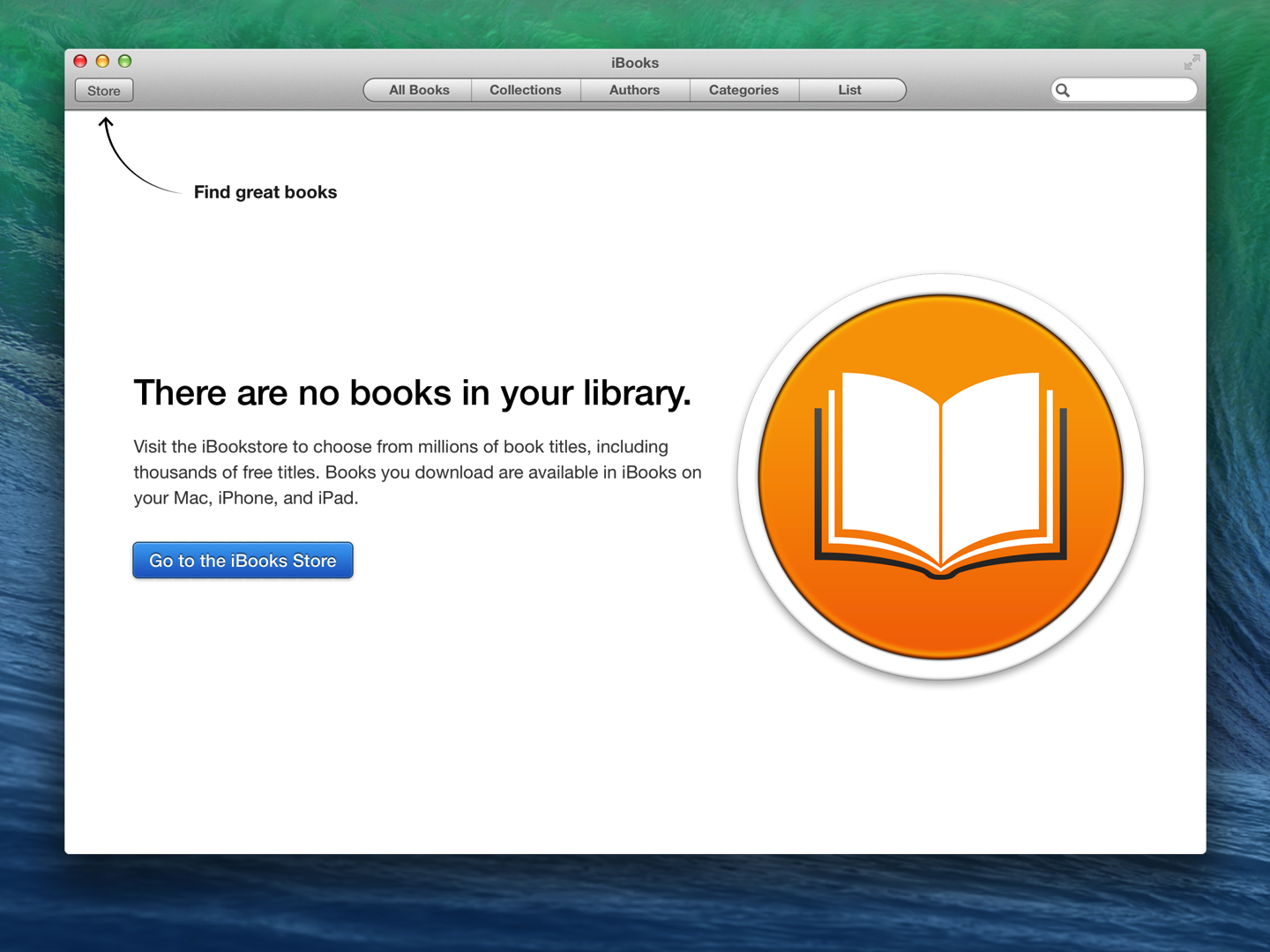
iBooks tells the user what’s missing from this view, boldly stating that they’ve no books in their library while clearly directing them how to add content. Users are directed to the iBooks Store not only by showing an arrow that highlights the Store button but also by having a dedicated call to action button within the empty view itself.
While iTunes similarly channels users into adding (or purchasing) content, Apple also show the user an iTunes product-shot, filled with content, essentially showing the regular state of the app.
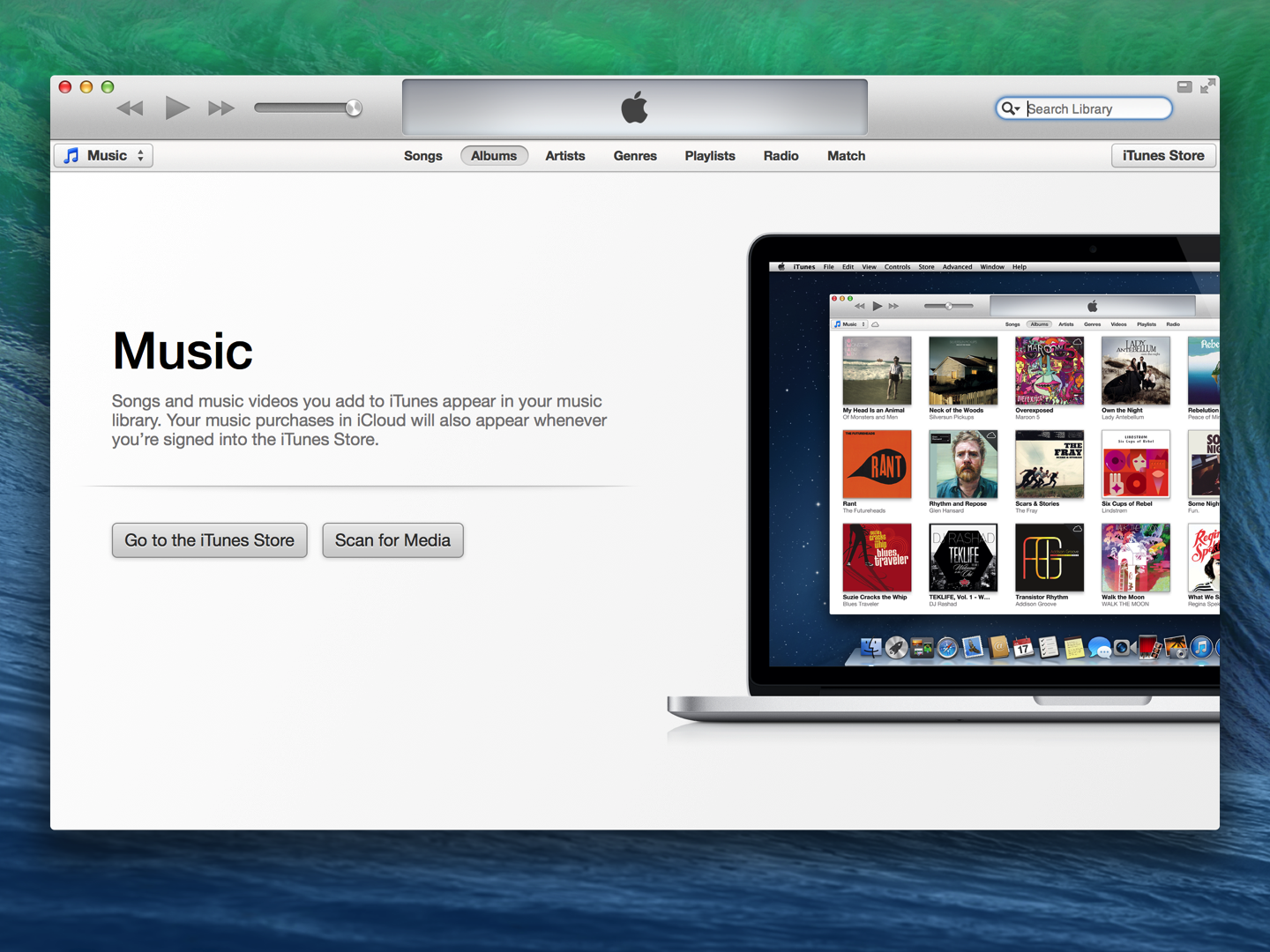
What’s presented here is actually an uncluttered, ideal, view of how their library may look, set upon a backdrop of what is probably a clean install of OS X.
Being able to make a potentially complex app like iTunes appear both beautiful and simple within the first-run experience only serves to encourage users to follow the suggested steps and begin using the app in earnest.
Inbox Zero
While many empty states guide users in performing actions to create and add content, this isn’t suitable for every scenario.
A great example of this is Inbox Zero, perhaps the most well known of empty states. Inbox Zero is essentially a view from which a user has removed, cleared or dealt with all previous content (email being the usual suspect here).
Such views are often designed to be rewarding and rightly so for users may aim (and often struggle) to reach this point within the app on a regular basis.
For example, the user of a fitness app has just completed a list comprising of their daily exercise routine. What should the fitness app do or suggest within the empty list-view now?
It’s probably not a good idea to suggest adding more (or creating new) exercises here. A more helpful suggestion would be to congratulate the user on their impressive workout while showing an option to add a reminder, encouraging the user to plan their next training session.
This behaviour may help the user get on with another task while encouraging use of the app in the longer term, instead of being a plea for constant, prolonged use in the immediate-term.
While I’ll leave covering regular Inbox Zero type views in more detail for a future post, it’s worth keeping in mind areas on an app that may not be viewed quite so often.
Discover
Like with first-runs I enjoy exploring apps for other empty, explanatory views or features that I might not know in detail. Again, Apple allows users to discover even more apps via the ‘Near Me’ section within the App Store that also features a great empty state.
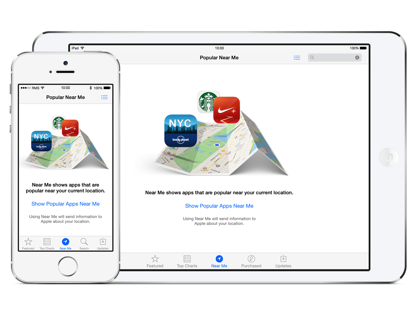
The initial Near Me view is not only visually appealing, with a clean graphic that illustrates its obvious use, but also displays a concise description, an unobtrusive call to action button, and finally a privacy note to the user that using this feature will send information to Apple about their location. All this information is shown clearly within a single view.
Again, another great example is set for concisely display potentially complex information to the user in a friendly, personal manner.
No dead ends
Taking time to help users discover new features within an app is great but it’s also worth ensuring users aren’t led to a point at which they appear to hit a dead end.
Dead ends may not only be a completely empty view but another part of the UI that perhaps doesn’t perform an appropriate function. Some examples of this may be a blank list view with no suggestion as to add content, or even a button that has no effect within the current view that should really be disabled instead.
Error views are an example of where many users may expect to hit a dead end. Errors are actually great opportunity to create positive experience within an app out of a potentially negative situation. Any error is probably shown as a result of something going wrong.
I like to see apps clearly disclose to the user easy to understand information as to what went wrong and how they get back on track.
Pro Tip: Look at tracking the error pages (such as 404s) on your site. Being able to see what a user was requesting when they were greeted with an error allows you to redirect common URL typos and searches to help reduce the number of avoidable error pages being served.
The error view on the webpage below not only reassures the user that their data is safe, but also clearly directs the user to the appropriate channels should the wish to seek further help. This page is far from being a dead end.
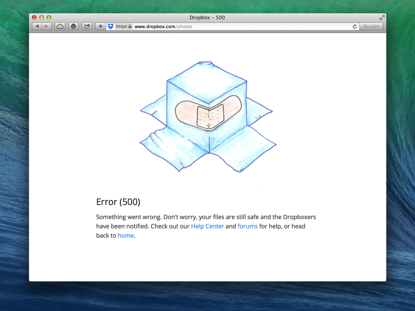
Even if “Dropbox” wasn’t mentioned anywhere in the image above, the error is still instantly recognizable as its own.
Dropbox consistently show similar illustrations in views across its products, helping to create a relaxed and friendly experience that’s particularly important when dealing with an error or scenario requiring further support.
Personality
While using a consistent approach in empty views across devices or platforms can help develop an app’s brand or personality, consider whether an empty view needs to be the same on different devices.
In Ember for Mac we show some beautiful illustrations within our empty views but when building Ember for iOS, we chose not to include any illustrations, similar or otherwise, as we were building an app specifically for iOS 7 which places a great emphasis on simplicity and text, in particular.
Don’t be afraid to be different. Empty views are a blank canvas after all and provide a great opportunity to do something fun or inspiring. Be unique.
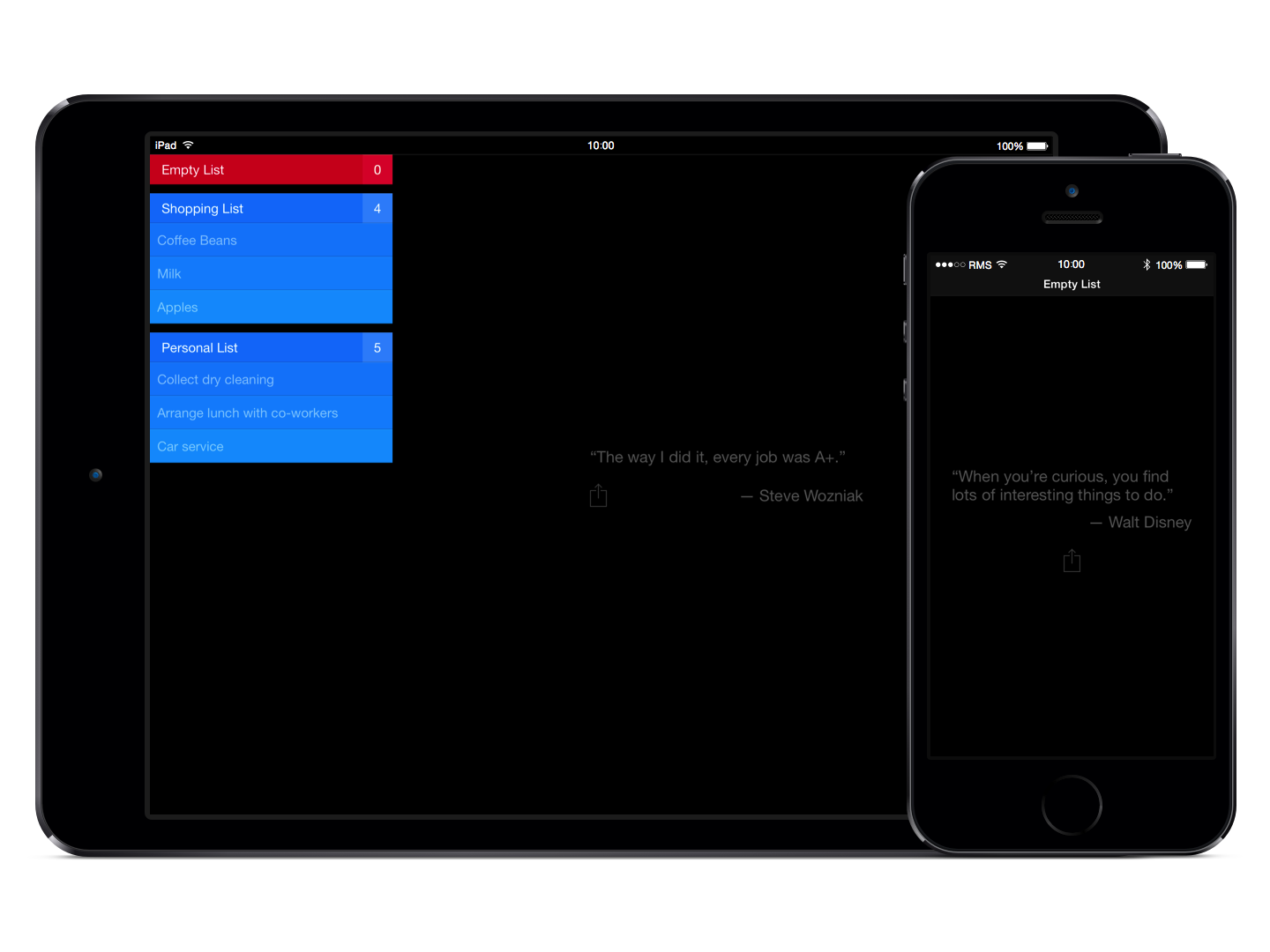
Clear takes the opportunity to show users inspirational quotes. The typical use-case when an empty list-view is shown is where a user has cleared some aspirational to-dos or completed some work-related tasks.
A quote is then shown after all tasks have been cleared that aims to inspire user to do more, not necessarily within the app itself but in the users daily life.
Lastly, it’s worth allowing additional time to test these empty views before shipping, especially if an empty view was added as an after-through or late in the project.
Ensure localised copy is displayed consistently throughout while handling all appropriate cases where pluralisations occur, particularly in error strings that may be presented to the user.
The areas I’ve touched upon in this post are all contributing factors towards the perceived quality and user experience of an app. Hopefully, you’ve already given careful consideration to such areas or have been reminded to do so now.
If you’d like to check out what other apps are doing in their empty states be sure to check out both the Empty States and Little Big Details blogs. If you’ve any questions or comments relating to this post, I’d love to hear them. Feel free to reach me on Twitter.
Image credit: Shutterstock/ronstik
Get the TNW newsletter
Get the most important tech news in your inbox each week.