Jerry Cao is a UX content strategist at UXPin — the wireframing and prototyping app. To learn more about design collaboration without the pain of committees, download the free e-book Design Collaboration in the Enterprise: Mastering the Early Design Stages.
The waterfall model of design may have worked during the birth of the digital era, but our industry has certainly outgrown the linear product development process.
Today, more and more companies are abandoning the obsolete waterfall model in favor of Lean and Agile UX methodologies. These more modern approaches value and incorporate collaboration: the first time the developer sets eyes on the project shouldn’t be when they begin coding; the copywriter shouldn’t add text only after the layout design is finalized, etc.
Photo credit: Creative Commons. Creative Commons 2.0.
In this piece, we’ll discuss how to implement collaboration in the earliest planning stages of the design process. We’ll provide advice on conducting user interviews, stakeholder interviews, analyzing data, and then mention how the affinity diagrams (the KJ technique) can tie it all together.
Collaboration in User Interviews
User interviews can go in countless directions depending on the setup (group or individual), location (on-site or contextual), and strategy (the types of questions you ask). While the more technical options will be determined based on your specific needs, it’s the strategy – the methods for the actual interview – that are enhanced by collaboration.
Source: Cacoo
1. Collaborating with users with contextual interviews
As we described in The Guide to Usability Testing, we always recommend collaborating with users for research. For starters, user interviews can produce more honest and unguarded feedback since there can be too many social-psychological factors at play in focus groups that add bias and skew the responses.
Going a step further, contextual interviews – interviews that occur in your user’s natural settings, such as their home or office – are even more fruitful because you’re able to see and discuss how the user engages with their surroundings to accomplish tasks. Bringing users to an external environment (even a conference room) can introduce variables that, however slight, may affect their thoughts and feelings, which of course affects their responses.
In addition to the user being more relaxed and confident, contextual interviews provide information about your user that otherwise goes unnoticed. Playing a bit of detective while you’re in your users’ home or office helps reveal:
- Technological preferences – Mac or PC? iOS or Android? Feel free to ask them why they prefer one over the other.
- Technological proficiency – Seeing them actually interact with technology goes a lot further than merely asking them about it. People tend to be inaccurate when asked about this – whether from pride, humility, or just unawareness – but seeing it firsthand will give you a solid answer.
- Personal quirks – How a person decorates their environments says a lot about them. Pay attention to what they keep nearby (whiteboard or sketchpad, for example) and clues to their personal interests (for persona creation).
- Organization – The general state of cleanliness will tell you the user’s organizational skills and preferences. This will go a long way in designing your ideal interface and user organizational menus.
- Unmet needs – Does your user have any “quick reference” bits of paper or links lying around? Maybe makeshift reminders because whatever’s in the existing system isn’t enough? These are gold for a designer in inspiring new features and sometimes even new products.
- Daily life – What external circumstances interfere with your user’s daily life, and how frequently? Knowing that your product must contend for your user’s attention with children, chatty coworkers, outdoor noises, etc., you can sometimes design ways to minimize or avoid such distractions.
When you go on-site, follow the Master-Apprentice Model. Pretend that you are the apprentice who is consulting with the master to learn their mentality, methods, and secrets. Remember that you’re there to watch and listen, not to dictate better ways of doing work.
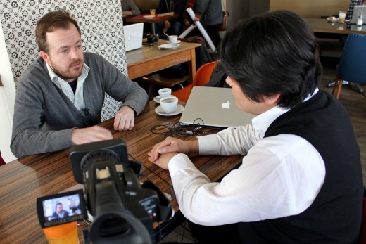
Source: “Expert Interview – Ruth Benny.” Nicholas Wang. Creative Commons 2.0.
Now that we’ve examined how you can take advantage of user environments for collaborative research, let’s examine how you can involve the rest of your team.
2. Collaborating with your team on user interviews
In an ideal world, you’d be able to bring the entire team onsite to observe (and even participate) in contextual interviews. But that’s quite rare in today’s world of distributed teams and creeping deadlines.
Luckily, you can still set yourself up for better interviews by planning with your team beforehand. For instance, you’ll certainly want to decide the strategy of the interview, specifically the questions being asked.
Before beginning user interviews, try holding a team meeting with every relevant member. Ask them what they’d like to know about the target user. Identify the glaring knowledge gaps, then start creating a rough draft of interview questions.
As we mentioned in Design Collaboration for Enterprises, not every suggestion will be usable, but you will certainly gain new insights and perspectives. New questions can lead to more thorough data, and the varied perspectives of product managers, developers, and marketers unearth questions you may not have thought of alone.
When UXPin first moved to the United States around 2012 to build our web app, we conducted over 50 user interviews. We talked to everyone ranging from designer friends to well-known experts like Brandon Schauer of Adaptive Path. We met at their offices, at coffee shops, in their own apartments – anywhere that put us closer to the user.
Source: “2014-04-30 17.09.22.” Nicholas Wang. Creative Commons.
Considering that interviews made up most of our customer development process, we had to ask the right questions. We sat down with the marketing and development leads, then spent almost an entire day discussing knowledge gaps. When the first session was finished, the design team reconvened to draft a list of roughly 20 questions. Once the list was done, we spent another 2-3 hours with everyone polishing the questions before we were ready.
During the interviews, we always brought along at least one marketer or developer. We also brought existing sketches and documentation so that users could react to something, making the session more collaborative.
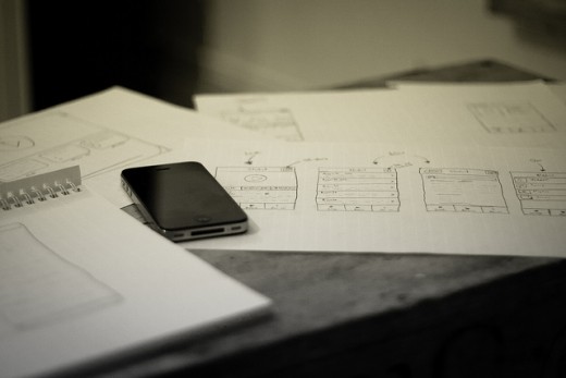
Photo credits: “App sketching”. Johan Larsson. Creative Commons.
As we just described, always try to invite other team members. For example, another designer or researcher can help take notes while you focus on follow-up questions. In the best case scenario, you’ll also be accompanied by team members from other departments – we highly recommend sparing some time for developers to observe the interview.
If you choose to have more than one representative at the meeting, you must follow one essential rule: one person should take charge. This means doing most of the talking and interviewing, but that’s not to say the observers must sit in silence. They can certainly chime in, but the interview lead should have the authority to steer the conversation should follow-up questions go off-track.
3. User Interview Best Practices
Once you have the parameters set, it’s time to focus on the actual interview itself. All the preparation aside, it’s how your team presents itself in the interview that determines the data quality. Below are some guidelines that we tell our own teams to make the most out of of the interviews.
- Memorize the questions beforehand – Constantly checking the list of questions will slow the momentum of the interview, and distract you from observing some key environmental clues. Memorizing the questions beforehand gives you one less thing to worry about, and makes the dialogue more conversational.
- Use open-ended questions – In other words, avoid yes-or-no questions. Open-ended questions urges your interviewees to think critically about their answers and give more insight than confirming or rejecting your initial biases.
- Pause after asking – Silence after your question will signal to your interviewee that you’re expecting their answer, and will avoid accidentally influencing them with suggestive follow-ups. It’s human nature to avoid silence by talking more, but fight that instinct or risk “leading” your users’ responses.
- Don’t just ask about emotions – Your data on motivations will be more accurate if you analyze user behaviors instead of feelings. Your interviewees are likely strangers, so they won’t be completely honest about their emotions. Stay on specifics, what they did or will do, rather than only how it makes them feel.
For further user interview best practices, Erika Hall gives her advice in this article for A List Apart, including general guidelines and sample questions.
Stakeholder Interviews
Just like user interviews help you understand the target audience, stakeholder interviews help you understand the business requirements. The idea and motivations behind both kinds of interviews are the same – but the application is different.
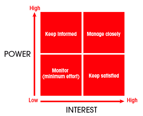
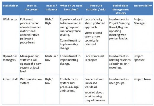
Source: Stakeholder Matrix
Some people prefer to hold their stakeholder interviews after the kickoff meeting, but we advise against this. In our experience, revealing all of your stakeholders’ goals and expectations early on will prevent last-minute surprises, ensuring you start and end the project on the right path.
While user interviews are best conducted one-on-one, for stakeholder interviews it’s quite common to have multiple team members present. You don’t want to overwhelm the stakeholders by inviting every member of your team, but you can include all the department heads, plus a few lower-level extras who need a lot of answers.
Like we recommended in Design Collaboration for Enterprises, it’s not as important that everyone is present at the meeting, so much as everyone is represented.
As with user interviews, hold an internal meeting beforehand and ask your team what they’d like to know from the stakeholders. Gather questions, concerns, and ideas from all the team members, and relay the most useful ones during the meeting. This is the best way to ensure nothing slips through the cracks.
Source: CX Journey
As far as how to conduct the meeting, remember that, just like user interviews, it needs to feel like a conversation – not an interrogation.
Here’s a few tips:
- One team member should lead the discussion at a time – It also helps to select one person as the official scribe, although you should certainly encourage everyone to take their own notes. As the topics change, it also makes sense to shift the interviewer accordingly. For example, if you’re talking about technical constraints, it makes more sense to hand the reins over to the lead developer.
- Focus more on problems, not solutions – Set aside around 45-60 minutes per stakeholder, then make sure you keep an ear out any time someone starts rattling off a long list of “must-haves” or “nice-to-haves.” Hear them out, but then ask follow up questions to dig up the root problem.
- Get inside their heads – Ask directly what the stakeholders want the product to accomplish, and what their criteria for success is – their answer will have a direct impact on the subsequent kickoff meeting discussions. While these aren’t the only questions to bring up, these are a good start towards questions focused on goals and objectives instead of solutions.
Just as important, ask stakeholders what risks might cause the project to fail.
In all likelihood, this question has been on the stakeholder’s mind, but not on their tongue. Get them to admit their fears – as early as possible – so you and your team can be on the look out and prevent them from derailing the entire project. If they’re apprehensive about answering (for obvious reasons), assure them that the conversation is “off the record.”
That security will yield honest answers, and you’ll at least be aware of the threats even if you can’t disclose the source.
Obviously, you’ll need to alter your strategy to the type of stakeholder. In her book Designing for the Digital Age, Kim Goodwin outlines the different types of stakeholders and how to approach them. The below guidelines are tremendously helpful for each department:
Marketing Stakeholder — brand promoters looking for new, viable markets.
Engineering Stakeholder — design engineer, system architect, or GUI, if applicable. For hardware, heads of manufacturing and electrical or mechanical engineering.
Sales Stakeholder — in addition to a marketing head, it’s advisable to talk to a sales head, as the two often have different goals.
Executives and SMEs — the decision-makers with authority over the different branches.
Goodwin compiles all the need-to-know information in this quick-reference checklist — be sure to look it over before your next stakeholder meeting.
Incorporate Different Types of Data
In the vein of collaboration among team members, your data will greatly benefit if it’s drawn from multiple types of sources. So far, we’ve discussed methods for collecting qualitative data, such as user interviews. But quantitative data – such as click tests, analytics, and A/B tests – is just as important.
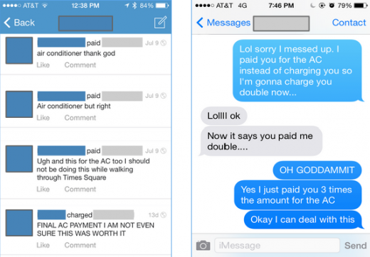
Combined with proper team communication, quantitative research and data can save a failing project or fix a critical mistake. This is exactly what happened to Venmo, a money-exchanging app with a curious problem. While they used data to fix a critical design error, their collaborative approach certainly applies to the pre-kickoff phase.
Source: A case study on how Venmo uses Looker to make product and design decisions
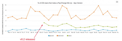
Monitoring the customer service feed (research data in itself), the support team noticed an increase in users accidentally paying when they wanted to charge. They immediately notified the product team, who then collaborated with the data team to interpret the metrics.
By diving into business analytics in Looker, the teams pinpointed the start of the trouble to a recent interface update. Within a month, the product team released a revamped interface (v. 6.2), and the data team then confirmed that error reports sharply declined.
Source: A case study on how Venmo uses Looker to make product and design decisions
The moral of the story is that, by treating data as a collaborative tool rather than an elixir, product teams can iterate more quickly and more accurately – regardless of whether they’re planning features or fixing them.
Like Venmo demonstrated, share the results with the entire team. Don’t keep the insights to yourself. Everyone on the team benefits from the fruits of your research, whether you think it’s in their department or not.
Here at UXPin, whenever we’re doing our quarterly collaborative planning sessions, we’re preparing data (raw and interpreted decks) to help the whole team understand the full context of new feature ideas. That’s an essential step in the design process. The team is composed of individuals each making critical decisions within their fields, and each choice should be as well-informed as possible.
We also draw our data from different sources. We look at Kissmetrics (user behaviour), our own database (financials and business data), Desk (customer service data) and qualitative data (customer interviews). We’ve found this triangulation of the data types gives us a wide blanket of understanding, with the fewest blind spots.
Affinity Diagrams: The KJ Technique
User interviews and stakeholder interviews provide enough feedback to get started. An analytics review and data analysis helps to validate these initial findings.
After qualitative and quantitative analysis, you probably have a rough idea of what features to build and design. But how can you prioritize them efficiently?
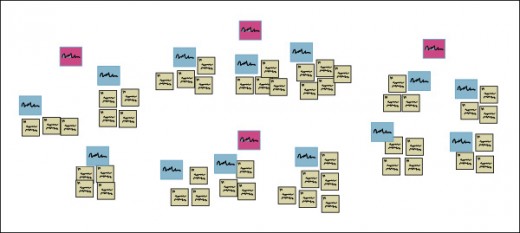
In the 60s, Japanese ethnogeography professor Jiro Kawakita created the Affinity Diagram, also known as the KJ Method or KJ Technique, in order to organize and analyze large groups of data. As a team activity, creating an affinity diagram ensures everyone understands the correct feature prioritization.
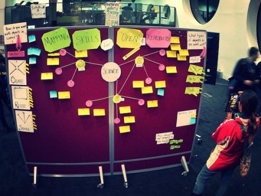
Source: “Affinity Diagramming 2.” d_jan. Creative Commons.
While companies commonly personalize the technique with their own modifications, in general it process follows these core steps:
Focus the activity around a singular goal or question – Basically, you must first agree on what issue you’d like the affinity diagram to help with. In the context of pre-design planning, this could be what elements you’d like the product to have.
Write ideas on sticky notes – Write down each idea on a sticky note or index card. These should remain simple and not go into too much detail. Continuing the example of product elements, these ideas could be features you’d like to implement, stylistic choices, or issues from user research that need to be addressed. Afterwards, place the cards on a wall.
Sort the cards into groups – Look for similarities in the cards and sort them into groups. The most important part of this step is that no one talks during it. The silence while sorting will ensure that the cards are organized into groups organically, and that no one person dominates the process.
Name each group – Give each group a title to properly categorize them. Now you know which department each idea falls under.
Vote on the most important elements in the groups – Optionally, you may want to start prioritizing ideas while you have everyone together. Within each category, democratically decide the priority list for each element. If you’re conducting a large affinity diagram, feel free to toss out the least important categories. If you’ve decided that “Improving Collaboration” is an important group, then now is when you’d decide if “Make comments editable” or “Auto-email daily project summaries” is more important.
The affinity diagram is a tried-and-true method of organization for helping you and your team make sense of the wealth of data available to you. In a way, it is one of the greatest gestures of collaboration, as everyone comes together to suggest the project’s priorities.
Of course, this exercise is meant to help capture as many insights as possible, not to command the product direction. In order to avoid product design by committee, we still advise letting the product team to make the final call. The KJ method simply ensures they leverage other teams’ expertise for better informed decisions.
To learn more about running a KJ workshop for UX purposes, we highly recommend Jared Spool’s insightful piece based on his experience.
Takeaway
Collaboration begins well before the design process.
Incorporating teamwork right from the start will build team unity throughout the entire process – and you’ll be glad its there when you come to the trouble points along the process. Get your team’s input before user interviews, and stakeholder meetings, and share your findings with everyone what the data is analyzed. Involving everyone in a prioritization activity like creating affinity diagrams also gives everyone a voice for better informed products.
For more advice on collaboration without compromise, download the free e-book Design Collaboration in the Enterprise: Mastering Early Design Stages. Learn the techniques for building collaboration into your existing processes based on best practices from top companies like Amazon, Hubspot, and Venmo.
Get the TNW newsletter
Get the most important tech news in your inbox each week.
