Just like the tech scene, the design industry has plenty of buzzwords that begin as meaningful terms, and end up becoming so misused that they ultimately lose purpose. The term branding is just about at that point, where it has mistakenly been used to describe a simple logo design instead of a comprehensive identity or multifaceted personality (think: logo, tagline, graphics, shapes, colors, etc) for your company.
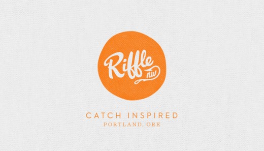
With this in mind, I recently came across Hovercraft, a “multi-disciplinary design studio” based out of Portland, OR, and its work with a local restaurant by the name of Riffle NW.
At first look, upon loading the project page through Behance, you’ll see a simple circular logo and tagline, but as you move through the entire job, it unfolds into something much more complex.
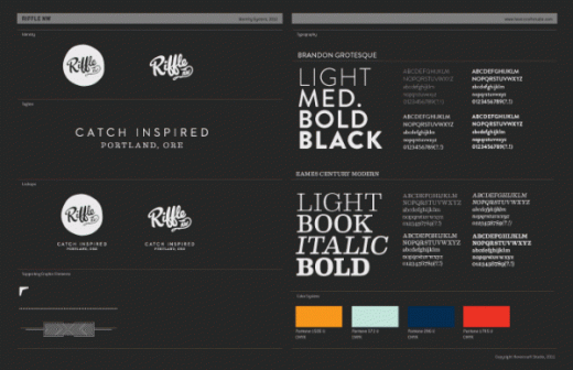
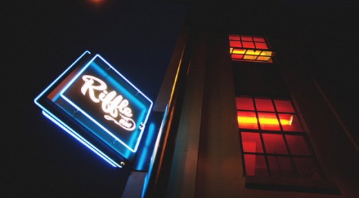
The thing is, comprehensive brands are everywhere, but the way this one was only just recently created from scratch, but still manages to feel timeless, classy and original, makes Hovercraft‘s work a great example of branding done right.
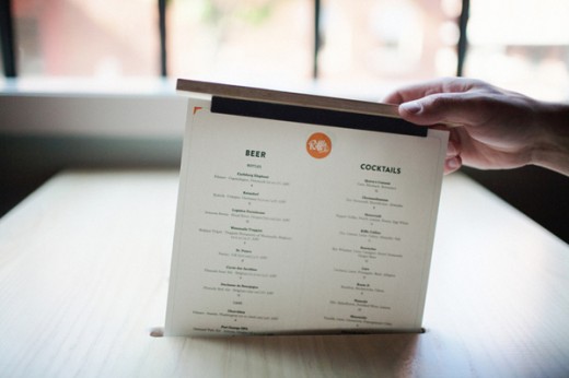
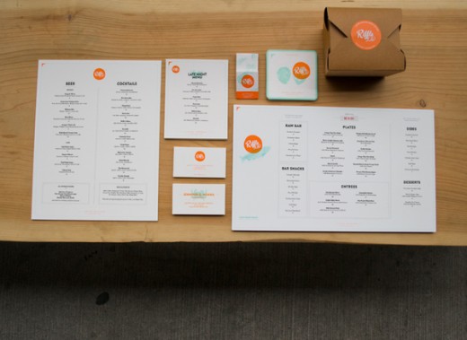
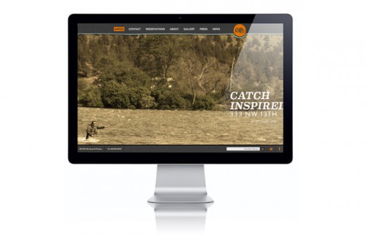
See everything via the link below:
Get the TNW newsletter
Get the most important tech news in your inbox each week.
