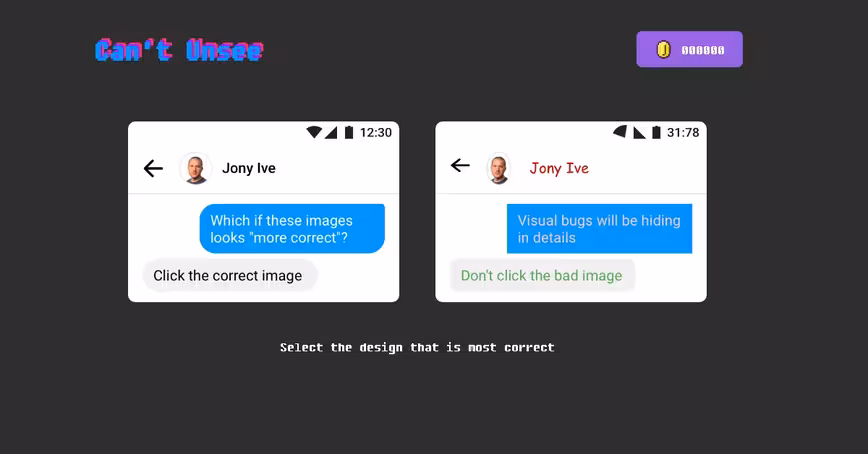
If you’ve never thought about how much design work goes into even the tiniest parts of a UI, then you can now play a game which will enlighten you on the subject.
The game is called “Can’t Unsee” and it challenges the player to choose between two different pictures of the same design element. One is the “correct,” or more aesthetically pleasing option, while the other is off in some way.
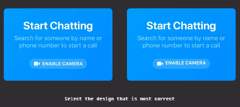
It’s basically a spot-the-difference puzzle, only the minute changes aren’t “things out of place,” but the difference between good and bad UI design. And get ready to squint, because some of these differences are insanely difficult to pinpoint. You have to examine every element on the screen, even that which you’d never focus on, very carefully.
The game is divided into “Easy,” “Medium,” and “Hard” sections, though a few of the “easy” ones are way harder than they have any right to be, and a few of the rare obvious differences made it into the “hard” section.
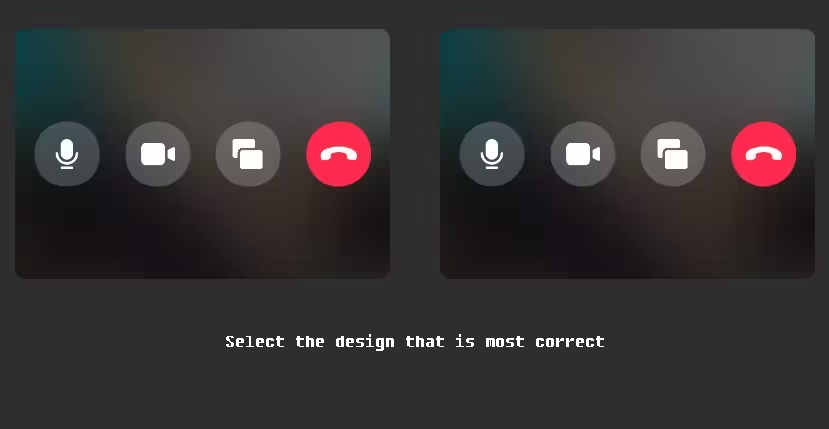
After you’ve made your choice, the two cards are laid, one over the other, and you can click the compare button to rapidly flip between both of them. It really isn’t until you see them in succession like this that the often-tiny differences become apparent. Of course, like the title says, once you see them, you absolutely can’t unsee them.
I opened up the game after my editor showed it to me (and maybe tacitly fired up my competitive nature by implying it was hard) and, a couple of questions in, made the mistake of muttering to myself, “Nah, this isn’t so hard.”
Thirty seconds later, my strained eyes were cursing me.
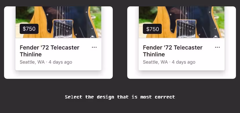
The game was conceived by Alex Kotliarskyi, while the designs come from Amanda Hum. According to Twitter and LinkedIn, both currently work for Facebook as a software engineer and product designer, respectively. That might explain why several of the design choices look like they’re based around social media posts.
Some players on Twitter have protested that some of the design choices are a matter of convention or preference, rather than actual rules of design. In particular, this choice about a skip button color seems to be a bit controversial:
https://twitter.com/empatogen/status/1092661889916637184
So don’t feel bad if you pick one as a matter of preference and it ends up being “wrong.” If nothing else, this game does bring attention to just how much work goes into the tiniest details, the ones that most visitors would never pay attention to.
You can check the game out here. Let me know how you score.
Get the TNW newsletter
Get the most important tech news in your inbox each week.