Jordan Roland is a staff designer and illustrator for the Shutterstock blog. This post was originally published on the Shutterstock blog and has been reprinted with permission.
There are a few types of projects that most, if not all, designers will jump at the chance to work on. At the top of that list is album art (which, even in physical form, is still a thing). When done well, an album cover allows you to take one form of art (music), and reinterpret it as another form (visual).
For this tutorial, I’ll provide a few of the techniques used to create the sample piece below in Photoshop CC. Think of these as guidelines for using certain tools to get a specific style — they can also apply to work incorporating photos, text, textures or just about anything else.

Step 1
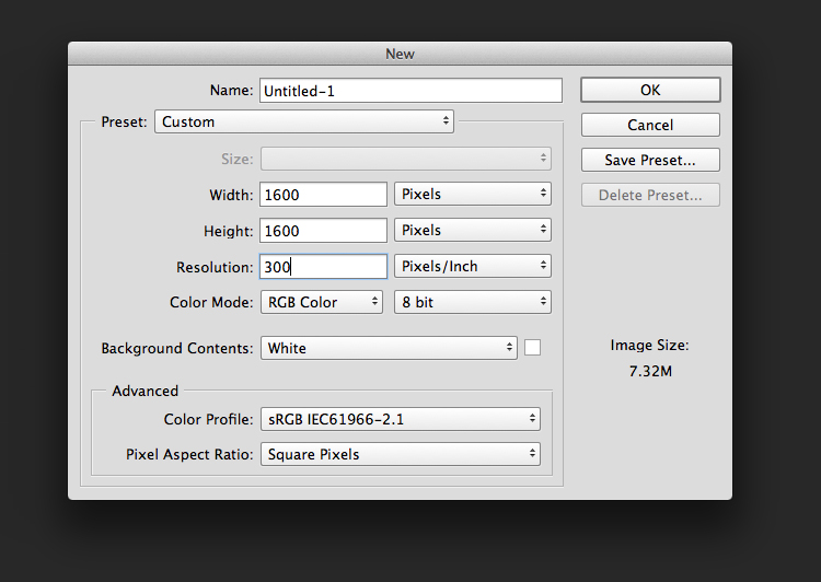
Set your file up as a 1600 x 1600 pixel square at 300 dpi. Remember to keep the square proportions, and always work at 300 dpi or higher — this will make it suitable for print, and digital music distributors will resize your files according to their own specs. You can always save multiple versions at different lower sizes, but you can never resize up, so be sure to keep that in mind.
Step 2
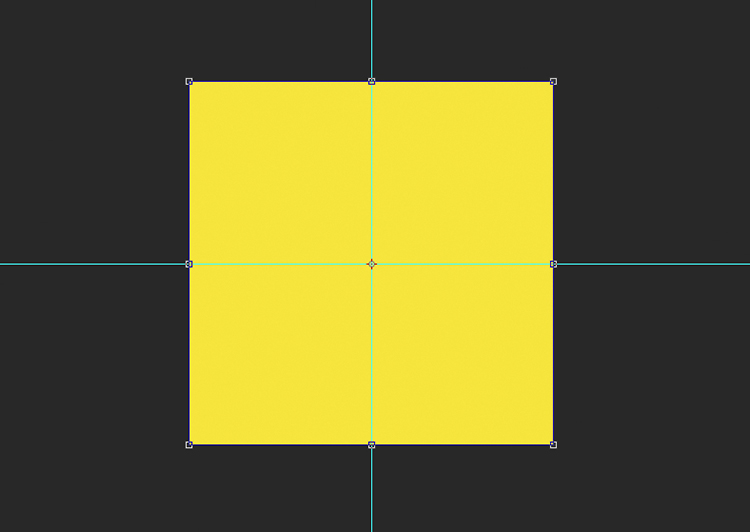
Fill the document with a background color using the paint bucket tool (G). Creating a bright background will help the imagery pop, as well as adding a vibrant feel. You always want to build your piece from the base up, so whatever color or image you pick for your background, it will influence the choices you make as you continue to add elements.
 We’re going to be using a lot of basic shape alignments and symmetry here, so it’s smart to set your guides to divide the art board into four equal squares. This helps ensure that everything is aligned and exact.
Step 3
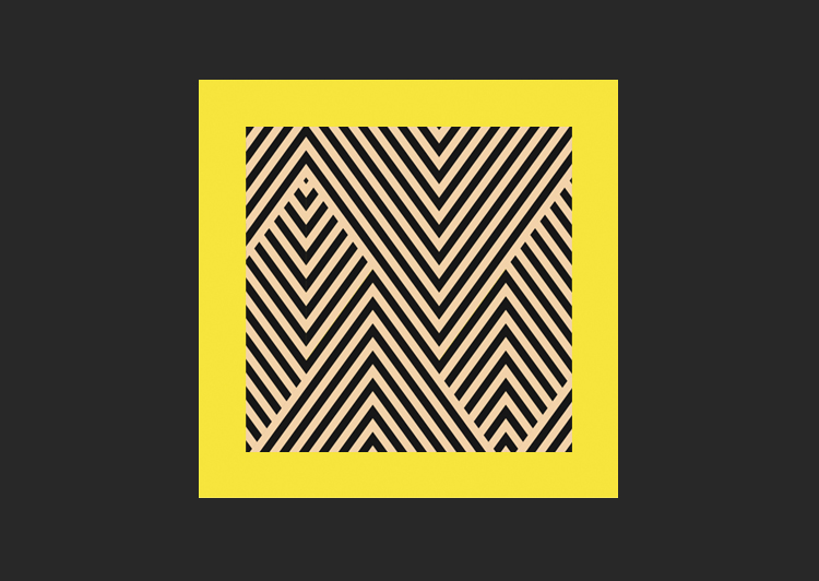
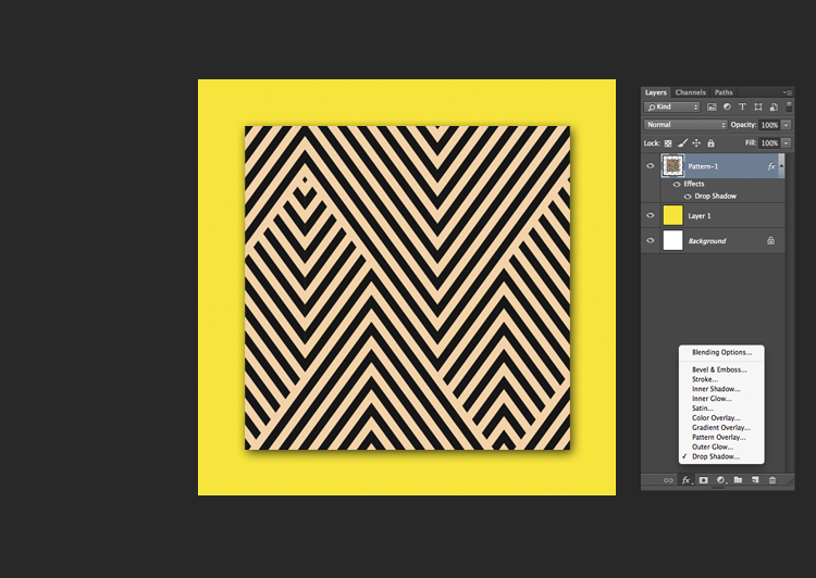
Add your next layer on top of the background. For this piece, I downloaded Shutterstock image 162361568. Center the art in the middle of your document.
Step 4
Add a drop shadow to the art by double clicking the fx icon at the bottom of your layers palette. Go to Drop Shadow and set your opacity to 75 percent and your angle to 120 degrees. As you can see, there are other options in the fx menu too — test out some of these other features, like bevels and strokes to see how they affect your composition. Have fun when you’re working on this. I’ve discovered a number of great tools by just clicking on something I’ve never tried and seeing what it does.
Step 5
Duplicate the art layer by hitting Command+J, then use the transform tool (Command+T) to rotate the new square.
Step 6
This is where things get fun with color choices. We’re going to import some images of liquid from a lava lamp and give them a more psychedelic color palette to help our cover pop more. First, however, we need to separate the lava from the background.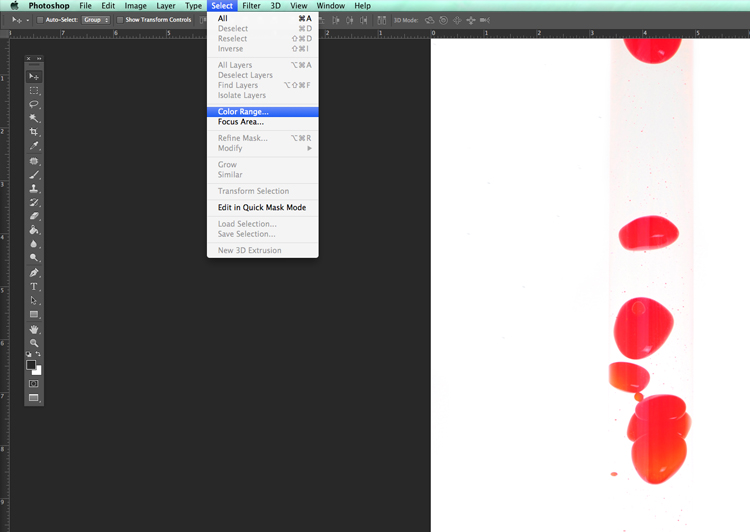 I used Shutterstock image 147333596, because its solid background makes easy to separate the art. Open your file, and go to Select > Color Range. When the Color Range box appears, click on the white of the document, adjust your fuzziness to 140, and click OK.
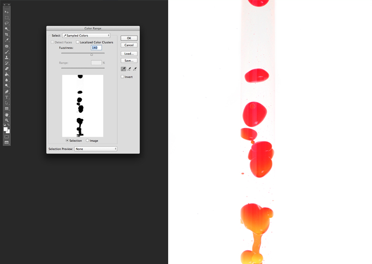 This will select all of the white in the document, but we want the lava droplets. Hit Shift+Command+I to select the inverse instead, which will be the droplets. Then hit Command+J to copy them onto a new layer.

Step 7
Hide the bottom layer and you should see your droplets separated from the white background. From here, you can use the lasso tool (L) to draw around the ones you want to use.
Note: This method can also be applied to silk screening. If you have any piece of art that needs color separations, this selection method can help you select and subtract colors from the piece. You can also select certain colors and make a new layer with them, so that you can prep your files for each color you want to print.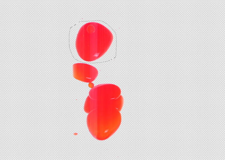
Step 8
Drag your selected lava lamp droplets (or other selected imagery of your choice) into the album-cover file. Now we’ll start playing with the colors to give this a more psychedelic look and feel.
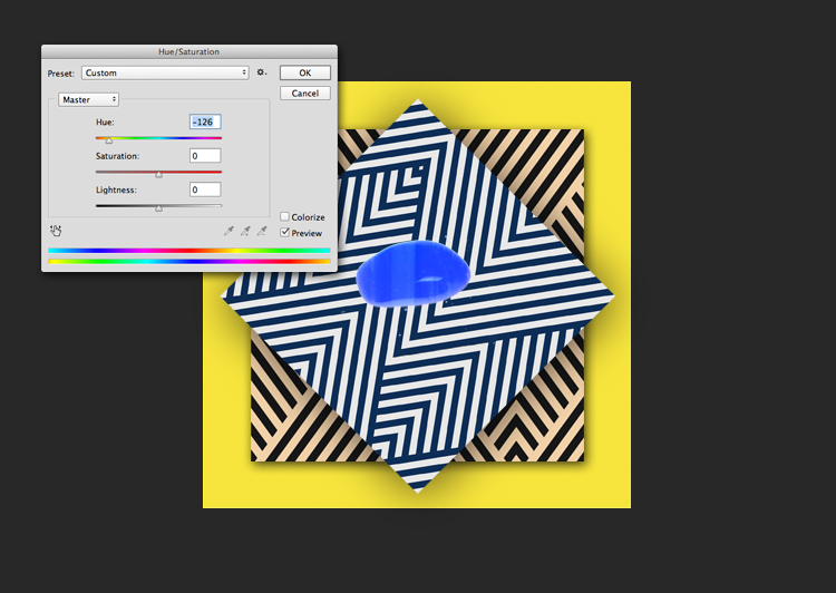 Hit Command+U to bring up the Hue/Saturation dialog box. Use the Hue slider to change the color of each lava lamp droplet. Adjust the colors however you like them, playing with how they interact with the background.
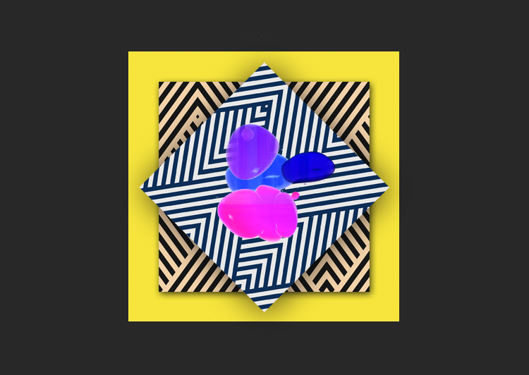
Step 9
Make a new layer and use the marquee tool (M) to draw a square shape. Use the paint bucket tool (G) to fill the square shape with a bright color (I used hex #08ec59).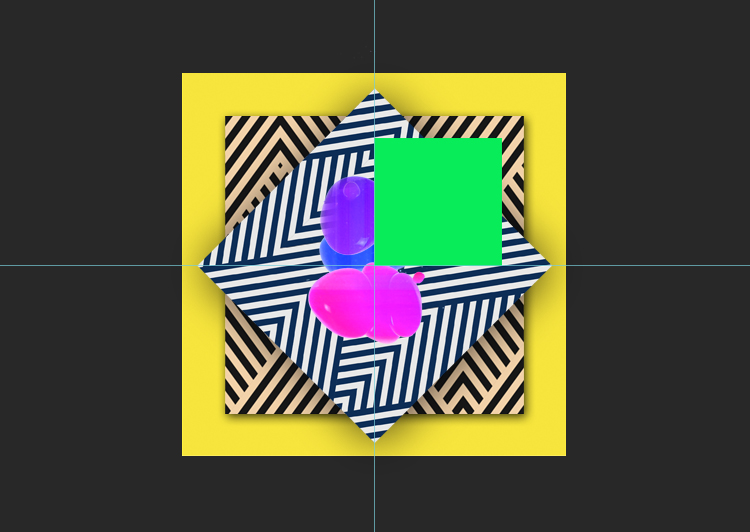 Use the arrow tool (V) while holding Option to drag a copy of the square. Move the two squares to align with the square shapes of your guides.
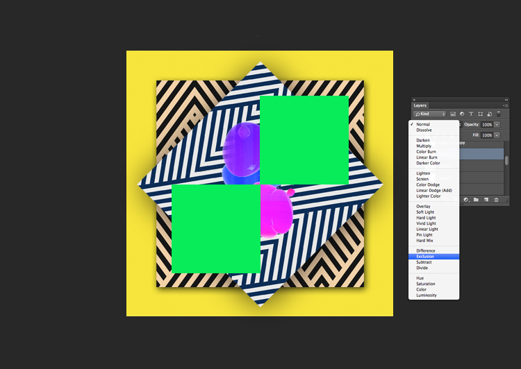 Often, designers use this technique to overlay a sold shape over a photograph. You’ll see this a lot in high-end fashion magazines and elsewhere, where there will be a big, solid shape over an image, with color manipulation often used to show the image through the shape. (See examples here and here.)
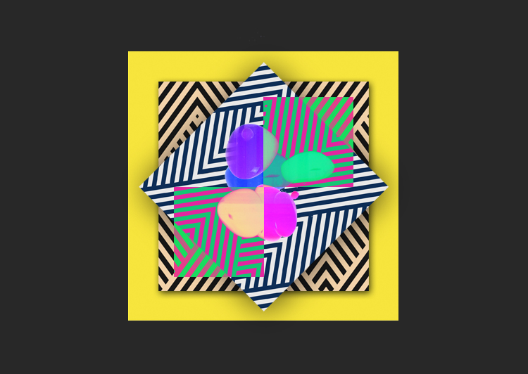
Step 10
Typefaces can be tricky, so let’s talk type selections. For the uninitiated, there are two kinds of typefaces: serif (type with small flourishes at the ends of the letter strokes) and sans-serif (no flourishes); within those, there are also subcategories.
I used Brandon Grotesque for this cover. It’s a sans-serif font with rounded edges that works well for the layout due to its modern and geometric feel. Sans-serif fonts have a very contemporary look, so if you’re going for a more vintage feel, you could look to ’60s or ’70s serif fonts for that effect.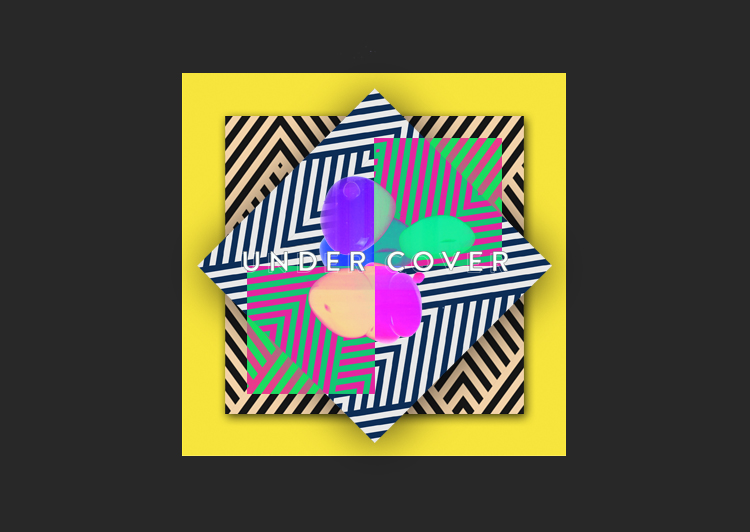
I centered the type using the guides I created to help with the symmetry of the overall piece. I made it white, and added a 1-pixel black stroke around it to help define and hold the shape of the letters.
Of course, you may be going for something entirely different with your album art, but the methods used here will help with almost any composition. If you have any questions about any of the other tools or effects you can use, please let us know in the comments below!
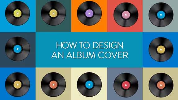
Top image: Vintage Vector Vinyl Record Disc Background by mejnak
Get the TNW newsletter
Get the most important tech news in your inbox each week.